

Designing a Proximity Detection System for Industrial Draglines
A look at the key decisions behind designing a computer-vision-assisted proximity detection interface for dragline operations. This was a short, focused design sprint rather than a comprehensive end-to-end product engagement. The project did not reach direct testing with operators, so the case study focuses on selected interaction problems and early design reasoning based on stakeholder feedback and the available operational context.
Note: No confidential client data, operational footage, site configurations, or proprietary computer-vision details are disclosed. All site imagery and visuals were replaced, simplified, or recreated solely to demonstrate the interaction approach.
Context & Problem
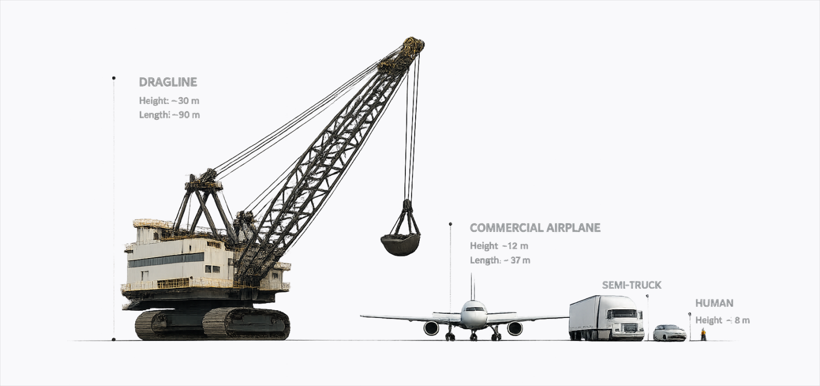
Draglines are among the world's largest mobile machines. So large, even a haul truck looks small beside them. In mining operations, these machines are used to displace vast amounts of earth efficiently, but their size creates significant blind spots for operators, particularly around the bucket and boom, the most hazardous moving parts, where nearby vehicles or personnel may not be visible. This limited visibility increases the risk of collisions during operation. To mitigate these risks, operators rely on multiple video feeds from standard cameras mounted around the dragline, but in practice this requires continuous attention switching and manual interpretation, making it difficult to detect collision risks in time. The goal was to minimize the delay between a vehicle entering a blind spot and the operator recognizing and responding to a potential collision to help protect both personnel and equipment.
Solution & Impact
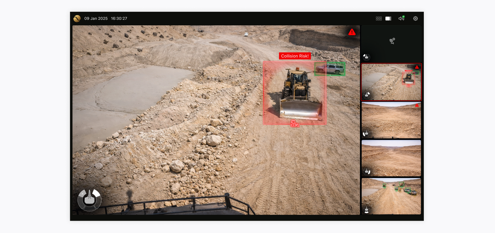
To address this gap, the proposed solution combined real-time computer vision with a context-aware monitoring interface capable of detecting and tracking nearby vehicles across multiple camera feeds. Instead of requiring operators to continuously scan fragmented video streams, potential risks were surfaced directly within each feed through minimal, in-situ annotations. The interface was designed to shift the operator’s role from continuous interpretation toward faster recognition and response, reducing the need to mentally reconstruct spatial relationships across disconnected views. The experience prioritized information that was immediately relevant while balancing warning visibility with visual noise. Camera navigation, spatial orientation, feed layouts, and collision overlays were designed together to help operators understand where a potential risk was located relative to the machine without overwhelming them in time-critical situations.
The direction was presented to project stakeholders and was positively received. However, the project was paused before it reached field testing or deployment as delivery circumstances changed while the underlying computer-vision models were still being refined. As a result, the design decisions presented in this case study should be understood as informed hypotheses grounded in the available operational context and stakeholder feedback, rather than outcomes validated with operators in real working conditions. No safety or usability impact is therefore claimed at this stage, although the project may still be revisited in the future.
Key Decisions & Tradeoffs
Aligning the system with spatial understanding
Most attention initially focused on collision alerts and system intrusiveness (see Decision 4). The camera system itself was largely treated as a solved problem. We inherited the conventional surveillance paradigm: a grid of camera feeds, click-to-expand interactions, and static camera labels or IDs. Because this interaction model was already widely adopted, it was not initially questioned in our discussions. It left operators with a familiar but demanding sequence: inspect the feed, recall labels from memory, interpret the scene context, infer orientation, and mentally map it relative to themselves. Even when performed quickly, this sequence could add cognitive overhead and delay recognition of a risk. Engineers, on the other hand, were more concerned about solving the orientation problem that resulted from moving cameras.
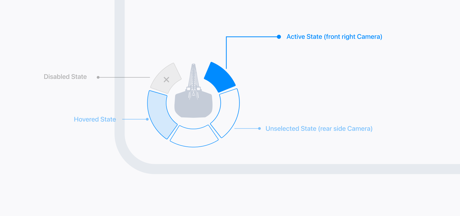
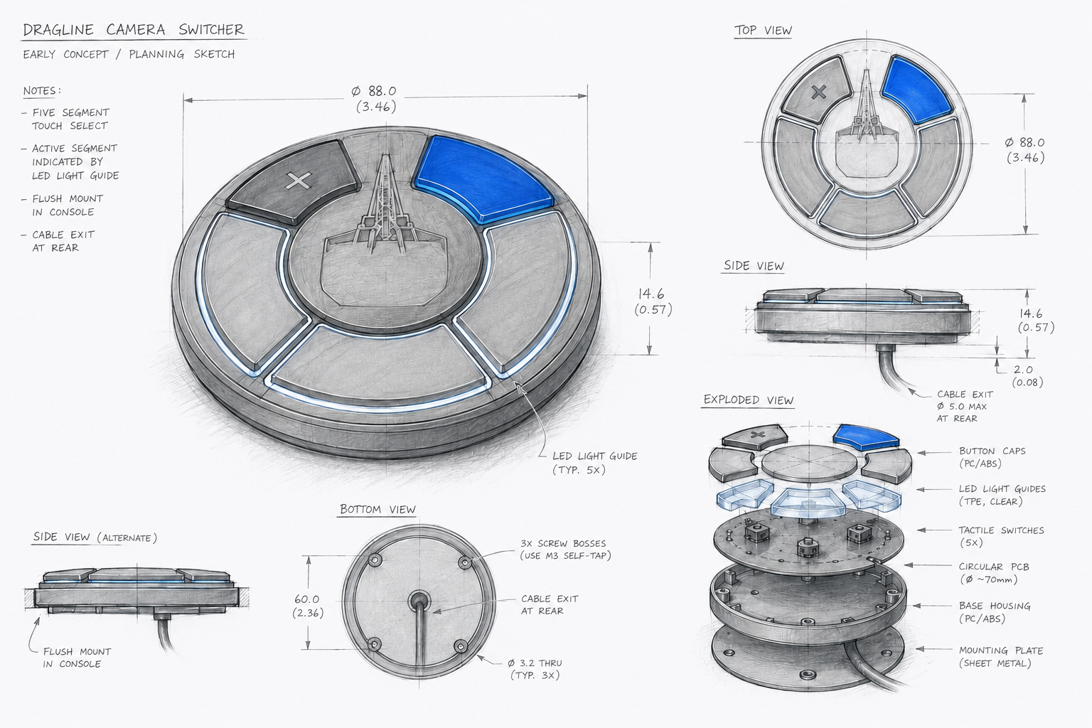
At first, I was still constrained by the surveillance-camera paradigm. The improvements I initially explored were automatic expansion of cards, smarter feed prioritization, and clearer labels, such as left and right instead of camera IDs. These addressed visibility, but not the underlying interpretation problem: the operator still had to mentally translate camera feeds into spatial understanding. The breakthrough came when I stopped thinking in terms of real-world orientation and started thinking in terms of the operator as the frame of reference. Instead of asking which camera physically faced north or south, the system needed to communicate where the risk existed relative to the operator at that moment. We moved away from directional labels and surveillance-style camera identification entirely. Cameras became represented spatially rather than linguistically, with the boom acting as the primary frame of reference. Through experimentation, this evolved into a switch-like visual control that both communicated orientation and enabled camera navigation itself. The interface no longer relied on text labels or memorization. The aim was to make orientation understandable through spatial positioning rather than label interpretation. The solution itself was relatively simple once the problem became visible. The real challenge was escaping the inherited surveillance paradigm and recognizing that the interface should optimize for human spatial cognition rather than camera management.
Stabilizing Layouts for Predictability
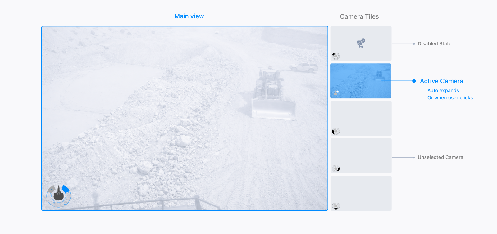
Surveillance platforms conventionally adopt two viewing modes: a grid view for monitoring all cameras, and a focused view where one feed becomes dominant. In many systems, this second view either becomes a full-screen view that requires user interaction to return to the grid, or a hybrid layout where the selected feed expands while the remaining feeds collapse into smaller cards and behave like tabs. We chose the second approach because operators still needed peripheral awareness of surrounding feeds while focusing on a primary risk area.
When implementing this approach, a common usability issue that prevails among many surveillance systems is the instability of camera positions when a feed is highlighted. Whenever a camera expanded into the main view, its original tile disappeared from the grid, causing the remaining feeds to reposition themselves dynamically. Although subtle, this made camera locations less predictable and could make spatial memory harder to develop. We stabilized the layout by preserving the selected camera’s positional reference even when it became the primary view. The solution followed interaction patterns already familiar in products like video conferencing platforms and tab-based interfaces, where the active item remains visually represented rather than disappearing entirely.
Adapting the Camera Grid to the Physical Setup
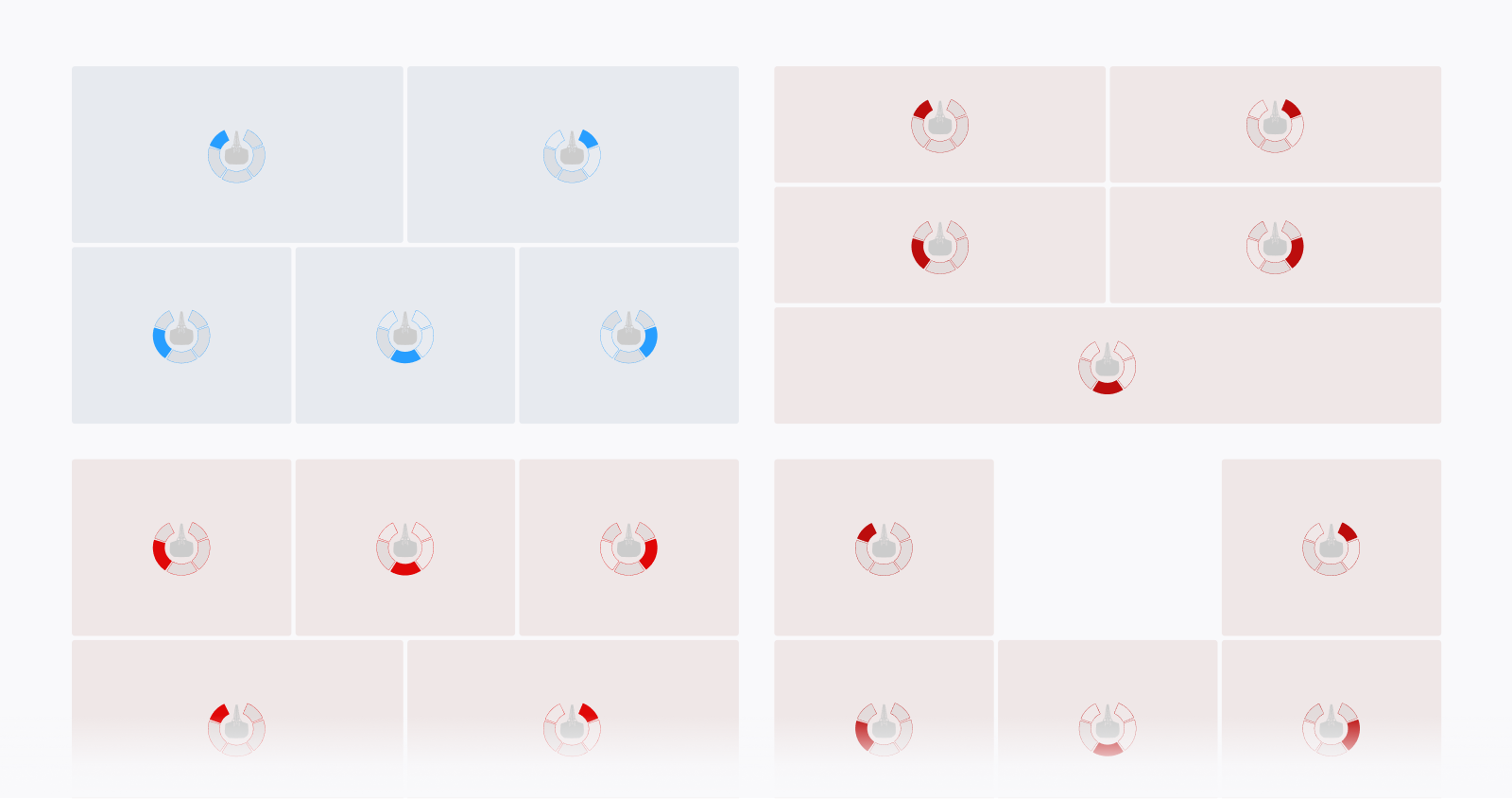
The blue top-left layout was selected for the final design.
Another secondary decision involved the spatial arrangement of camera tiles within the main grid view. Initially, we explored directly mapping the physical position of each camera to its location in the interface. This would have been straightforward with a symmetrical camera setup, but the dragline used an uneven camera configuration. A fully accurate spatial mapping would have required introducing an awkward third row or heavily asymmetrical layouts, which negatively impacted scanability and visual balance. Instead, we opted for a compromise that preserved enough spatial intuition without sacrificing layout clarity: the top row represented the forward-facing views, while the bottom row grouped the side, rear, and rear-side views from left to right. Although not a literal physical mapping, this arrangement was selected during design review for its balance of spatial cues and layout clarity. The bottom feeds were fitted into their available space without cropping, so the full camera image remained visible.
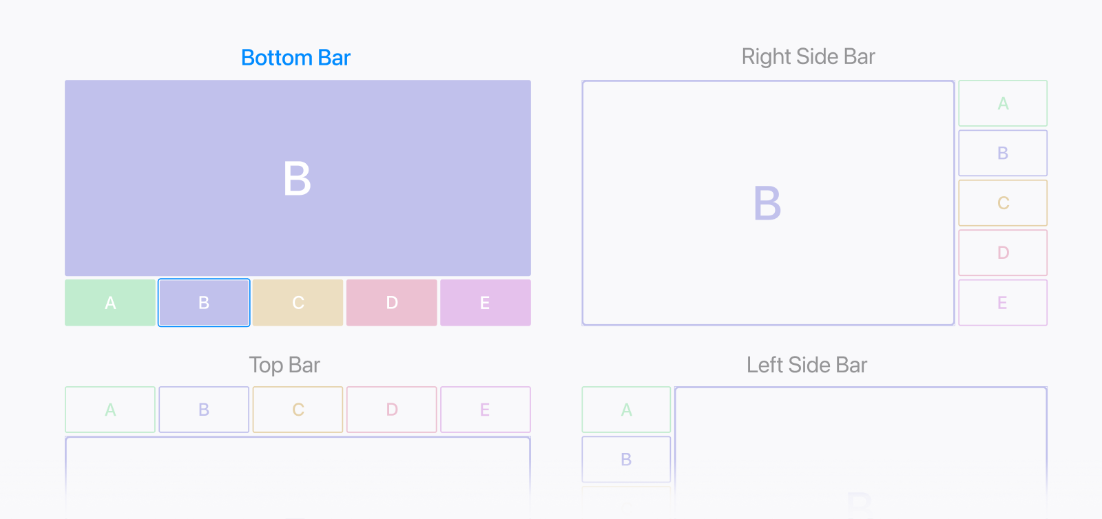
The remaining question was whether secondary camera tabs should appear beside or below the primary view. We chose the right-side layout because it preserved more vertical space for the main feed and kept the surrounding camera views in a consistent, separate strip. This gave the active view greater prominence while keeping other feeds visible and easy to select.
Balancing Visibility with Intrusiveness
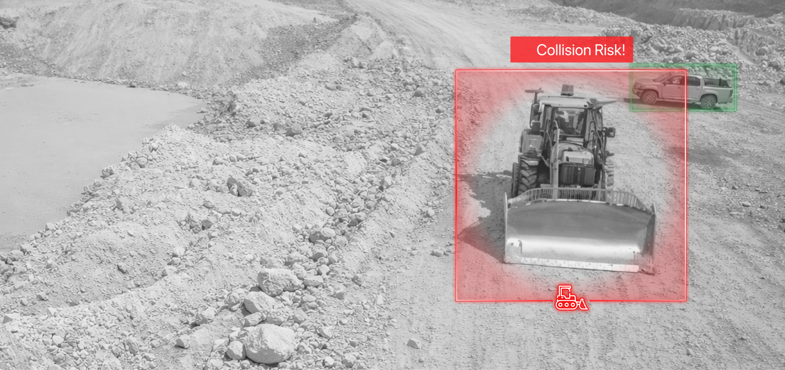
The site imagery was generated for illustration purposes to avoid displaying real operational footage.
The collision warning overlay patterns used in this project were largely inherited from a previous anti-collision system designed for haul trucks. While the underlying computer vision models and operational context differed, the UX principles for surfacing risk remained consistent. Detailed exploration of the overlay logic, progressive warning states, and visual intrusion tradeoffs can be found in the related Truck Anti-Collision System case study.
UI Directions
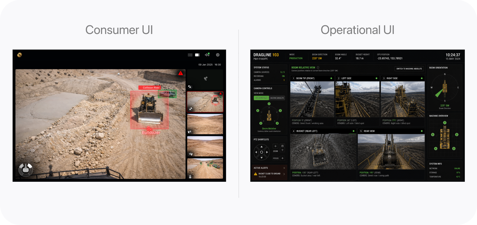
The operational concept on the right was AI-generated for rapid direction exploration.
Another early design decision focused on the overall UI direction of the system. Early concepts leaned heavily toward a simplified, consumer-style interface (largely influenced by my background in consumer product design) with larger content areas, reduced visual density, and cleaner interactions similar to modern web applications. While approachable and visually refined, these versions felt disconnected from the expectations and realities of operational environments. The alternative followed a more industrial UI language commonly seen in surveillance and heavy-equipment systems: denser information layouts, persistent system visibility, and stronger emphasis on monitoring multiple machine states simultaneously. As the project evolved, we gradually shifted toward this operational direction while still selectively simplifying areas that introduced unnecessary visual noise. The selected direction aimed to balance clarity with familiar operational patterns; its effect on operator trust and usability remained untested.
Other decisions
Several smaller UX decisions also shaped the final experience of the system:
- Minimized controls & content: Reduced non-critical controls and interface noise to keep attention focused on monitoring and risk awareness.
- Dark mode by default: Explored a dark operational theme intended to reduce glare; legibility and long-session comfort still required testing.
- Sound design & alert behavior: Proposed progressively escalating alerts, with fatigue and intrusiveness still requiring evaluation in operational conditions.
- Limited settings complexity: Kept configuration options intentionally constrained to maintain consistency and reduce operational overhead.
- Reused anti-collision UX patterns: Adapted established warning and escalation patterns from previous anti-collision systems to accelerate development and preserve consistency across platforms.
