

Exploring Consumer Product Flows & Interaction Patterns
A growing collection of personal studies across consumer products. Each exploration follows a product area through its main flows and smaller interaction details, comparing familiar conventions with alternative structures. The aim is to build a working mental library of patterns, their tradeoffs, and the contexts in which they make sense.
Note: These are independent design explorations, not commissioned or shipped products. The page shows selected directions from much larger rounds of iteration, with brief notes on the choices behind them rather than a complete account of every decision.
Travel & Airline Booking Apps
Context & Goal
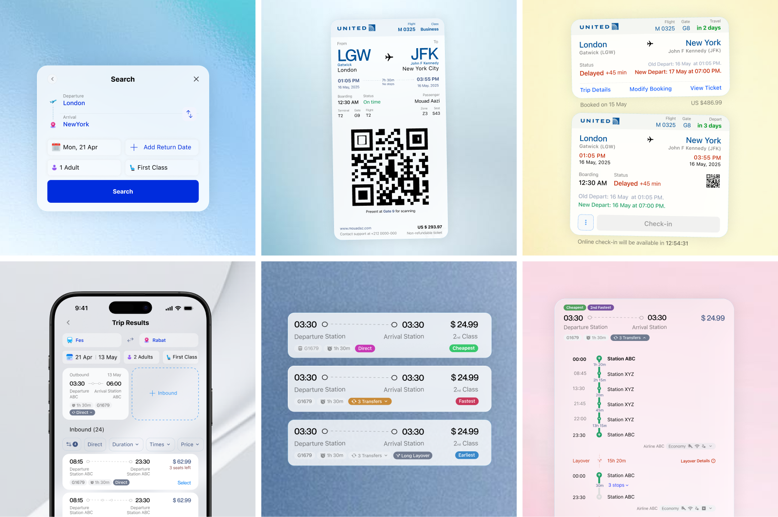
Travel booking connects structured search, comparison, configuration, payment, and ongoing status management. This study follows those tasks from the first search to check in, exploring the larger flow alongside details such as reversible routes, optional return dates, fare labels, and ticket states. The screens show selected alternatives from broader rounds of iteration, not one production system. Many of these patterns also apply to marketplaces, configurable purchases, and other time-sensitive services.
Key Flows & Screens
Trip Search
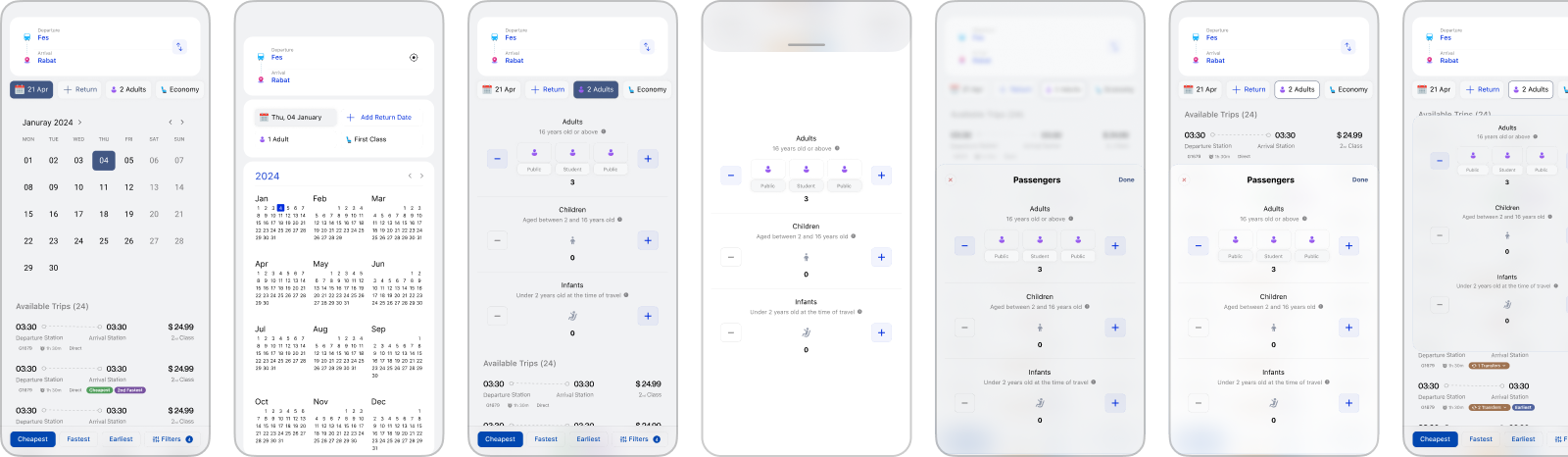
Trip search appears simple, but it establishes the information architecture for everything that follows. Route, dates, passengers, and travel class were organized around the order in which people typically form a trip in their minds: where, when, and under what conditions. The selected direction treats departure and arrival as one reversible relationship, keeps return travel optional, and reveals secondary choices without turning the entry point into a dense booking form. The iterations below focus primarily on hierarchy, grouping, and progressive disclosure rather than visual styling.
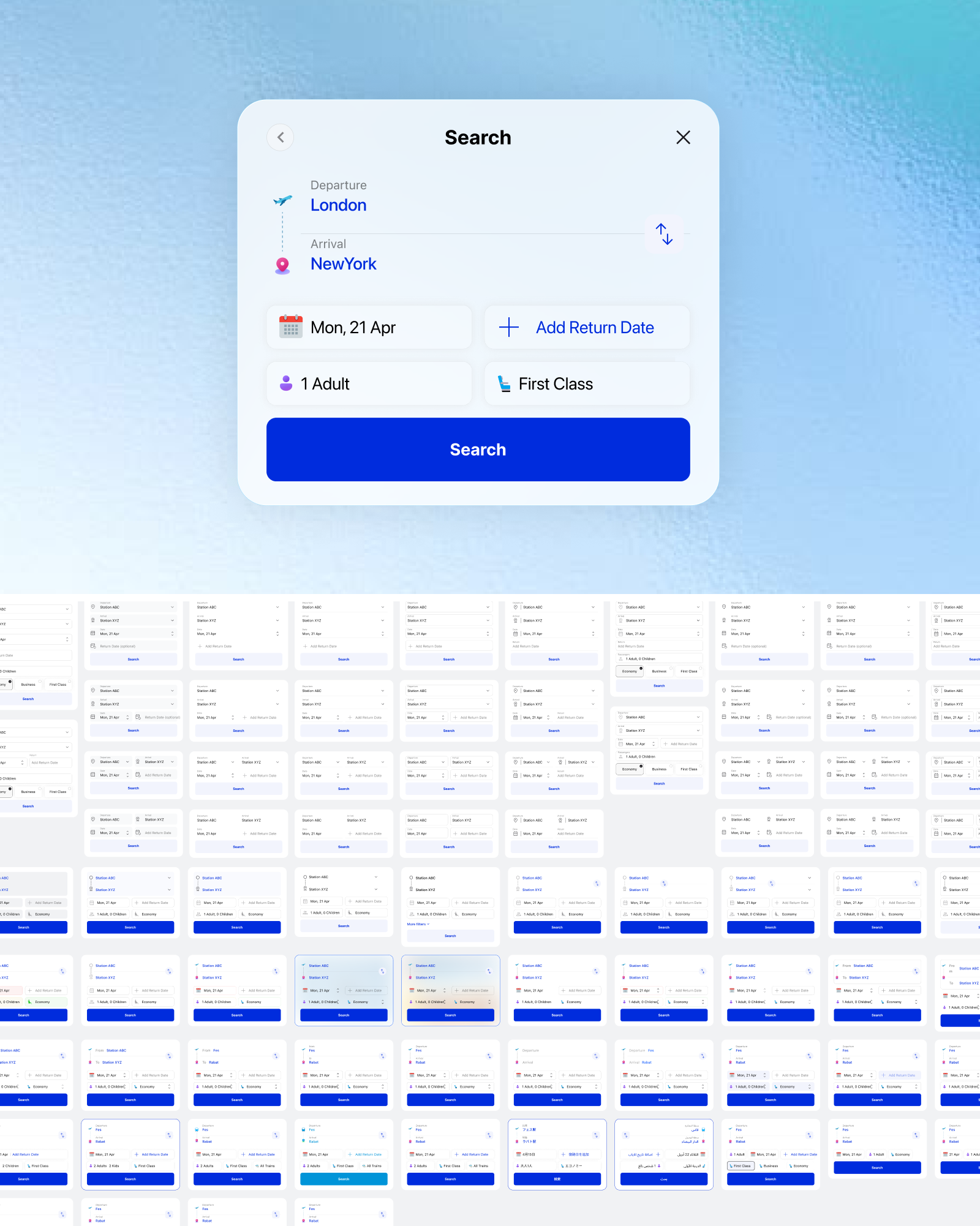
Before visual styling, the search flow was reduced to its underlying interaction model. The wireframes tested how field order, trip type, and conditional options affected perceived effort. One-way and return journeys were treated as variations of the same task, allowing the structure to remain stable while revealing only the fields required by each selection. A major question was whether to preserve the familiar One-way / Return tabs used by most booking products. While recognizable, this pattern introduces an upfront mode selection and often changes the form before users can enter the journey itself. Treating the return date as an optional addition creates a simpler shared structure and removes one decision from the starting state, but the improved efficiency also means departing from a convention many travelers already understand.
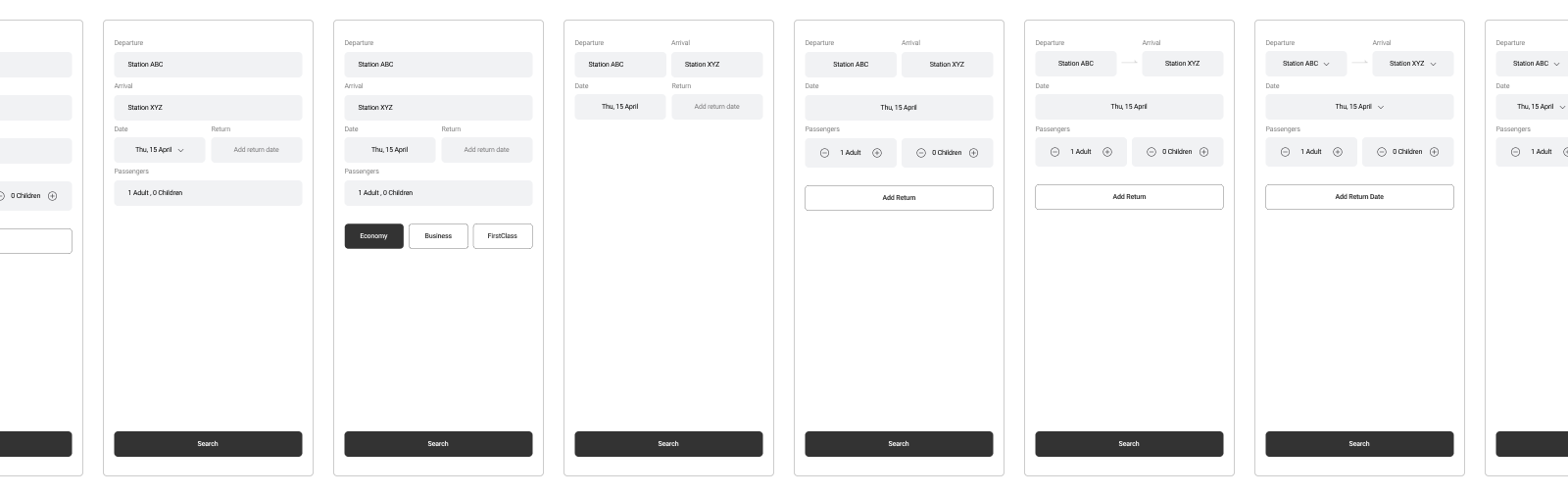
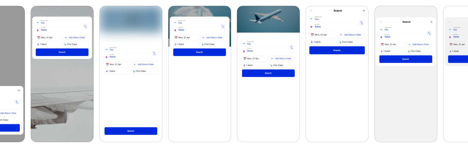
The same field relationships were carried into different visual treatments to separate questions of interaction from questions of identity.
Station, Date, Passenger, & Class Pickers
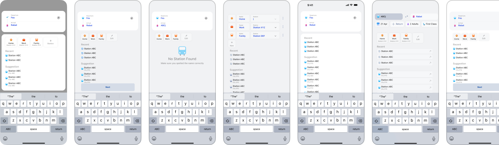
Many travel apps treat station selection as a simple text-search task. In practice, a traveler may know the station name, repeat a recent route, start from a saved place such as Home or Work, or simply need the nearest option. The right mix also depends on the product: airline users may search by city or airport, rail passengers by a specific station, and local commuters by proximity or routine. A richer picker can combine direct search, saved shortcuts, nearby stations, recents, and relevant suggestions around that context.
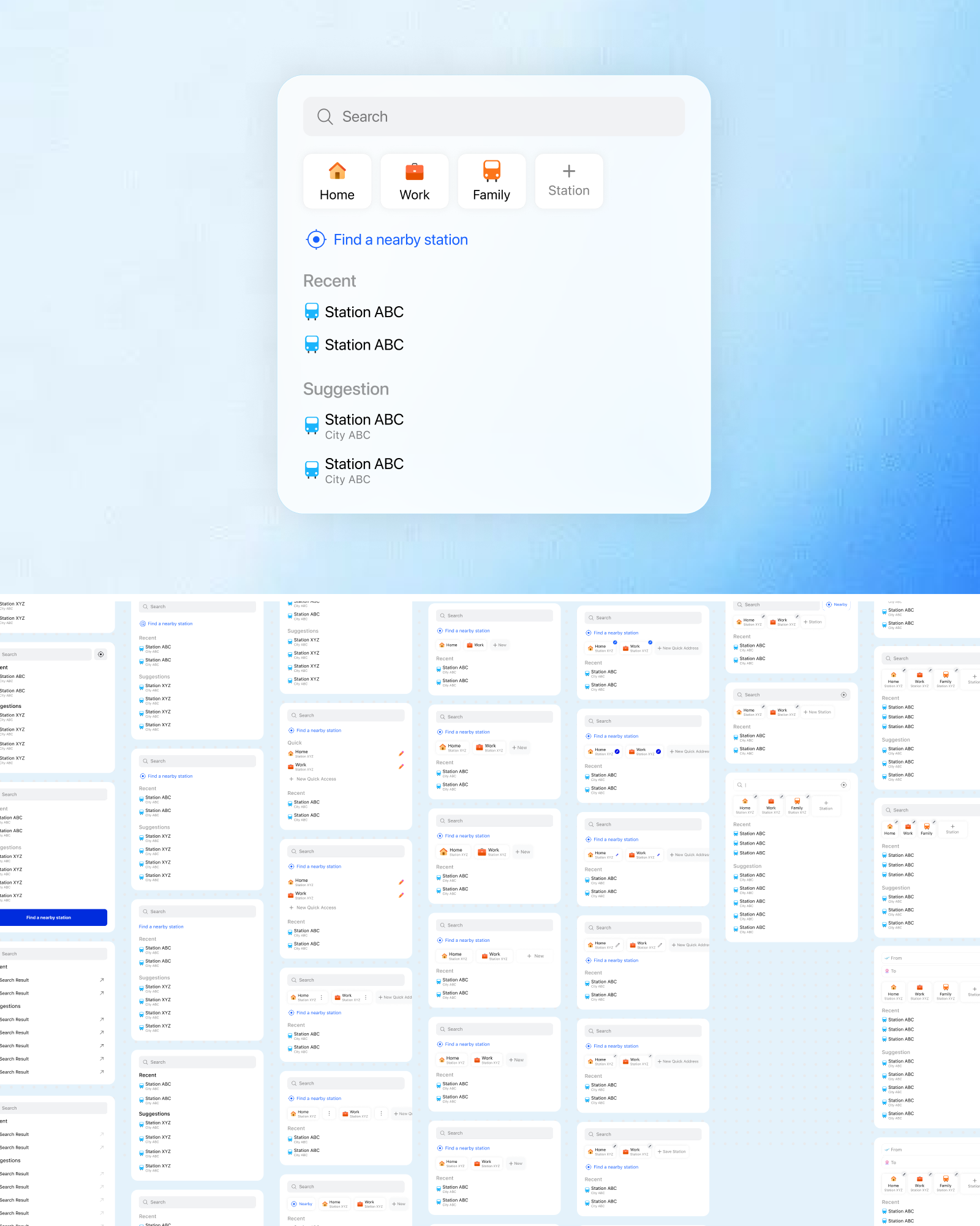
Different presentation models were explored beyond the conventional full-screen picker. Some versions opened in a compact modal, while others expanded directly within the search form so the picker and journey context became one continuous surface.
Trips Overview & Management
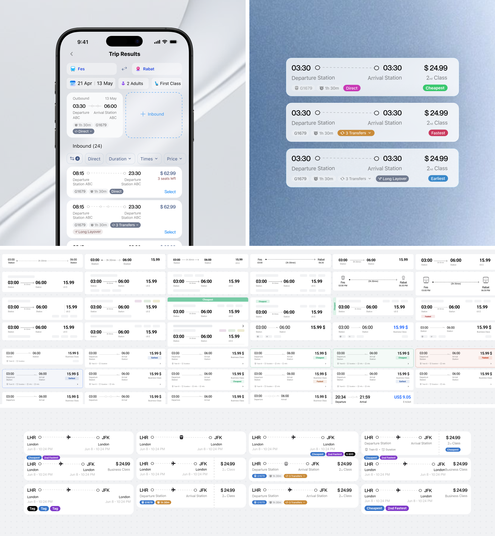
A trip-results screen works less like a conventional list and more like a comparison interface. Departure and arrival times, duration, transfers, fare conditions, and price need to remain in predictable positions so options can be scanned vertically without reading every card in full. The main variations explored how much information could remain visible before each result became too dense, and which differences deserved stronger labels because they could materially affect the choice.
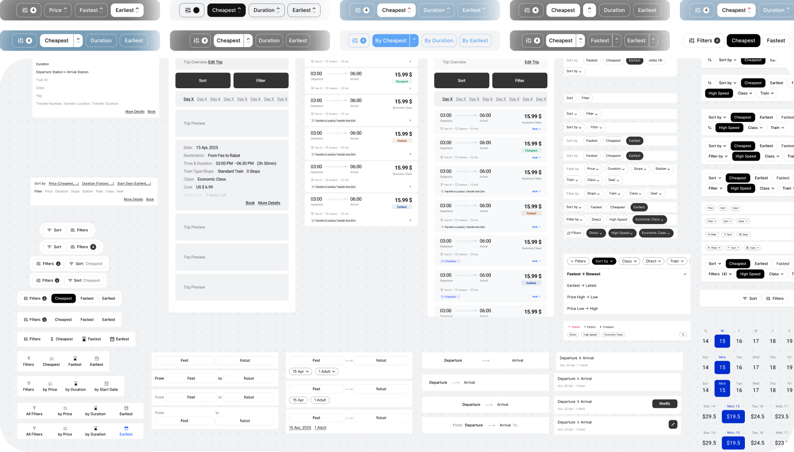
Filtering introduces a second layer of information architecture around the results. High-frequency constraints such as departure time, duration, transfers, and price can remain close to the list as quick filters, while less common criteria move into a dedicated filter view. Applied choices stay visible as removable chips so users can understand why the results changed without reopening the full panel, with sorting kept separate because it changes order rather than eligibility.
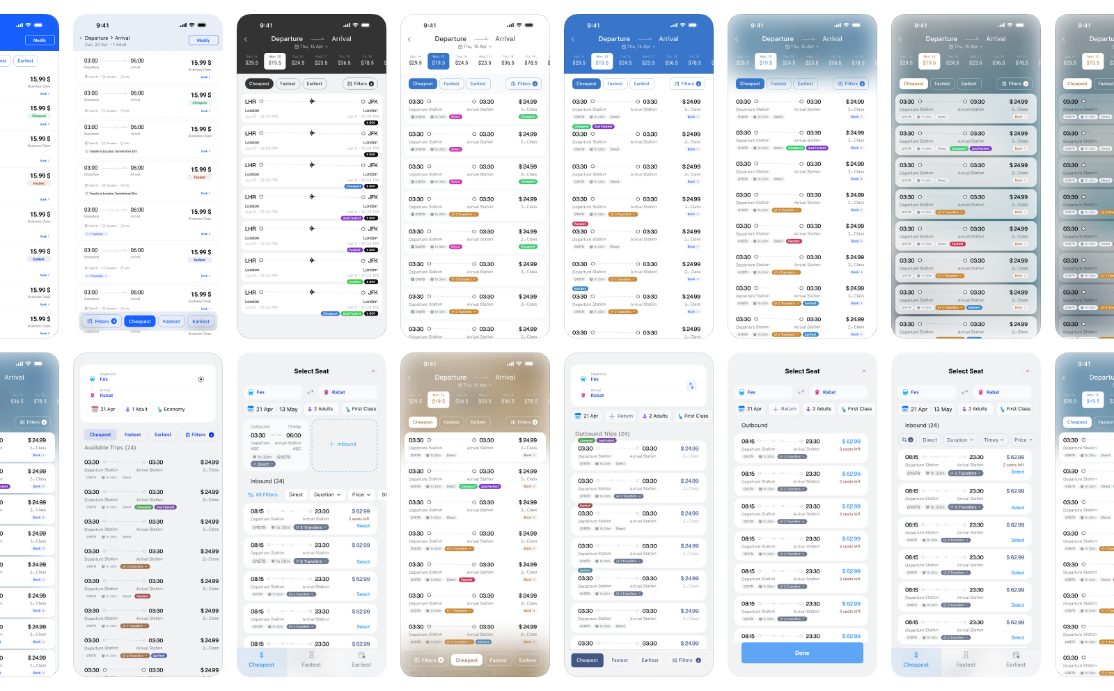
Once the information order was stable, the same results structure was tested across different levels of density and visual emphasis. Color, surfaces, selected states, fare labels, and supporting imagery changed, while the core comparison points remained in the same positions. This allowed the interface to adopt different product identities without changing the scanning pattern users rely on when comparing several trips.
Trip & Transfer Details
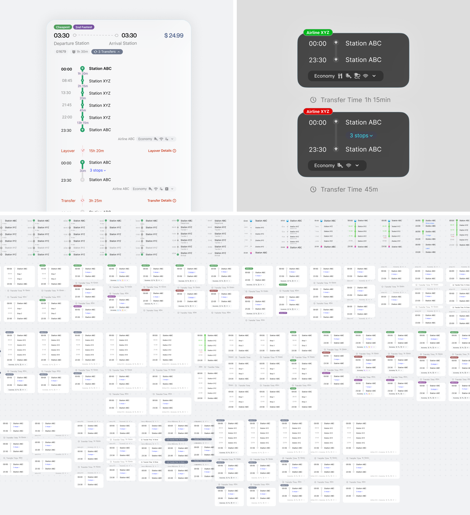
Trip details shift the task from comparing options to understanding a sequence. Each leg, station, departure and arrival time, operator, and transfer needs to be read in chronological order without losing the overall journey. Transfers were treated as first-class events rather than small annotations between routes, with their duration and location placed directly in the timeline. The variations explore how much detail should remain visible by default and what can wait until a specific leg is expanded.
End-to-End Booking Flow
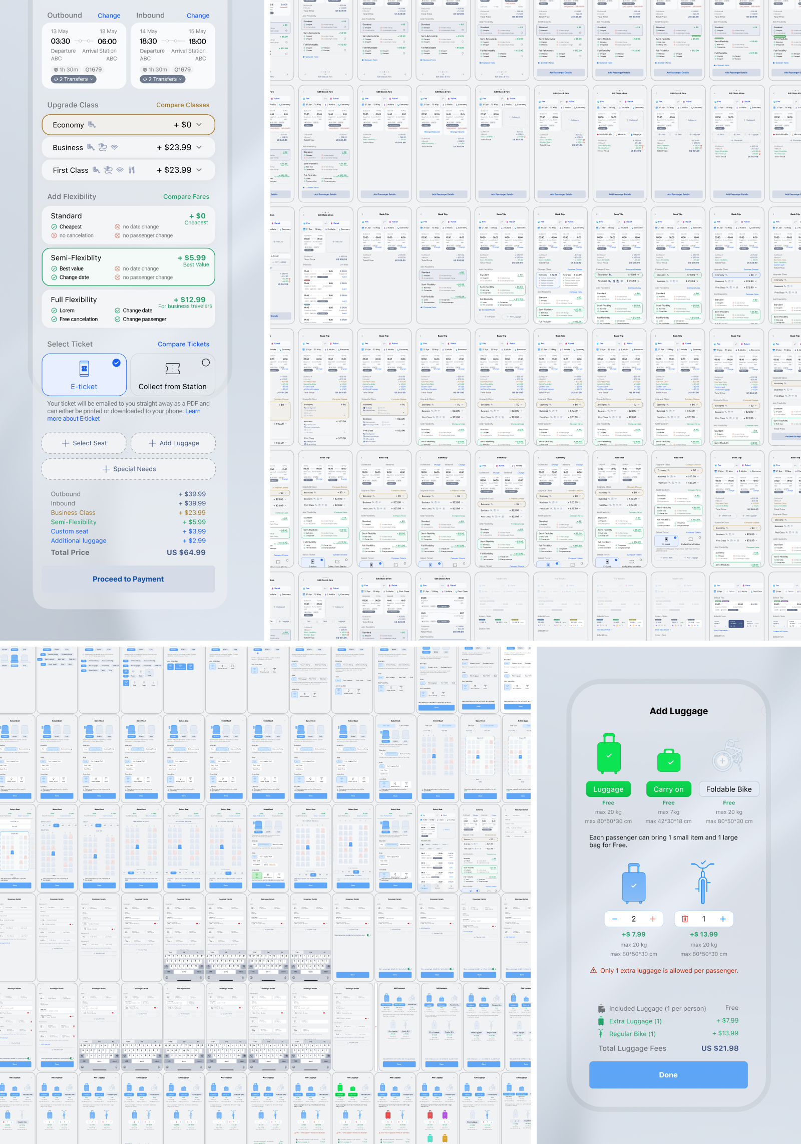
The booking flow is the central experience of a travel product and contains countless decisions across fares, passengers, seats, luggage, optional services, review, and payment. It is also a major commercial surface, creating different opportunities to present upgrades, bundles, insurance, and partner offers. Some products push these through preselected options, artificial urgency, weak opt outs, or visually imbalanced choices. The exploration considered how marketing and revenue opportunities could remain visible without disguising what is optional or obscuring their effect on the total price.
The screens compare how fares, passenger details, extras, and payment can be divided into manageable steps while keeping the selected journey and changing total available for review.
E-tickets, Boarding Pass, & Flight Status
Once a booking is complete, the experience shifts from supporting choices to maintaining clarity and confidence throughout the journey. The same trip needs to move between several representations, including the ticket, boarding pass, live flight status, and trips overview. Information that was important during purchase becomes secondary, while timing, location, status, and the next required action become increasingly prominent as departure approaches.
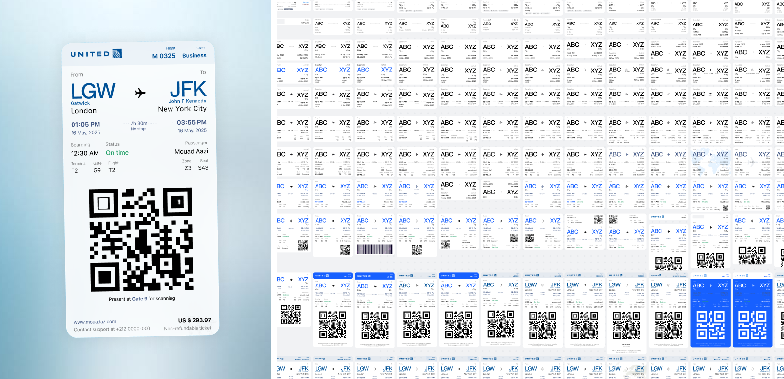
A boarding pass serves both the traveler and the scanning system. Route, departure time, gate, seat, and boarding group need a stable hierarchy for quick checks under time pressure, while booking references and secondary details can remain quieter. The code requires enough size and contrast to scan reliably without dominating the information people need before reaching the gate.
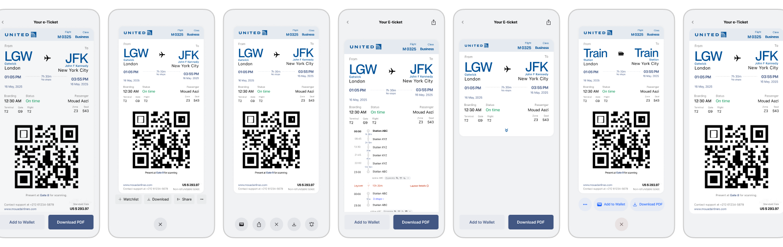
The same ticket may appear as a compact preview, a full screen pass, an expanded detail view, or a document prepared for saving and sharing. Essential travel information and the code remain stable across these contexts, while secondary details and actions can move around them. Different directions were also explored for airline and train tickets, where the required information and expected actions are not always identical.
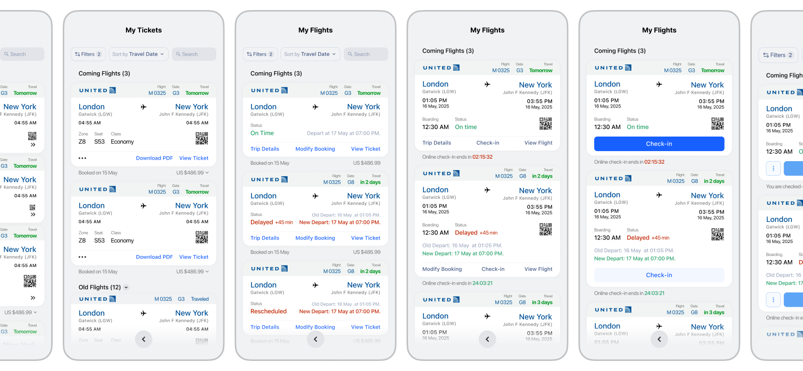
A digital ticket is not a static document. Days before departure, booking management and check in availability may matter most. Closer to travel, attention shifts toward the gate, boarding time, seat, and live status. During a disruption, the delay and the next available action need stronger emphasis without changing the entire card structure.
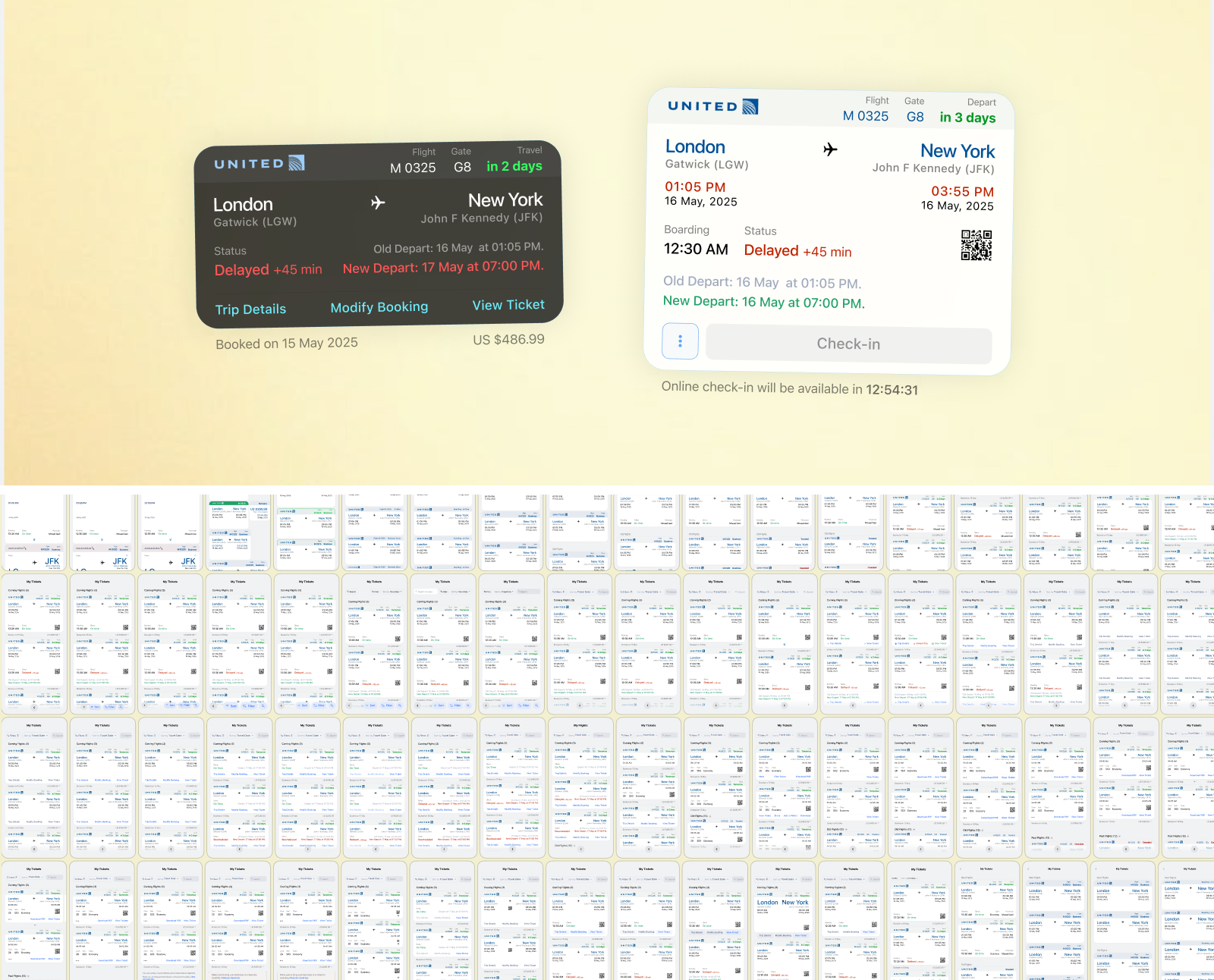
The trips overview needs to help travelers distinguish between upcoming, active, disrupted, and completed journeys without opening each ticket. A consistent card structure makes routes and dates easy to scan, while status and available actions change according to urgency. Grouping trips by their stage also prevents older bookings from competing with journeys that currently require attention.
Check In Flow
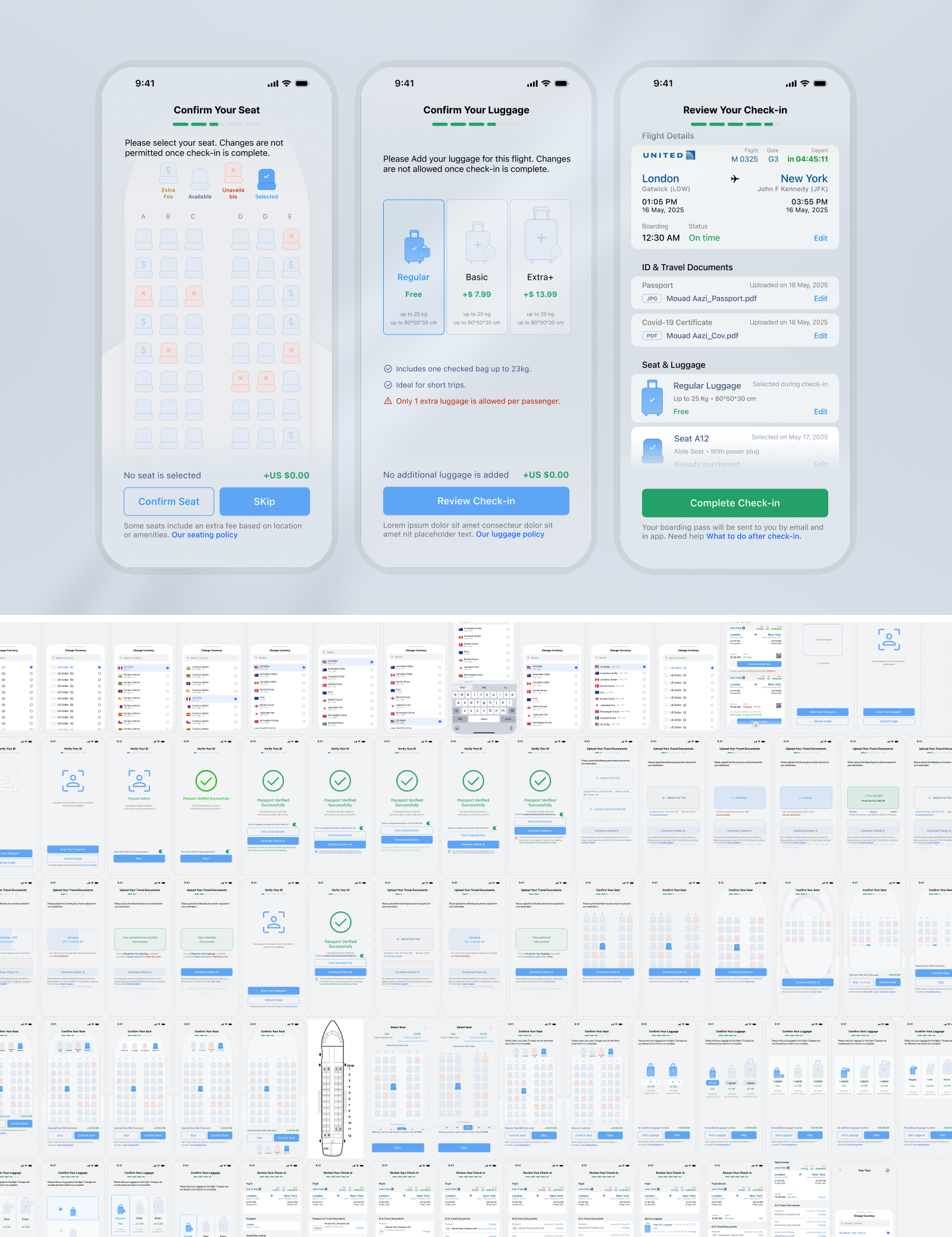
While tickets and status views support the journey after booking, check in is the point where a reservation becomes ready for travel. The flow brings together passenger confirmation, travel documents, seat selection, baggage, required declarations, and final review. Some steps may already be complete, optional, or irrelevant depending on the airline, route, and passenger, so progress cannot rely on one rigid sequence. The exploration focused on keeping requirements visible without making every passenger move through unnecessary screens. Existing information can be confirmed rather than entered again, optional steps can be skipped, and unresolved requirements remain visible in the final review. Changes to seats, luggage, or passenger details also need to update the summary before check in is completed.
Applications & Limitations
Although the exploration focuses on train and airline travel, many of its underlying patterns apply to other products involving structured search, comparison, configuration, booking, checkout, and ongoing status management. Station selection has parallels with location pickers, trip results with marketplace comparison, booking with configurable purchases, and travel status with orders, appointments, or other time sensitive services. This was a self directed pattern study rather than the design of one production product. The screens represent alternative directions and design hypotheses, not a single system intended for implementation. They were not validated with a defined user group or shaped by one operator’s inventory, commercial rules, technical architecture, accessibility requirements, or regional constraints. Any direction would need to be adapted and tested within its actual product context.
Film & Series Streaming

Context & Goal
Streaming moves between two different intentions: finding something worth watching and returning to something already started. This study explores how catalogue browsing, title details, and playback entry points support both. The iterations focus on content hierarchy, the space given to artwork, and the information needed before pressing Play, across mobile and desktop.
Key Flows & Screens
Balancing discovery with returning to watch
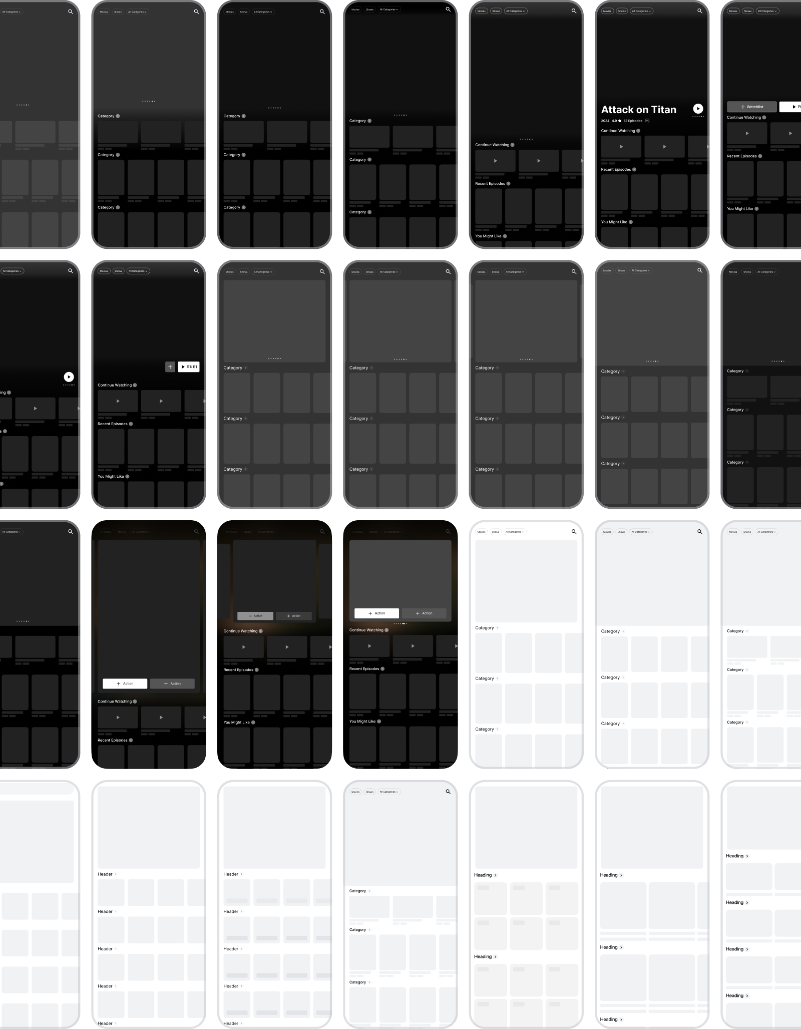
A featured title can give the catalogue a strong identity, but it also pushes useful content below the first screen. The Home explorations vary the hero height and the placement of its actions against Continue Watching, recent episodes, and recommendations. Resuming a familiar title and discovering a new one need different levels of explanation.
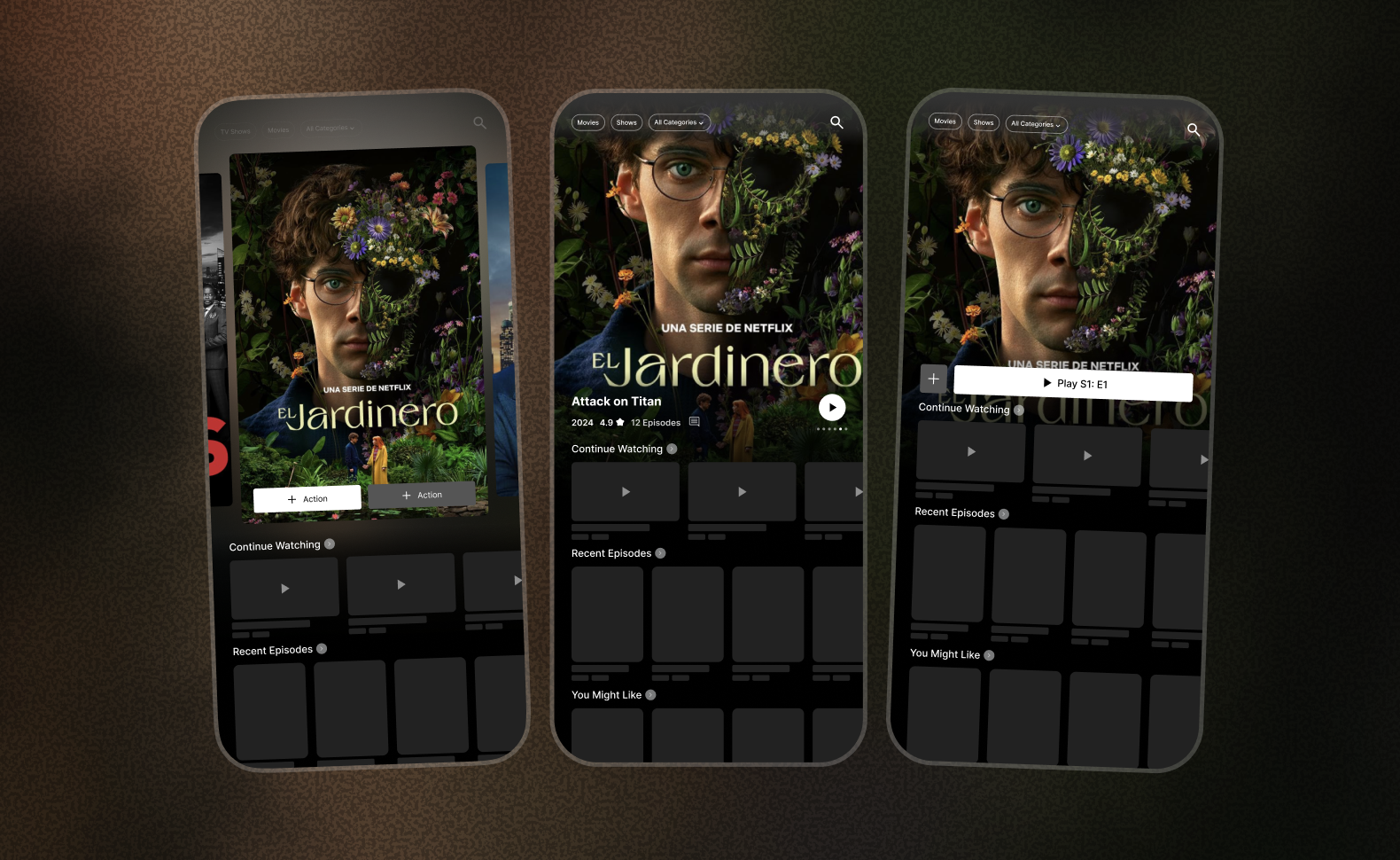
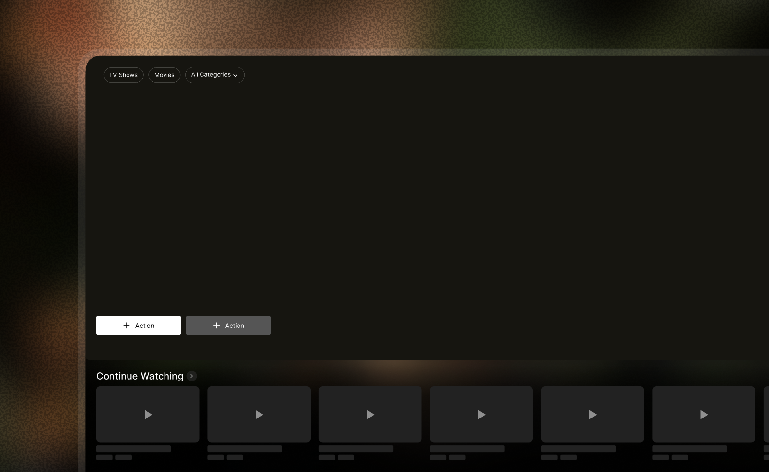
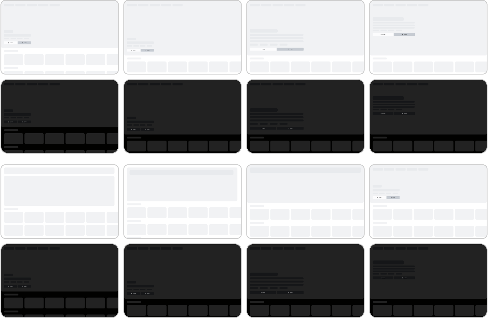
Desktop introduces a different balance: a wide feature area has more room for context, but can still consume most of the first view. These layouts test how the featured title, category controls, and first content row share that space rather than simply enlarging the mobile composition.
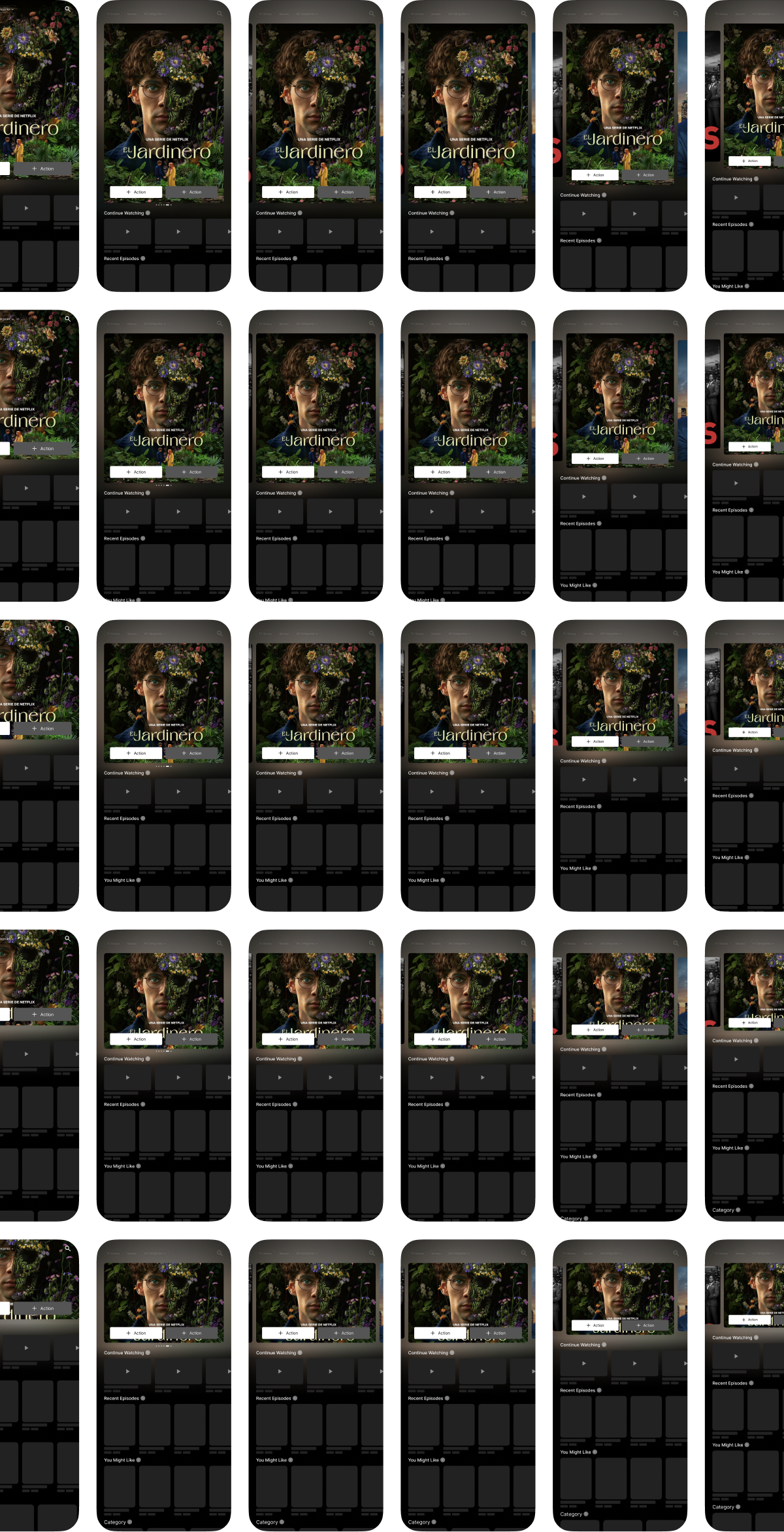
Small changes to the hero alter what the first screen invites people to do. Title placement, metadata, button grouping, and the point at which the next row appears were explored together, keeping the featured artwork consistent so the structural differences remained easier to compare.
Before adding artwork, the layouts were reduced to their proportions. The wireframes isolate the balance between the feature area and the catalogue, including how much of the next row is visible as an invitation to continue browsing.

Balancing title information with playback access
A title page serves people who are ready to watch and people who still need to decide. The explorations compare an embedded preview with a separate Play action, then vary the emphasis given to the synopsis, metadata, watchlist, downloads, cast, and related titles. The main question is how much context belongs before playback becomes the obvious next step.
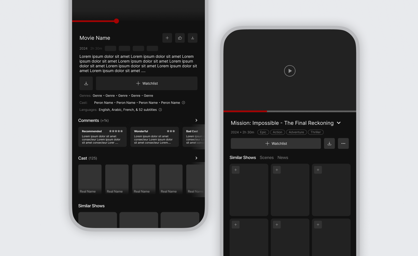
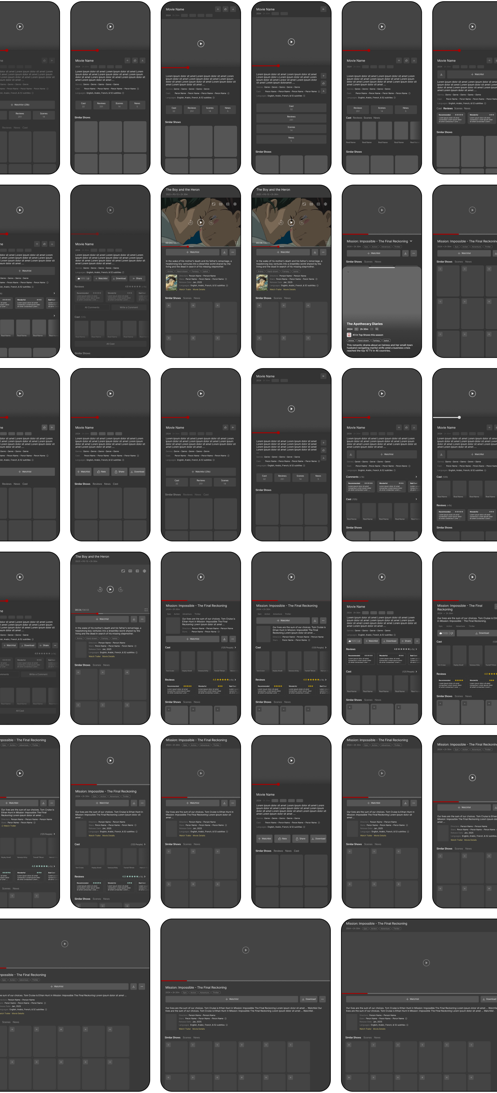
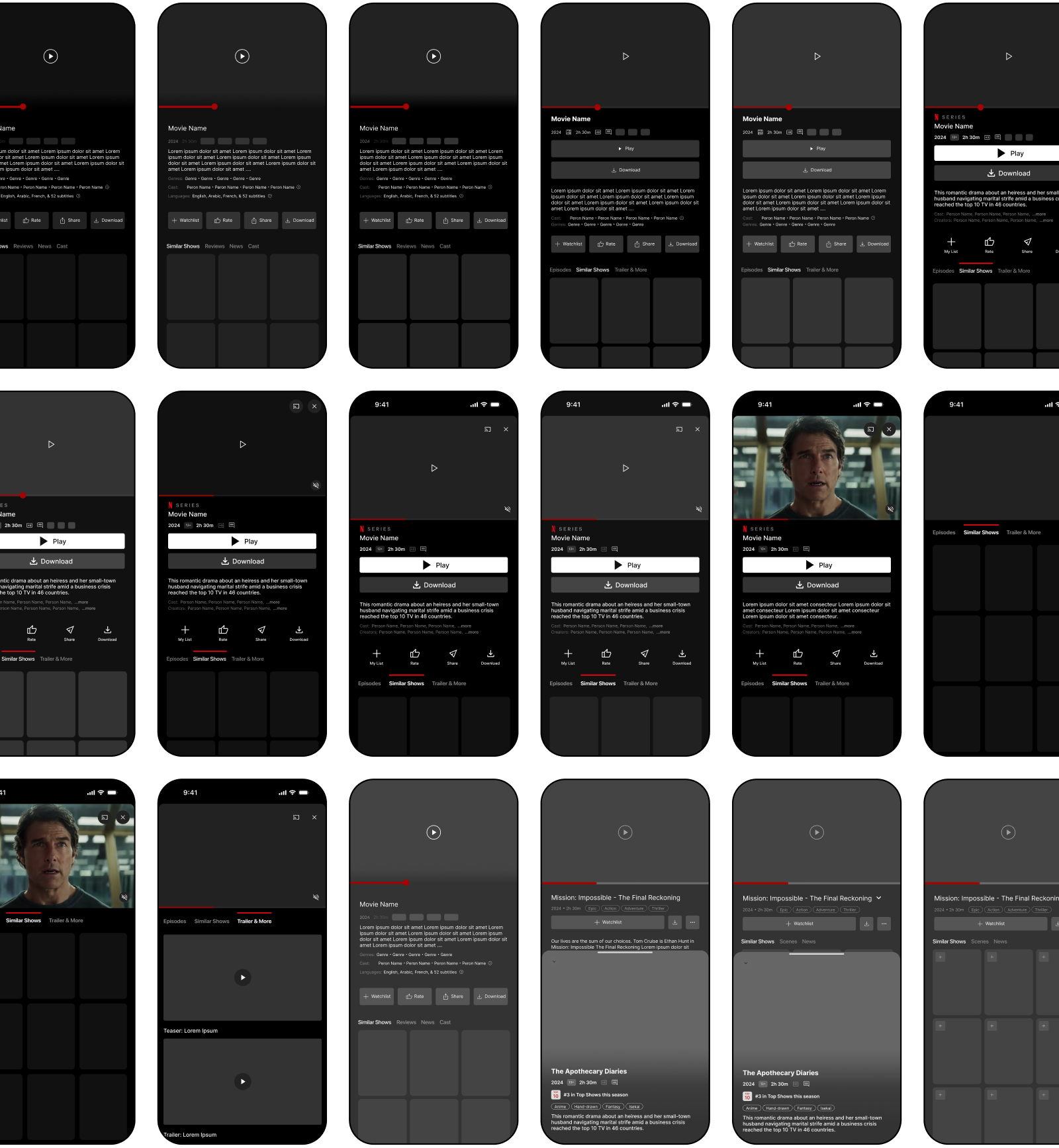
A poster-led page creates a stronger sense of the title, while a compact layout brings actions and information closer together. Play was tested beneath the title, within the artwork, and in a persistent bottom bar. Each placement changes its visibility as the user reads further into the page.
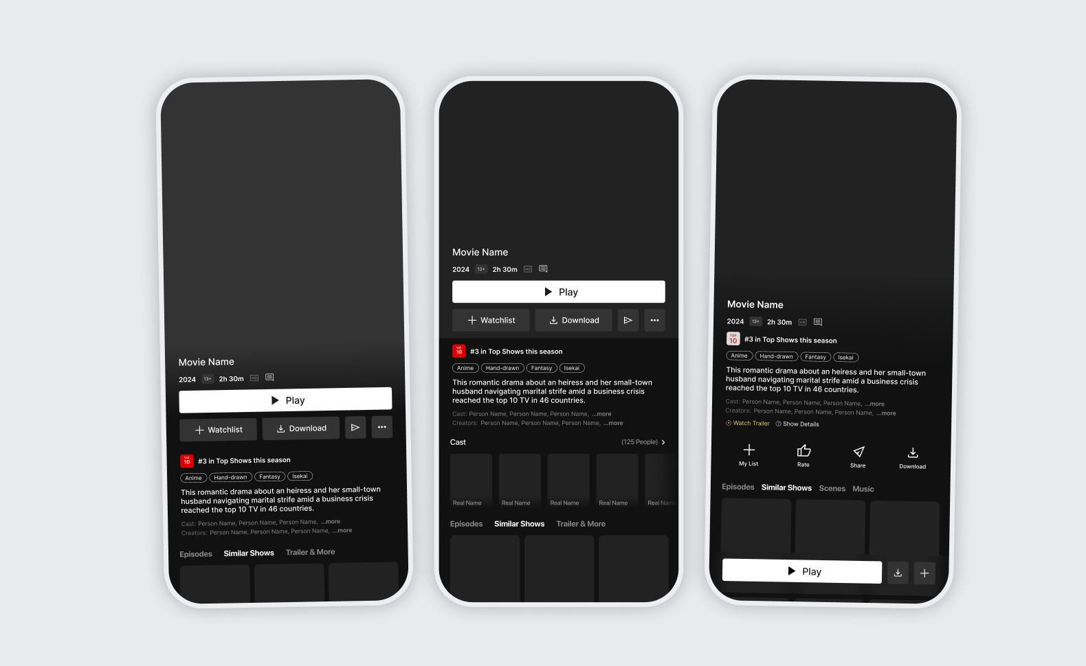
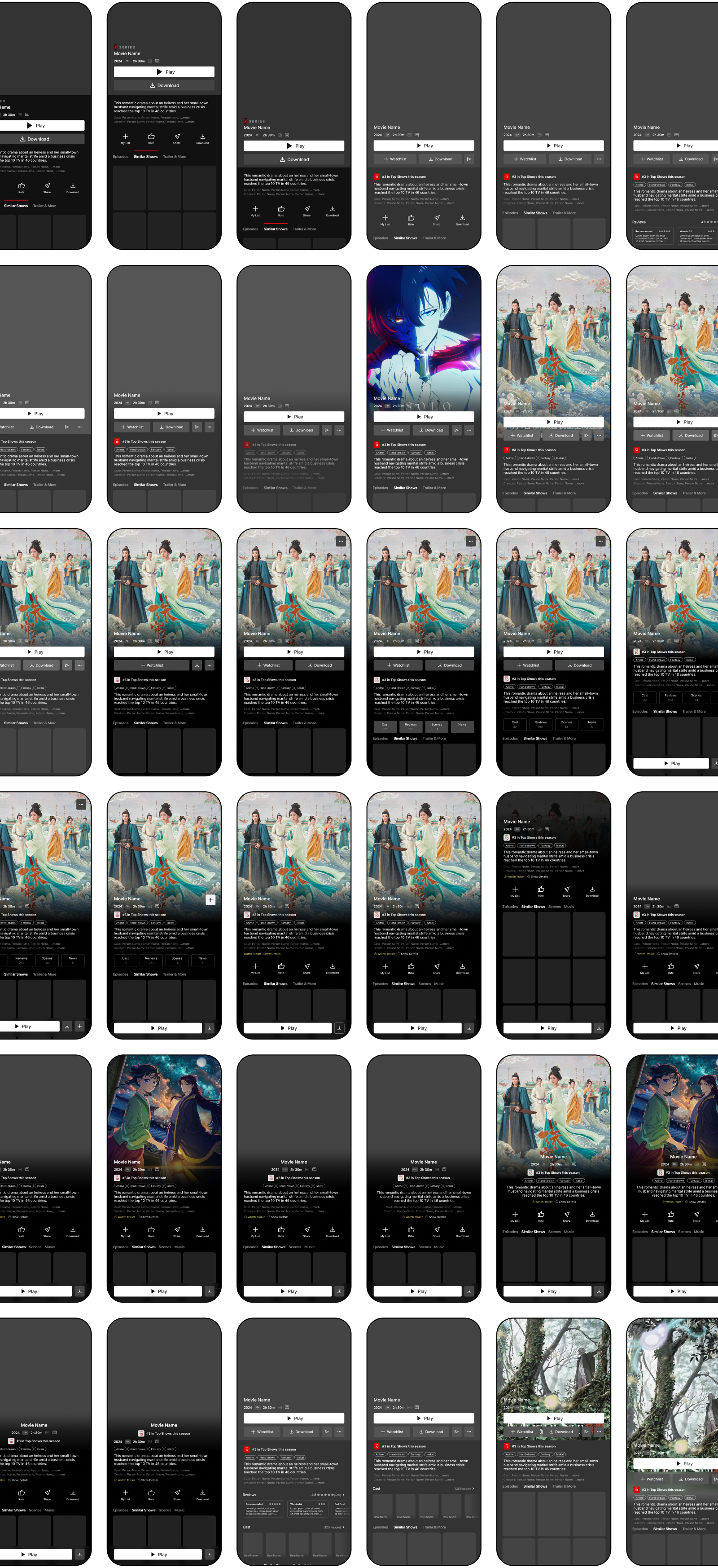
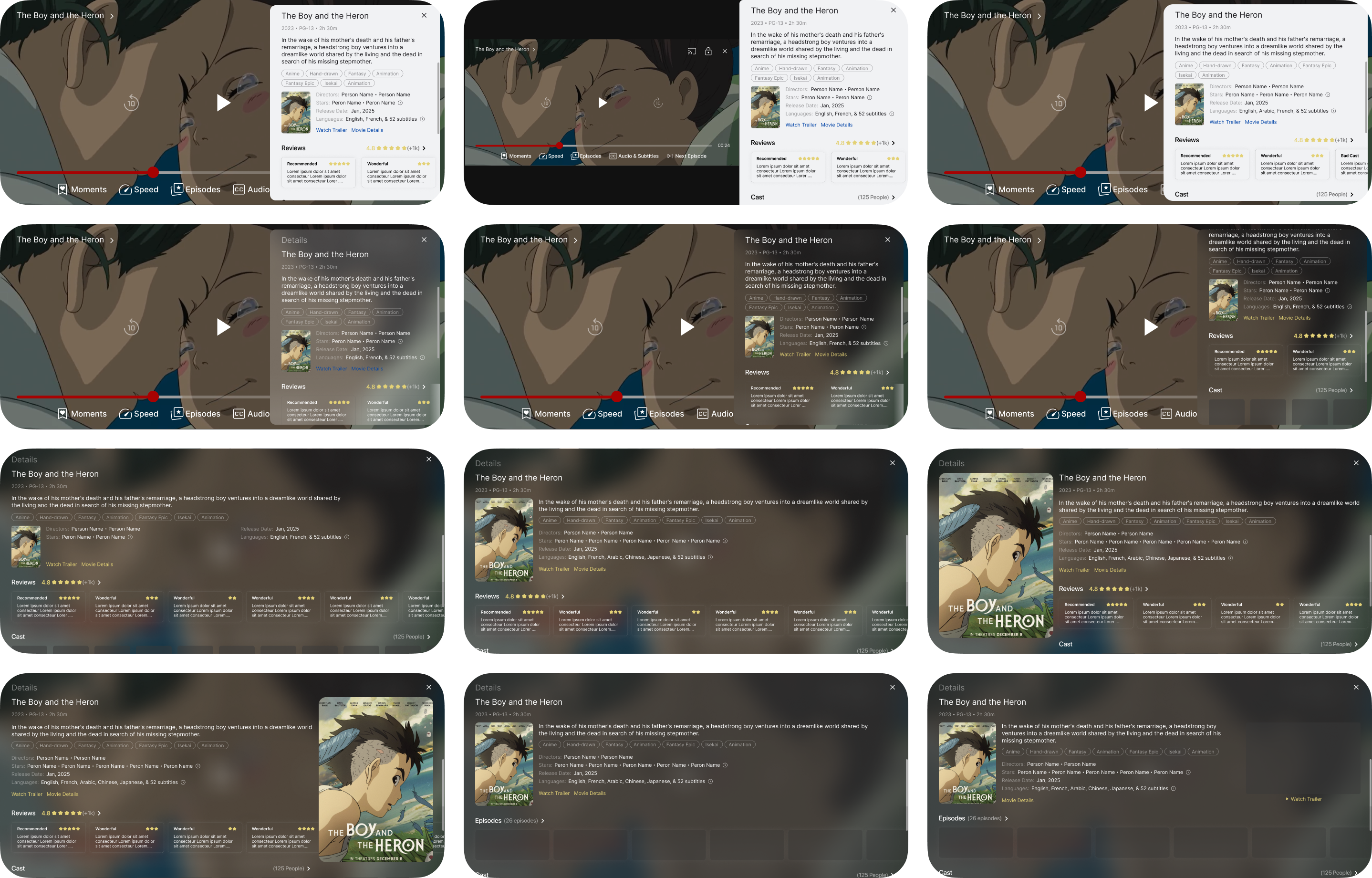
Cast and reviews add reasons to explore a title, but compete with the synopsis and core actions when everything appears at once. These lighter layouts test shorter summaries, horizontal cast lists, review previews, and quieter utility controls.
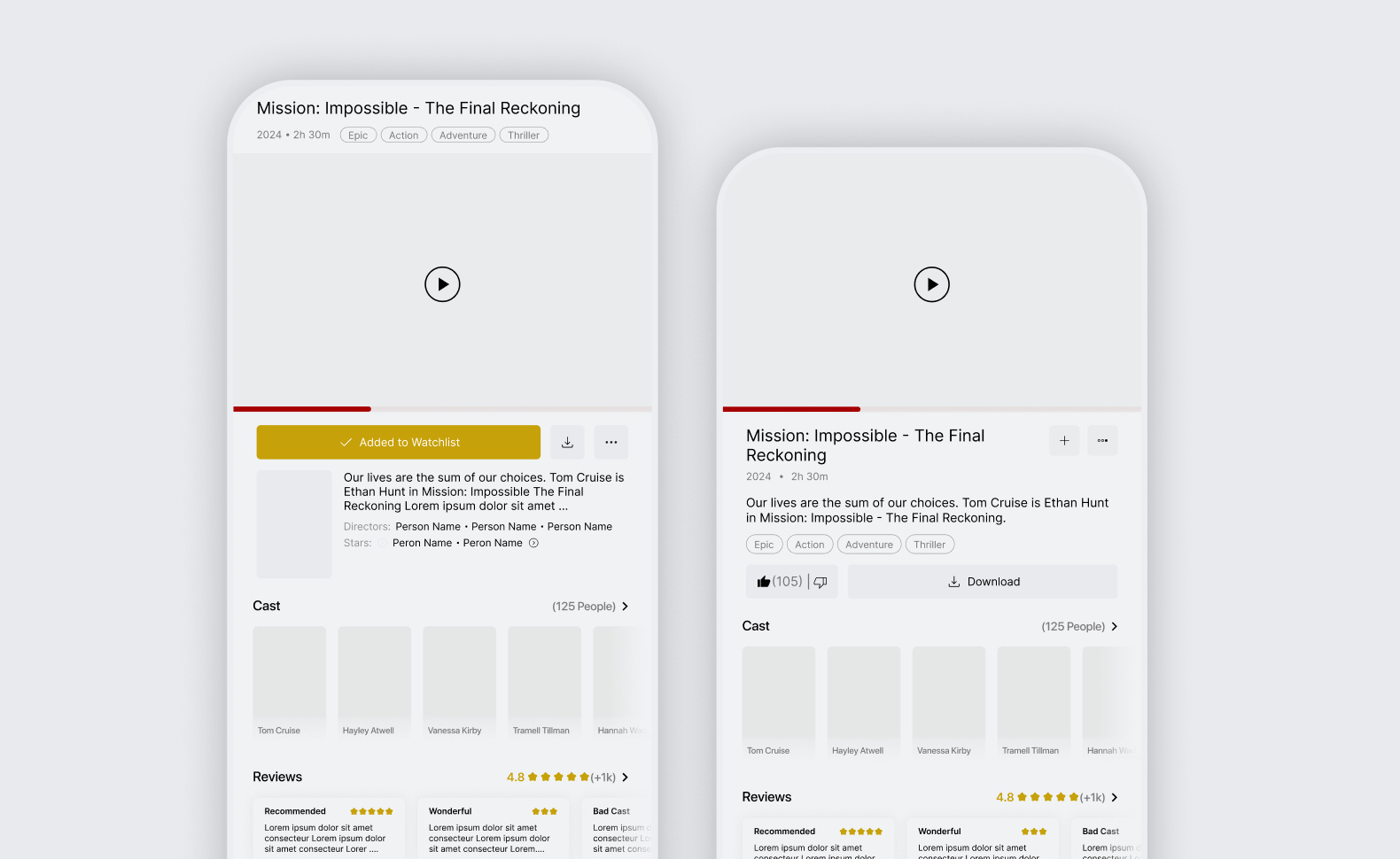
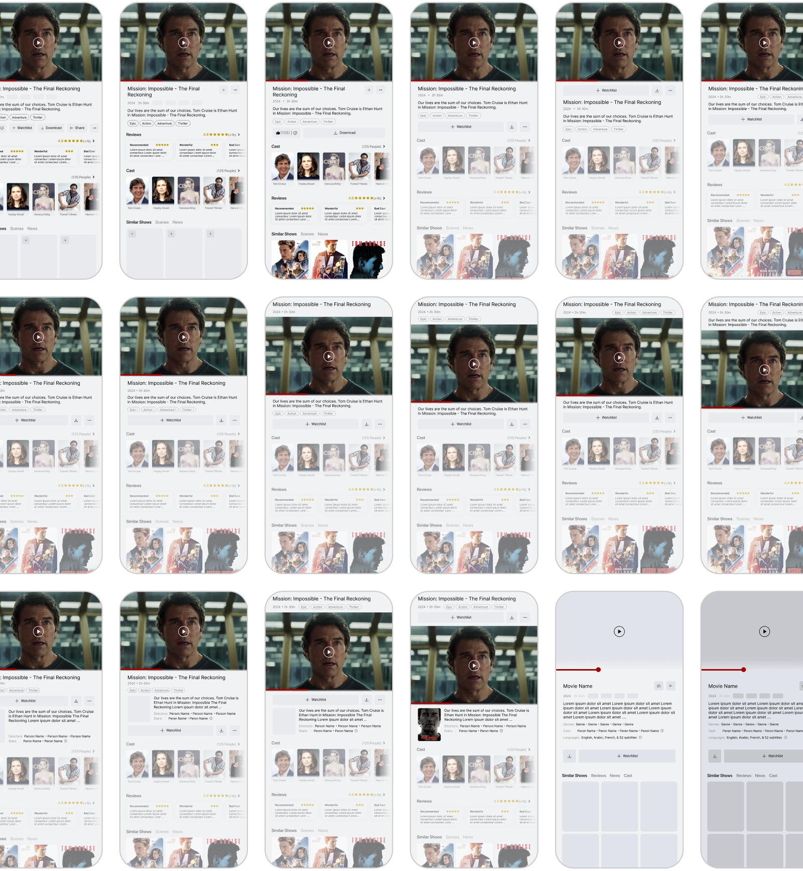
An embedded preview makes playback part of the detail page; a poster with an explicit Play button separates choosing from watching. The alternatives also test the transition between a large media area and a more compact title header as supporting content becomes the focus.
Series need another layer of navigation within the same page. Season and episode selection were explored alongside the synopsis and title actions, so choosing where to start does not require treating every episode as a separate catalogue item.
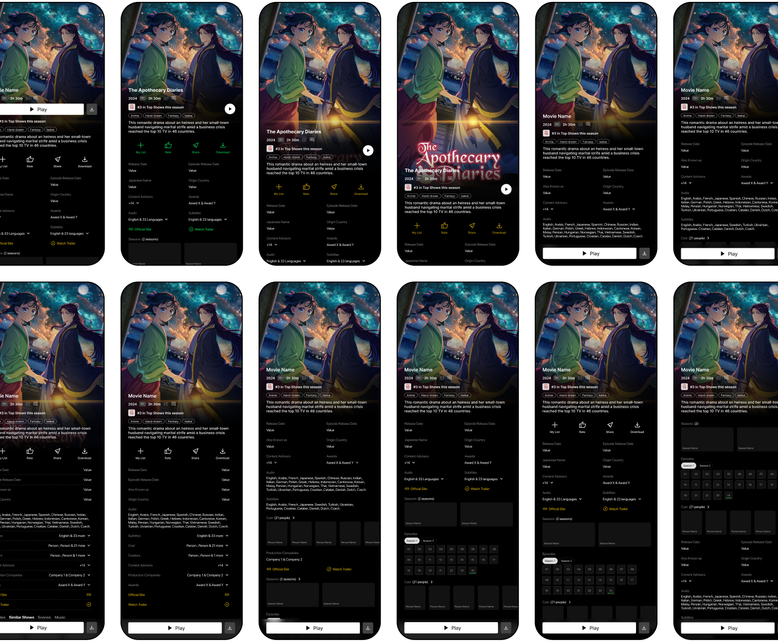
Episode selection, reviews, and cast browsing remain areas for further exploration, particularly how much to preview on the title page and when to open a dedicated view.
Media Player
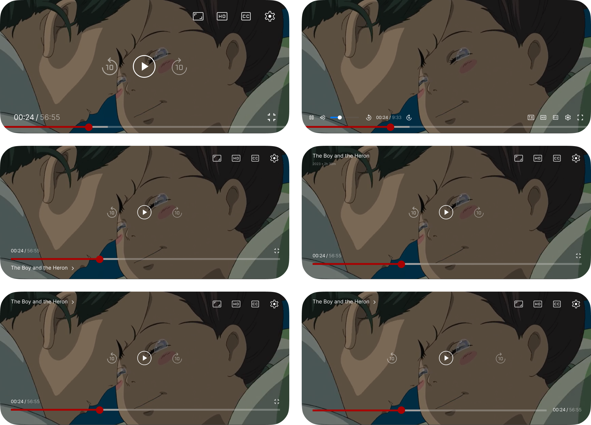
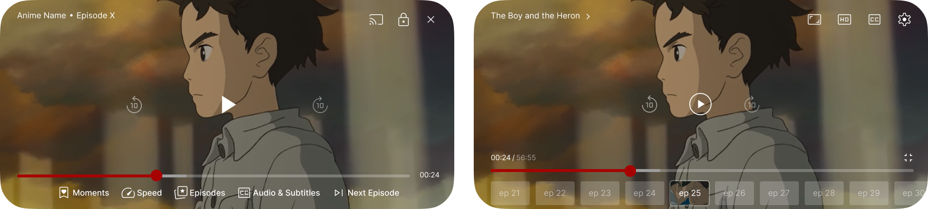
The player is the next part of the study: transport controls, subtitles and audio, episode navigation, and the transition back to browsing. The space below is reserved for those explorations; no player direction is presented as resolved.

Applications & Limitations
Catalogue hierarchy, content previews, persistent actions, and expandable detail have uses beyond streaming. Their value depends on the task: a familiar viewer resuming an episode needs less context than someone choosing an unfamiliar film. These screens explore those differences, but have not been validated against a live catalogue, audience research, licensing rules, or device constraints.
