Archived work · Personal project · Design systems · 2023
An Early Design System for Jikan
An archived exploration of visual foundations, reusable components, and interaction guidelines for a personal time-management app. This was one of my first attempts at building a design system, developed as a reference for my own design work rather than a shared production system.
About This Archive
Jikan was a personal time-management app with a growing set of screens and interactions. The design system was an early attempt to bring those interfaces together through shared rules for color, typography, layout, icons, shape, elevation, and motion. It served as a working reference for designing the app and exploring how individual choices could form a consistentThe original documentation is preserved here as a record of an early personal project. It includes experiments with color generation, token naming, component states, and usage guidelines, with visible influences from Material Design and Apple’s interface guidelines. The sections below retain the original examples and explanations. As my design skills developed and agentic AI workflows made it possible to build the apps I had been designing, this earlier approach no longer suited the product’s needs. It was replaced with a new version that aligned more closely with native iOS patterns and the realities of implementation. Much of the thinking around hierarchy, consistency, and reusable components carried forward. visual language.
The Design System
Color
Every color used in Jikan falls under one of four roles. Primary Colors (Brand Colors), Secondary Colors (Category Colors), Tertiary Colors (Activity Colors), and Neutral Colors. Each role is further divided into sub-roles to maintain consistency and flexibility throughout the design.
Primary Colors (Representing Jikan)
Primary colors are five colors that represent the brand identity and are consistently used in brand elements and key UI elements. To maintain visual harmony, all primary colors are designed with matching saturation and lightness values and only differ in their hues.
One of these primary colors is selected as an accent color and is used to highlight and draw attention to specific important elements like CTAs, buttons, or links. Jikan uses blue as the default accent color, but users can select their preferred accent color in the app settings.
Blue Accent
HEX
#0033CC
HSL
225, 100%, 40%
Brown Primary
HEX
#CC8800
HSL
39, 100%, 40%
Rose Primary
HEX
#CC00CC
HSL
300, 100%, 40%
Green Primary
HEX
#00CC00
HSL
120, 100%, 40%
Red Primary
HEX
#CC0000
HSL
0, 100%, 40%
Each primary color is used to generate its corresponding container color by maintaining the hue and saturation and increasing lightness (90 instead of 40). Each primary color’s lighter variant is applied to thematic sections or components that match the tone or context of the primary color (e.g., using the light accent color for call-to-action blocks).
Blue Container
HEX
#E5ECFF
HSL
210, 100%, 94%
Brown Container
HEX
#FFF0D2
HSL
40, 100%, 93%
Rose Container
HEX
#FFD2FF
HSL
300, 100%, 88%
Green Container
HEX
#D2FFD2
HSL
120, 100%, 88%
Red Container
HEX
#FFD2D2
HSL
0, 100%, 88%
Blue Container-50
HEX
#E5ECFF
HSL
210, 100%, 94%
OPACITY
50%
Brown Container-50
HEX
#FFF0D2
HSL
40, 100%, 93%
OPACITY
50%
Rose Container-50
HEX
#FFD2FF
HSL
300, 100%, 88%
OPACITY
50%
Green Container-50
HEX
#D2FFD2
HSL
120, 100%, 88%
OPACITY
50%
Red Container-50
HEX
#FFD2D2
HSL
0, 100%, 88%
OPACITY
50%
Blue Container-25
HEX
#E5ECFF
HSL
210, 100%, 94%
OPACITY
25%
Brown Container-25
HEX
#FFF0D2
HSL
40, 100%, 93%
OPACITY
25%
Rose Container-25
HEX
#FFD2FF
HSL
300, 100%, 88%
OPACITY
25%
Green Container-25
HEX
#D2FFD2
HSL
120, 100%, 88%
OPACITY
25%
Red Container-25
HEX
#FFD2D2
HSL
0, 100%, 88%
OPACITY
25%
Occasionally, when more than five elements are needed in brand graphics, the brand uses additional primary colors to expand the palette.
Purple Add-primary
HEX
#6600CC
HSL
270, 100%, 40%
Yellow Add-primary
HEX
#CCCC00
HSL
60, 100%, 40%
Cyan Add-cyan
HEX
#00CCCC
HSL
180, 100%, 40%
Purple Add-Container
HEX
#E8D2FF
HSL
240, 100%, 94%
Yellow Add-Container
HEX
#FFFFD2
HSL
60, 100%, 94%
Cyan Add-Container
HEX
#E5FFFF
HSL
180, 100%, 94%
Purple Add-Container-50
HEX
#E8D2FF
HSL
240, 100%, 94%
OPACITY
50%
Yellow Add-Container-50
HEX
#FFFFD2
HSL
60, 100%, 94%
OPACITY
50%
Cyan Add-Container-50
HEX
#E5FFFF
HSL
180, 100%, 94%
OPACITY
50%
Purple Add-Container-25
HEX
#E8D2FF
HSL
240, 100%, 94%
OPACITY
25%
Yellow Add-Container-25
HEX
#FFFFD2
HSL
60, 100%, 94%
OPACITY
25%
Cyan Add-Container-25
HEX
#666#E5FFFF643
HSL
180, 100%, 94%
OPACITY
25%
Secondary Colors (Representing Categories)
Secondary colors are generated from primary colors by adjusting the hue while maintaining matching saturation and lightness. Unlike primary colors, the hue range of these colors dynamically shrinks or expands as the number of activity categories changes. This hue range starts from a specific hue value (e.g., blue at 250°). As more categories are added, the range of possible hues around that starting point becomes narrower. For example, the hue range for blue might be from 250° to 200°, but as more categories are created, the range might shrink to 240° to 170°, and the new secondary color will have its hue at 170°. This, of course, changes the starting point of every category and therefore changes their hue values. The goal is to maintain enough contrast and visual distinction between each category while adjusting the color spectrum based on the number of categories.
Tertiary Colors (Representing Activities)
The secondary colors are used to generate tertiary colors by adjusting their tone and chroma following Jikan's color system, Jikaniro. Each category can generate multiple colors, named possible-tertiary-colors, but only a few of these are selected through an algorithm that test for maximum contrasting relationships. The selected colors are called tertiary colors. It should be noted, though, that as the number of activities grows, the contrasting relationships between colors become tighter, and the visual distinction becomes harder to maintain because the available color space becomes more limited.
Neutral Colors
Neutral colors are used to complement Jikan's overall color palette. These include shades of gray, white, black and are used for elements like backgrounds, text, borders, and subtle UI components.
White Neutral
HEX
#666643
HSL
324515
Black Neutral
HEX
#666643
HSL
324515
GreyD Neutral
HEX
#666643
HSL
324515
GreyL Neutral
HEX
#666643
HSL
324515
Usage Guidelines
Do
Select one primary color as the accent color and use it consistently in the user interface.
Don't
Don't use more than one primary color as accent colors.
Do
Use different primary colors to highlight different non destructive actions.
Do
Use red-primary for error messages to indicate failure. Use blue for neutral ones.
Don't
Don't use red for non destructive actions. Don't use non-red for desctructive ones.
Don't
Avoid using green for error or neutral messages. Only use it to indicate success.
Color System
Since the number of activities change from one user to another, Jikan uses a dynamic system, called Jikaniro, to generates dynamic palettes for each category. The system first takes one category color as its base color, manipulates chroma and tone to generate all possible colors, and then uses an algorithm to select a the most contrasting colors based on the required palette size. The system is designed to generate the maximum number of colors with the highest possible contrast.
Manipulating the chroma and tone while keeping the hue of this color results in the following palette:
Contrasting Relationships
For a 9-color palette, applying Jikaniro algorithm to the larger palette results in the following palette:
For a 9-color palette, applying Jikaniro algorithm to the larger palette results in the following palette:
Applications
Activity Colors
Manipulating the chroma and tone while keeping the hue of this color results in the following palette:
Contrasting Relationships
For a 9-color palette, applying Jikaniro algorithm to the larger palette results in the following palette:
Applications
Activity Colors
Manipulating the chroma and tone while keeping the hue of this color results in the following palette:
Contrasting Relationships
For a 9-color palette, applying Jikaniro algorithm to the larger palette results in the following palette:
Applications
Activity Colors
Manipulating the chroma and tone while keeping the hue of this color results in the following palette:
Contrasting Relationships
For a 9-color palette, applying Jikaniro algorithm to the larger palette results in the following palette:
Applications
Activity Colors
Manipulating the chroma and tone while keeping the hue of this color results in the following palette:
Contrasting Relationships
For a 9-color palette, applying Jikaniro algorithm to the larger palette results in the following palette:
Applications
Activity Colors
Manipulating the chroma and tone while keeping the hue of this color results in the following palette:
Contrasting Relationships
For a 9-color palette, applying Jikaniro algorithm to the larger palette results in the following palette:
Applications
Activity Colors
Manipulating the chroma and tone while keeping the hue of this color results in the following palette:
Contrasting Relationships
For a 9-color palette, applying Jikaniro algorithm to the larger palette results in the following palette:
Applications
Activity Colors
Manipulating the chroma and tone while keeping the hue of this color results in the following palette:
Contrasting Relationships
For a 9-color palette, applying Jikaniro algorithm to the larger palette results in the following palette:
Applications
Accessibility
Conversations were structured around open-ended questions, allowing participants to share their thoughts, preferences, and pain points. The interviews provided valuable qualititative data, offering unique.
Tokens
Typography
Jikan's type scale follows M3's five type roles: display, headline, title, body, and label and uses the Major Second ratio with a base of 14dp to generate a wide selection of font styles that can be used across an app. However, not all styles generated by this ratio were necessary for the mobile experience; some were reserved for use on other platforms. Additionally, a few styles were subtly customized to better fit the app's specific design needs and improve usability in certain contexts. For platform-specific support, the system defaults to Roboto on Android and San Francisco (SF) on iOS to maintain familiarity and compatibility.
Introducing Jikanji
Jikan-ji is the custom typeface designed exclusively for Jikan to reflect its unique identity and purpose. The name blends Jikan (時間, meaning time in Japanese) and Ji (字, meaning character). Jikan-Ji is a bold, modern display font with strong, rounded letters. It’s designed to stand out and grab attention, making it perfect for headings, logos, and branding. The font has a clean, minimal look that combines boldness with readability.
Applications
Tokens
Layout
Grid System
The responsive layout grid for Jikan is made up of three elements: columns, gutters, and margins. Following standard best practices, the columns are defined as percentages (4 columns, not fixed values), and the gutter is set to 16dp for consistent spacing. However, the margins deviate from the recommended 16dp and, instead, use a custom 26dp margin to create a unique yet consistent visual identity.
Spacing System
Following standard practice, Jikan consistently uses an 8pt spacing system and applies multiples of 8 (4dp, 8dp, 16dp, 24dp, 32dp, etc.) to dimensions, padding, and margin of elements.
Brand Elements
To generate unlimited brand elements i used a grid system with prexisting elements that are already designed and an algorithm to generate unlimited 'scenes' from a structured combination of these building blocks (circle, half circle, quarter circle, with sizes L, m, s, xs).
Icons
Most of Jikan's icons were adopted from Google Fonts Icons. Additional icons were either sourced from other repositories, like Iconify, or custom-designed to meet specific needs of the app. All selected icons are consistent, visually distinct, and adaptable to various themes and user interactions
System Icons
Icons in their resting state use the outlined sharp style with a weight of 200 and a default size of 24dp. Icons that have an active state switch to the filled sharp style and maintain the same weight, size, and elevation values. Larger or smaller icon sizes, primarily 16dp, 36dp, and 48dp, are used contextually in components or key areas where emphasis or accessibility is required.
Category Icons
Unlike system's icons, category icons are filled and rounded. The icons represent represent broad classifications of activities grouped by users. Jikan's default categories include learning, work, social, entertainment, sports, and others.
Activity Icons
Activity icons, on the other hand, are outlined and follow the same rounded style to maintain consistency with the category icons.
Color-Coded Icons
Aside from activities and categories, some icons are color-coded to express priority. Throughout the app, orange, red, green, blue, and grey are used consistently in tags, reminders, and other elements to indicate high, medium, low, or neutral priority, respectively.
App Icons
To ensure a beautiful, meaningful, consistent, accessible, and scalable visual identity across multiple platforms, Jikan's app icon was designed following best practices for icon design.
Applications
Shape
The shape scale used for Jikan is based on Material Design System (M3). Components are assigned styles depending on how rounded they need to be. Square-cornered shapes are labeled as 'None,' slightly rounded shapes as 'extra-small,' and fully circular shapes are marked as 'full.'"
Shape Scale
Baseline Shapes
Elevation
Jikan uses elevation to communicate the hierarchy and depth of components. Higher elevation is applied to interactive elements, such as floating action buttons (FABs) and modals, to make them stand out from the background, signaling interactivity. Other elements, such as cards and sheets use moderate elevation to subtly differentiate content sections without overwhelming the layout. Each component is assigned a specific elevation value to visually indicate its hierarchy and relationship to other elements.
Elevation levels
The elevation levels ranges from 0, representing no elevation (flat elements like the background or inactive items), to higher values indicating components that are elevated or visually “closer” to the user, such as modals, buttons, or floating action elements. Some components have different elevation values in their resting and active states. When at rest, they have a lower elevation to seamlessly integrate into the interface, but when interacted with (e.g., when pressed or hovered over), their elevation increases to highlight their interactivity.
Depicting Elevation
In addition to shadows, elevation is also sometimes depicted through other visual cues such as surface edge, opacity, background blur, fill, and surface overlap.
Do
Use the same color to represent the same category through the app whenever possible
Do
Use the same color to represent the same category through the app whenever possible
Don't
Use the same color to represent the same category through the app whenever possible
Don't
Use the same color to represent the same category through the app whenever possible
Do
Use the same color to represent the same category through the app whenever possible
Don't
Use the same color to represent the same category through the app whenever possible
Do
Use the same color to represent the same category through the app whenever possible
Do
Use the same color to represent the same category through the app whenever possible
Don't
Use the same color to represent the same category through the app whenever possible
Scrims
A higher elevation is also expressed using scrimmed background. When the background is scrimmed, primarily behind modals and overlays, it indicates that the content above it is at a higher elevation.
Motion
Jikan uses micro and macro interactions to complement its UX and make its UI feel more natural and engaging. These interactions follow motion design principles to enhance usability, provide feedback, and create intuitive interactions by visually guiding users through transitions, highlighting relationships between elements, and mimicking real-world physics.
warning Note: The easing curves and durations displayed here are preliminary and meant for preview purposes only. They are not finalized and will be refined in future iterations
Duration
All interactions in Jikan use two types of duration: short (100-200ms) for small-area transitions or when elements exit the screen, and long (300-500ms) for larger-area transitions or when elements enter the screen. Short durations enable quick exits, while longer durations help users smoothly absorb changes when UI elements interact or appear.
Do
Use quick durations for transitions requiring immediate feedback, such as button presses or simple state changes
Avoid
Avoid using slow durations for frequent interactions, as they can disrupt the user experience and feel unresponsive.
Easing
Besides duration, all interactions also use proper easing to feel smoother and more natural. The main ones include Ease-In, mostly applied for scrolling animations and entering elements, like modals or menus, Ease-Out for subtle hover effects and exiting elements, like notifications or drawers, and Ease-In-Out for balanced transitions, like button clicks or page transitions. Less used ones include Linear for steady progress bars or loading spinners, Bounce for playful interactions, like buttons or icons reacting to clicks, and Elastic for drag-and-drop actions or animated transitions that require a springy, responsive feel.
Do
Use easing without lateral movement for transitions like top chips when switching screens quickly and directly.
Avoid
Avoid using easing without lateral movement for transitions between tabs; lateral movement creates a more natural experience.
Transitions
Jikan's transition patterns closely align with M3 Guidelines. The most used patterns include Container Transforms to expand elements to reveal more detail, like a card turning into a details page; Forward and Backward Transitions to navigate between screens at consecutive levels of hierarchy (fade with partial sliding for Android and parallax effect with slower background movement for iOS); Lateral Transitions for side-to-side movement; Top-level Transitions to navigate between top-level destinations; and Enter/exit Transitions to introduce or remove a component on the screen. In addition to these patterns, some UI elements are enhanced with custom animations that add a playful touch to the interface without affecting usability.
Container Transform
Use container transform for changes within a single component, like expanding or collapsing content.
Forward Backward
Use for navigating hierarchical levels, with forward transitions feeling progressive and backward transitions feeling regressive.
Lateral
Use for navigation between peers, such as tabs or carousel items, to emphasize a horizontal relationship.
Top Level
Use for global navigation, like switching between major sections or screens, to signify a significant context change.
Enter/Exit
Use Enter/Exit transitions to introduce or remove a component on the screen.
Other
Use UI animations sparingly for unique interactions or branding moments.
Components
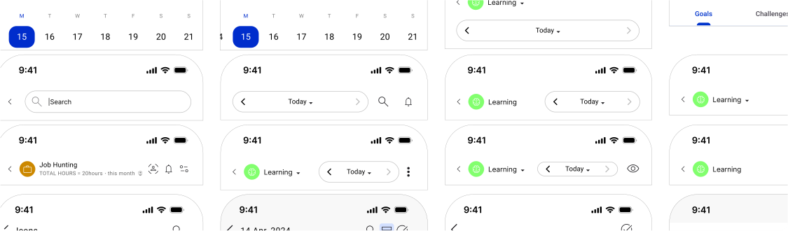
This page contains some of the interactive building blocks used to create a consistent user interface for Jikan. This page, however, only provides a glimpse of the app's core components; the full details and specifications of these components are documented in a dedicated Figma file.
Credit to Google’s Material 3 and Apple’s Design System because many of the components I used were inspired by them. While I adjusted and customized some components to create a fresh look, designing everything from scratch would have been way harder without these as a foundation
This work was developed for personal use, without the engineering collaboration, existing codebase, token architecture, and organizational constraints that shape a production design system. Some rules, naming choices, and examples would be approached differently today. The archive shows the system as it was explored, not a current specification or evidence of adoption across a development team.
Let’s talk about your project.
Tell me about your project, where you need help, and any timing you have in mind.