

Archived work · Personal project · Time tracking · 2024
Designing Jikan, a personal time tracking app
A personal product-design exploration of activity logging, time reports, goals, and the workflows connecting them. This archive brings the app features, design process, and brand identity together in one continuous case study.
The screens and documentation below preserve the original 2024 concept. They show the design work and intended experience, rather than the current status of a released app.

Project overview
Roles
Product Design
UX Design
UX Research
UX Writing
UI Design
Interaction Design
Roles
Brand Design
Type & Icon Design
Graphic Design
Documentation
Video Editing
Project Management
Summary
Jikan is an all-in-one time tracking app that helps users track, analyze, and manage their time. It offers detailed logging, insightful reports, goal tracking, and AI-powered assistance to improve productivity, balance, and overall well-being.

Problem
Some people like tracking time, and some don’t. Those in the first group often face problems like juggling notes that get lost, messy spreadsheets that are hard to maintain, or calendars that don’t provide the full picture. Existing time-tracking apps work well for projects but are too rigid for daily activities. Meanwhile, habit-tracking apps are good for monitoring repetitive actions but don’t offer a comprehensive view of how time is spent across different activities or categories.


Solution
Jikan offers a flexible, all-in-one solution that shows users a complete picture of how their time is spent. With features like goal setting, reminders, and personalized insights, Jikan helps users stay productive and organized by allowing them to track daily tasks, activities, and long/short term objectives in one intuitive platform.


Scope & Deliverables
Ongoing scope-creeps expanded the project to over 300 pixel-perfect screens, many of which required several iterations during wireframing and testing. The screens were supported by a robust design system, along with high-fidelity prototypes for specific user flows, brand guidelines, engaging graphics, and in-depth walkthroughs and demos. Altogether, the project required over 1600 hours of work over a span of 8 months.
Approach
The project was carried out following a Design Thinking approach to drive empathy and innovation, User-centered Design principles to guarantee usability and effectiveness, and Agile methodology to improve flexibility and efficiency.
1
Planning & Discovery

Defined project goals and scope, analyzed competitors, and set a clear roadmap for the design process.
2
User Research

Conducted surveys and interviews to understand user pain points, motivations, and needs, gathering insights to inform the design process.
3
Defining Problems

Conducted surveys and interviews to understand user pain points, motivations, and needs, gathering insights to inform the design process.
4
Ideating Solutions

Brainstormed ideas to address the defined problems, exploring various concepts to improve user experience and address gaps in existing tools.
5
Testing Concepts

Developed low-fidelity prototypes to test initial ideas, gathering feedback to validate design direction and identify improvements.
6
Hi-Fi Prototyping

Transformed concepts into high-fidelity prototypes, focusing on the final design and user interactions for a realistic representation.
7
Testing & Iteration

Tested the hi-fi prototypes with users, gathered feedback, and iterated on the design to refine and improve functionality and user experience.
8
Reflection & Documentation

Reviewed the design process, captured key learnings, and documented insights for future improvement, transparency, and knowledge sharing.
Timeline

App features
Jikan offers a flexible, all-in-one solution that shows users a complete picture of how their time is spent. Its Features include quick/detailed time logging, activity tracking, goal setting, reminders, personalized insights, task management, AI-driven reports, progress tracking, customizable themes, and seamless integration with voice assistants and smart devices
1/ Activities & Categories
The core concept of Jikan is that everything users do is represented as activities. Different activities can be created, grouped into categories, and nested within each other without limits. This allows users to track their time however they like with unlimited flexibility.

2/ Time Logging
Activities can be logged as time blocks with a defined start and end time. To log an activity, users select the date, activity, and start/end time. Jikan uses the same familiar concepts of time logging that are used by most popular time tracking and calendar apps.


Jikan offers two ways to log time, the quick way and the detailed way. Quick Logging allows users to quickly log activities with fewer clicks. Detailed Logging gives users the option to include more context for each activity, such as notes, attachments, voice memos, locations, and other specific details.


3/ Viewing Past Days
To view logged activities, users can choose between Calendar View, ideal for getting a quick, organized visual overview of activities by day, week, or month, and History View, ideal for reviewing and analyzing detailed, searchable entries of all logged activities over time.

4/ Time Reporting
One of the unique value propositions of Jikan is the unparalleled depth and clarity of its reporting. Logged time is transformed into meaningful visualizations, and every key time-tracking metric is calculated for each activity and category over specific periods.

The interactive charts allow users to quickly glimpse how much time they spend on specific activities and categories. Besides the general reporting filters, each chart has its own set of actions and filters that allow to drill down into specific insights that are most relevant.


5/ S.M.A.R.T Goals
Another unique value proposition of Jikan is its ability to integrate SMART goal setting with time tracking. Users can create and track specific, measurable, achievable, relevant, and time-bound goals that target key time metrics of specific activities and categories.

The concept behind this feature is simple but powerful. Users define their goals by specifying targets (such as total hours, average session time, active days, or others) for particular activities or categories over specific periods. Once these goals are set, Jikan automatically tracks progress based on the data from the user’s logged activities.


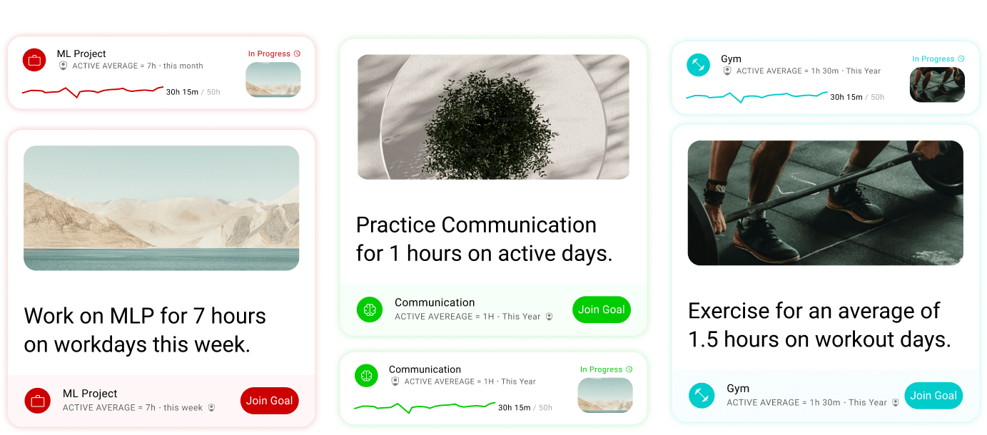

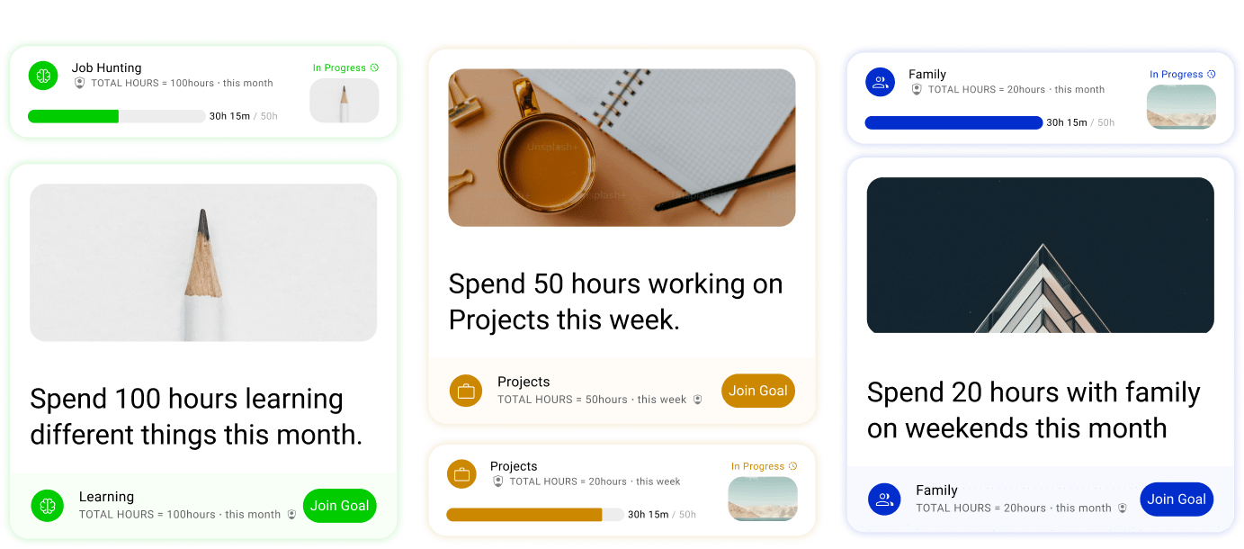
The concept of goal metrics allows users to set virtually any time-tracking goal they can imagine. It is versatile enough to ensures that every type of time-tracking objective, whether focused on productivity, consistency, or efficiency can be created and monitored.

6/ Shared Challenges
Besides private goals, users can also create or join shared or public goals to compete against each other. The two add a gamified element to make goal achievement more interactive and rewarding.


7/ Conditional Reminders
Similar to goals, Jikan’s Reminders feature allows users to set conditional notifications based on specific time-tracking metrics. However, unlike goals, reminders do not track progress or display insights. They simply notify users when the set condition is met.


8/ Task Management
Though not the primary focus of Jikan, the task management feature was added for users who prefer to keep everything organized in one place. Tasks can range from simple one-time to-dos to recurring habits.


9/ Jikan AI
Jikan is the first time-tracking app to fully integrate AI across its entire feature set. Unlike other solutions that use AI solely for automation, Jikan-AI enhances every aspect of the time-tracking experience. Users can ask it to auto-group activities, analyze and summarize their activity patterns, suggest and recommend goals or reminders based on their habits, and much more.

Jikan-AI is designed to give users a deep, personalized understanding of how they spend their time through conversational interactions. Users can ask questions in both text or voice modes, and the AI will assist by analyzing data, offering insights, and providing recommendations.


10/ Everything in One Place
The home screen provides users with a snapshot of their most relevant information. It displays previews of key reports, goals in progress, to-do tasks, and upcoming reminders. It also includes a preview of users' watchlist, which includes specific activities users want to monitor closely and find quickly.

11/ Seamless Authentication
Jikan’s authentication system is thoughtfully designed to cover all user scenarios, including login, sign-up, password recovery, and verification from start to finish. Each step is designed to be intuitive, user-friendly, and secure.


12/ Quick Onboarding
Jikan’s onboarding experience is designed to be engaging and straightforward, guiding users through the app’s core features and functionality.

13/ Personalized Themes
If users don't like the default minimal theme of Jikan, they can choose from existing themes or create their own. They can personalize the look by adding a custom wallpaper, which will be automatically blurred to create a visually appealing background that enhances their experience.

14/ Plans for Everyone
Jikan offers three plans to suit different needs: Free for essential tracking, Pro for advanced features like AI insights and advanced reports, and Premium for full access with integration tools.


15/ Interactive Widgets
Jikan offers customizable widgets that allow to quickly access key features like time tracking, goal progress, and upcoming reminders directly from the home screen.


Design process
Design thinking, user-centered design principles, and agile methodology guided this project from start to finish. Because Jikan's scope kept expanding beyond initial planning, its design process shifted to multiple iterative cycles instead of a single linear one. Initially, the focus was on establishing the core features and functionality of the app. As the project grew, each new feature or flow was treated as a separate mini-project requiring its unique cycle of research, definition, ideation, prototyping, and testing. The process was flexible, adapting to each feature’s needs, sometimes skipping steps for similar features, while other times emphasizing specific steps based on complexity.

1/Initiation & Planning
1/Initial UX Design
Initial Research
I must admit, because of my long struggle with time tracking, it was quite difficult to keep my biases in check as I was trying to empathize with people interested in time tracking. Understanding users' perspective, motivations, preferences, and pain points with time tracking and existing time-tracking solutions required detailed analysis of user's comments and reviews along with extensive interviews with students, freelancers, productivity enthusiasts and professionals. But ensuring that my personal experience didn't cloud my view on their experiences required conscious effort in all stages of research.
In this initial research phase, I quickly realized that focusing on every tiny detail of users' experiences with time tracking proved inefficient because it diverted attention from the app's core functionality. Doing so made it difficult to identify and address the KEY pain points and KEY needs that should drive the design. Research into users' experiences with additional functionality and nuances that improved the overall experience was conducted later on once the core functionality was validated and tested.
The collected data helped in shaping a deeper understanding of users through user personas, empathy maps, user stories, and journeys. However, although I focused on understanding every possible user scenario, I prioritized documenting only KEY personas and journeys that would effectively guide the next steps.

Initial Definition
After collecting and analyzing the data, big and small issues with existing time tracking solutions slowly emerged. The main challenge was to group these small issues and express them in a clear, concise, yet precise problem statement that accurately captured the core issues without losing important details.
Once the problems were clearly defined, formulating hypotheses wasn't that difficult. Making GENERAL assumptions about how certain features or solutions could address the existing problems was straightforward; the real challenge was the ideation, conceptualization, and testing of SPECIFIC solutions that addressed these problems in the following phases.

At this point, It became difficult to keep track of all functionalities, so I divided the app into three primary flows: Activity Logging, Reports & Insights, and Goal Tracking, each requiring its cycle of ideation, conception, prototyping, and testing to ensure it effectively addressed its specific user needs and challenges.

Then, I worked on clearly articulating the unique value propositions (UVP's) that would set the app apart from competitors. The guiding principles in this step were simplicity, insights, and personalization. The app should be easy to use, provide helpful reports, and allow users to set their own SMART goals (i.e., Specific, Measurable, Attainable, Relevant, and Time-bound) that capture every possible goal pertaining to time management, making it a more efficient solution for effective time management.

Initial Ideation
Some of the innovative ideas implemented in this app were in my mind before starting the project, but most of the ideas required a semi-structured cycle of inspiration, competitive analysis, and brainstorming. It should be noted, however, that ideation continued across all stages of design; the main challenge was keeping track of all ideas without losing focus on the three primary flows.

To stay focused, I tried narrowing down my ideation to align with the three flows, but as I was looking for inspiration, studying competitors and brainstorming, new ideas for extra features and functionality kept popping up. At first, I intentionally avoided exploring these "irrelevant" ideas to avoid distractions, but soon realized that doing so meant loosing them. Fortunately, I paid attention to this in the early stages, so I started documenting all ideas, even the crazy ones, in a
"parking lot" and then categorizing, sorting, and prioritizing them according to relevance, required time, potential impact, and alignment with the core vision of the app.
"parking lot" and then categorizing, sorting, and prioritizing them according to relevance, required time, potential impact, and alignment with the core vision of the app.
Ideation for this project was accomplished through three methods: inspiration, competitive analysis, and brainstorming. I started by gathering inspiration from various sources, including existing time-tracking apps and broader productivity tools. Meanwhile, I analyzed direct and indirect competitors to identify what worked well and what needed improvement in their solutions (i.e., features, flows, navigation, accessibility, consistency, visual identity, etc.).

In parallel, I kept brainstorming and noting down ideas on potential solutions and features that could enhance the main experience and/or add extra value to core functionalities like simplified time logging, or additional features like advanced analytics, smart reminders, or integrations with other tools

Initial Conception
The most challenging part of this project was figuring out a clear, intuitive, and unified structure that brings together the entire flows of the app in a way that made sense both visually and functionally. Knowing that the report section, for example, should be comprehensive and intuitive is easy, but finding the right conceptual framework that effectively structures the vast amount of data, meaningfully presents them, and intuitively integrates all possible features and actions without confusion or complexity is another story. Simply put, structuring information so it's accessible, understandable, actionable, yet not overwhelming was The Challenge in this project.
Throughout this stage, I kept examining how other solutions solved similar problems. I experimented with different conceptual models to group and structure similar elements and actions, hid less frequently used options behind menus, dropdowns, or buttons, added new tabs for advanced options, adjusted relationships between related elements and changed the visual hierarchy to reflect these relationships.

One breakthrough in time logging was breaking free from the project-oriented models used by most apps, where users create projects and tasks, sometimes with recursive tasks nested within each other. Although this approach worked well for managing projects and tasks, it often became limiting when it was used to track time across various activities and categories, and it lacked the flexibility to enable the grouping of similar projects together for collective tracking. For instance, if a user wanted to track time spent on similar tasks across multiple projects (e.g., client meetings or research), the conventional approach made it difficult to get a holistic view.
The alternative approach, instead, applies the same concept sightly differently by using activities as the core building block instead of projects. Users can then group these activities into broader parent categories, and further nest them as sub-activities recursively. This flexible structure opens up endless possibilities. Users can now take full control of how they want to organize activities and categories based on personal needs or workflows. They can create custom hierarchies, track time across these hierarchies, and generate tailored, meaningful reports that reflect their unique time management patterns.


With persistent trial and error, detailed journeys, complex flows, numerous wireframes, and consistent testing, I finally started to "piece together" the entire flows and sub-flows and "see" a clear direction of how everything should be structured. Once I "saw' that right conceptual framework through which everything fell into place, I started to see it everywhere. It's fascinating how this new framework had always been before my eyes, yet I was too framed to see it! I felt like a fish seeing the ocean for the first time, and I gained a new lens through which I could see how complex systems could be better organized.
Initial Prototyping
Typically, when the conception phase is completed successfully, (i.e., when its "architectural blueprint" is well drafted), the prototyping phase becomes mainly about visually designing elements like colors, shapes, and layouts to establish the product's look and feel and then experimenting with interactions to ensure smooth navigation and consistent experience. As simple as it seems, I had to relearn this the hard way.
One of the big mistakes I did in this project was jumping to the design phase too early before having the right conceptual frameworks in place. As I was designing, I didn't realize that I was both wireframing and designing at the same time. I figured I'd be able to design the interior of a house without fully understanding its architectural framework, but I ended up stuck in an endless loop of iteration. My design decisions kept shifting as the underlying structure was still being figured out, and I didn't realize this until I had already invested a significant amount of time and effort into design.
By that point, I had to backtrack and make major adjustments, which only added to the frustration and delays. Fortunately though, it wasn't late enough to course-correct. I immediately started focusing more on solidifying the core concepts and refining the structure before continuing with visual design. It turned out that unlike what I originally believed, most of the design work, in fact, happens in the conception phase, not the prototyping phase

Once the concepts were refined, I revisited the visual design with a clearer undertstanding of how the elementes interacted and related to each other. At this point, rather than focusing on creating a complete design system, I explored various design decisions and experimented with color, typography, layout, shapes, and effects to find the right balance between familiarity and creativity. I wanted an app that felt familiar enough for easy navigation but also stood out with its own unique visual identity.
This was another major challenge. The more I drew from existing designs, the more I found myself unintentionally adopting their frameworks, which, no matter how creative I tried to be, kept shaping my design decisions. It became difficult to fully break free from those influences, and I could always see how my design was framed by the choices of others, which made it harder to establish a user interface that was truly original.
This was another major challenge. The more I drew from existing designs, the more I found myself unintentionally adopting their frameworks, which, no matter how creative I tried to be, kept shaping my design decisions. It became difficult to fully break free from those influences, and I could always see how my design was framed by the choices of others, which made it harder to establish a user interface that was truly original.


Then suddenly, as I was designing a list element based on Google's M3 Design System and Apple's design guidelines, I tried tweaking some properties, and to my surprise, this small adjustment led to a fresh, unexpected look. I could have never imagined that seemingly significant differences between how various products looked were actually the result of small tweaks to a few key properties, but once I realized this, the distinction between apps started to blur. I began to see how small design decisions (like how spacing is handled or how colors are used) could have such a significant impact on the overall feel of an interface.


I feel like after this moment, visual design suddenly became much more intuitive, not just while working on this app, but when analyzing other designs as well. The quote: "Good designers copy; great designers steal" somehow made sense, and I began to recognize the common design principles at play across different apps and platforms. It made me realize that design isn’t about starting from scratch every time, but rather about borrowing inspiration from what already exists and then making it your own with a few KEY tweaks that result in a fresh new look.
The visuals of the app kept being changed and refined when I started working on other features, but once I was satisfied with how the app started to look, I started building an interactive, hi-fi prototype. I first revised the principles of motion design to ensure the prototype felt natural through smooth animations, transitions, visual cues, and feedback. Using user journeys as a guide, the prototype was constantly refined to be as close to the final experience as possible to simulate real user interactions and provides accurate feedback on usability, design, and functionality.


Initial Testing
Before starting the project, I planned to start testing once a hi-fi prototype was completed. However, as the work progressed, it became clear that I had to constantly test every design decision from the early concepts all the way to the final prototypes. Before testing on real users, I tested everything myself first. I tested conceptual models, information hierarchy, and alignment with user goals, and then I evaluated functionality, interaction smoothness, task flows, visual consistency, and accessibility.
The cycle of testing and iteration felt endless at first. The more I designed, the better I became, but the better I got, the worse my earlier designs seemed and the less satisfied I became. This cycle would go on forever. No matter how much I improved, there would always be more room for improvement, and my past work would always feel incomplete. I learned to recognize when to stop and move forward, rather than endlessly chasing perfection. Instead of endless refinements that delayed progress, it was important to know when the design was GOOD ENOUGH to meet user needs and expectations.
Once I was reasonably satisfied with the design, I moved on to testing with real users. I tested with users from different personas to ensure a diverse and representative sample for more accurate feedback.
After testing, I collected feedback, analyzed user pain points, and identified areas for improvement. I refined the design based on this input, making necessary adjustments to enhance usability, streamline interactions, and address any issues.

2/UX Design Cycles
Besides working on the core functionality of the app, another round of UX design was taking place. Whenever I had a new pressing idea, needed a break, or felt drained from working on the core flows, I would shift to working on additional functionalities. I called these UX design cycles because, though not as structured as the initial phases, each new feature and flow went through its own cycle of research, definition, ideation, conception, prototyping, and testing to ensure they fit well into the overall user experience. Besides time logging, reports, and goal tracking, the additional flows that required this separate cycle include conditional reminders, shared challenges, tasks, AI support and suggestions, home, watchlist, onboarding, and authentication.

More Research & Definition Cycles
As the project progressed, I found myself diving into additional research and definition cycles for each new feature or flow. While it wasn’t as formal as large-scale user research, this iterative process helped refine my designs and make them feel more cohesive. I focused on understanding the needs and behaviors of the user, as well as defining the core functionality by identifying the goals and challenges specific to each feature, analyzing similar apps, reviewing design patterns, and mapping out possible user interactions, and then defining the key elements and structure for each flow.
More Ideation & Conception Cycles
Ideation and conception cycles for extra features were more flexible than the initial stages. I adjusted my process based on the complexity of each flow. Some flows, like reminders and tasks, already had a well-established conceptual model or closely resembled patterns from other solutions, so I felt confident skipping conception and moved directly into designing and prototyping. Other flows, especially activities hierarchy and public challenges, were more complex and needed a solid, clear structure before moving forward.
The conditional reminders flow, for example, was inspired by the smart goals concept but required additional thought and design to adapt it for the app. The idea was to provide users with personalized reminders that would trigger based on specific conditions related to their activities or categories. Another example is the task management flow which largely adopted the basic structure of popular apps like Google Tasks and others, as they provided an effective and familiar way of managing tasks. The main difference was organizing tasks within categories and/or linking them to specific activities.
On the other hand, the activity hierarchy flow needed careful thought about how activities would be grouped, nested, and organized to ensure that users could intuitively understand and manage their activities, and the public challenges flow needed defining how users could turn personal goals into public challenges, share them with others, and track progress together. Both flows required a deep dive into the structure and logic before moving on to visual design or prototyping.

More Prototyping & Testing Cycles
Similar to previous stages, I began these new prototyping and testing cycles in parallel with some other stages. The visual design of the new flows wasn't as challenging as the earlier flows because I already had a solid framework to work with, and its process was similar. The difference was refining color, typography, layout, shape, icons, and other styles ensuring aesthetics, functionality, consistency, and accessibility.
A major challenge at this stage was figuring out an appropriate color system that satisfies three criteria:
1/ Consistency: Activities within the same category needed similar colors to show they belong together.
2/ Distinctiveness: Each activity within the same category, needed a unique color to avoid confusion.
3/ Differentiation: Different categories needed distinct colors to be easily recognizable.
2/ Distinctiveness: Each activity within the same category, needed a unique color to avoid confusion.
3/ Differentiation: Different categories needed distinct colors to be easily recognizable.
Plus, the system had to be both scalable and accessible as users added new activities and categories, maintaining clarity without repeating or blending colors.
Initially, I divided the color wheel into specific hue ranges corresponding to primary colors, with each range representing a single category. Within each hue range, I used different saturation and brightness values to generate different shades, tones, and tints to differentiate individual activities. I then manually checked for accessibility and removed colors that didn't meet contrast standards.

Using the HSL model to generate activity colors quickly proved ineffective. Since the model doesn't account for the perceptual differences of different colors, hues with different saturation and lightness values didn't always appear visually distinct. Even with different saturation and lightness values, it was difficult to predict which colors would appear distinct from one another. On top of this, generating colors with this model also caused issues with visual harmony. Colors of different hues, even with similar saturation and lightness, often clashed and didn’t complement each other well which led to a visually inconsistent user interface.
This was the perfect opportunity to explore how these systems were originally created and revisit their assumptions. During this exploration, I discovered Material Design’s tonal palette, which adjusts tones and chroma instead of saturation and lightness to account for perceptual color relationships. And Although it still required an algorithm for optimal contrast, it was more intuitive and scalable than the HSL-based system, so I decided to adopt it for the project.
This was the perfect opportunity to explore how these systems were originally created and revisit their assumptions. During this exploration, I discovered Material Design’s tonal palette, which adjusts tones and chroma instead of saturation and lightness to account for perceptual color relationships. And Although it still required an algorithm for optimal contrast, it was more intuitive and scalable than the HSL-based system, so I decided to adopt it for the project.

This color system, however, wasn’t perfect due to some inherent limitations. When there were more activities within a category, the available differences in hue, saturation, and brightness within each range started to overlap, making it harder to visually distinguish them. Similarly, as the total number of categories grew, the limited number of hue ranges available became stretched, reducing the visual distinction between different categories. Additionally, ensuring accessibility limited the range of colors I could use, further reducing the options available for distinction (i.e., inside each category) and differentiation (i.e., between categories). Although the system ensured accessibility and maintained a balance between color similarity and distinction, this scaling issue became more noticeable as the number of categories and activities exceeded a certain point.
To work around this limitation, I added a new button that allowed users to temporarily switch the colors of activities when they noticed the visual distinctions becoming unclear due to the growing number of categories or activities . Once they’re done, they could click the button again to return to the original color system without permanently sacrificing the visual consistency of their activities.
Unlike the projects I previously worked on, I used design tokens in this one's design system to achieve better consistency, scalability, and flexibility. Having learned from Google's Material Design 3 (M3) guidelines, It became clear that using tokens to manage colors, typography, spacing, and other elements was much more efficient than styles.
I should note that Jikan's Design System is largely influenced by Material Design 3.
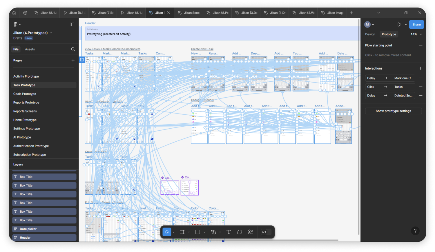
3/Project Management
Working on this project from concept to completion was also an opportunity to gain practical, in-depth experience in project management. I originally aimed to finish the project in 1-2 months, but every time I added a new feature or made a tweak, it stretched things out. Before I knew it, 6 months had flown by. It literally was a crash course in how scope creeps can snowball, delay progress, and turn a small project into a never-ending loop of "just one more thing." I had to learn the hard way, again, that sometimes "good enough" really was good enough if I ever wanted to actually finish.
I also quickly realised that a purely predictive approach (Waterfall) is hard to apply in software design becaue of constant testing and iteration. The process was never truly linear, and instead of sticking to a fixed plan, I needed to adopt a more adaptive (agile) and hybrid approach. This way, I didn't have to compromise flexibility and improvements as new feedback and insights emerged throughout the project.

Brand identity
Brand Statement
At Jikan, we believe time is more than just hours and minutes—It’s our most valuable resource that guides how we live, work, and achieve our goals. Tracking our time gives us insight into where our energy and focus are spent and allows us to make informed decisions, improve productivity, and focus on what truly matters. Our goal is to redefine how we track, analyze, and manage our time through intuitive, innovative tools that seamlessly integrate into everyday life. We value innovation, user-centricity, flexibility, insightfulness, privacy, and accessibility, and we strive to empower people to make the most of their time while respecting their needs and preferences. Time is yours to shape—let us help you make it meaningful.




The design system
The original visual foundations, components, and interaction guidelines are preserved in a separate archived case study.
Explore the Jikan design system →