

Designing an Advanced Period Picker for iOS Apps
This was a personal project without a client scope, commercial roadmap, or formal user research and testing. I designed and built the picker to solve a recurring problem in my own finance and time-management tools, then continued refining the flow until further changes produced little meaningful improvement. Still, It is not speculative concept work. The solution has been in daily use for over a year and has become an essential part of how I manage my finances and time, but it should be understood as an open-ended exploration of how far one interaction could be improved for its primary user, rather than a product validated for a broader audience.
Note: Much of this work began several months before iOS 26 and Liquid Glass were introduced. I designed the initial experience and broader directions in Figma, then refined most of the detailed interactions directly in code, where gestures, state changes, navigation, and performance could be evaluated through actual use. Once iOS 26 was released, I applied its visual language to the original white sheet, and the added depth and translucency suited the interaction even better. Development began before agentic coding tools were available, so it relied largely on manual implementation, and repeated debugging, and back-and-forth conversations with ChatGPT, not codex or claude,
Context & Problem
This project began with a recurring interaction problem across two personal apps I was building for managing personal finances and managing time. Both apps grew out of long-standing personal frustrations with existing tools that did not match my mental model and did not offer the level of control I needed. Although the two apps served different purposes, they repeatedly raised the same interaction question of how I could select exactly the period I had in mind. I wanted the solution to be powerful enough to support any period or combination of periods I could think of while making the process as efficient and intuitive as possible. Because these apps were built for my own use rather than for a public release, I had the freedom to explore the problem without limiting the solution to familiar patterns or immediate commercial constraints. I wanted to see how far I could push the experience while keeping it understandable, and the process became an opportunity to deepen my knowledge of interaction design, human interface guidelines, and the relationship between design and iOS development.
A UX opportunity
The first versions of the apps treated time as a sequence of months. A label showed the current month, and two controls moved backward or forward. This was simple and efficient, but only because the interaction assumed that one month at a time would always be enough. That assumption gradually stopped matching how I used the apps. I needed to switch between days, weeks, months, quarters, and years, select several periods, create ranges around specific events, and move directly to distant dates. A conventional bottom sheet could contain all these options, but changing periods was too frequent an action to hide entirely behind another layer, especially when maintaining a clear sense of the current time context mattered. The challenge became finding a way to support almost any period or combination of periods without sacrificing the speed and clarity of the original control.
How the period picker works
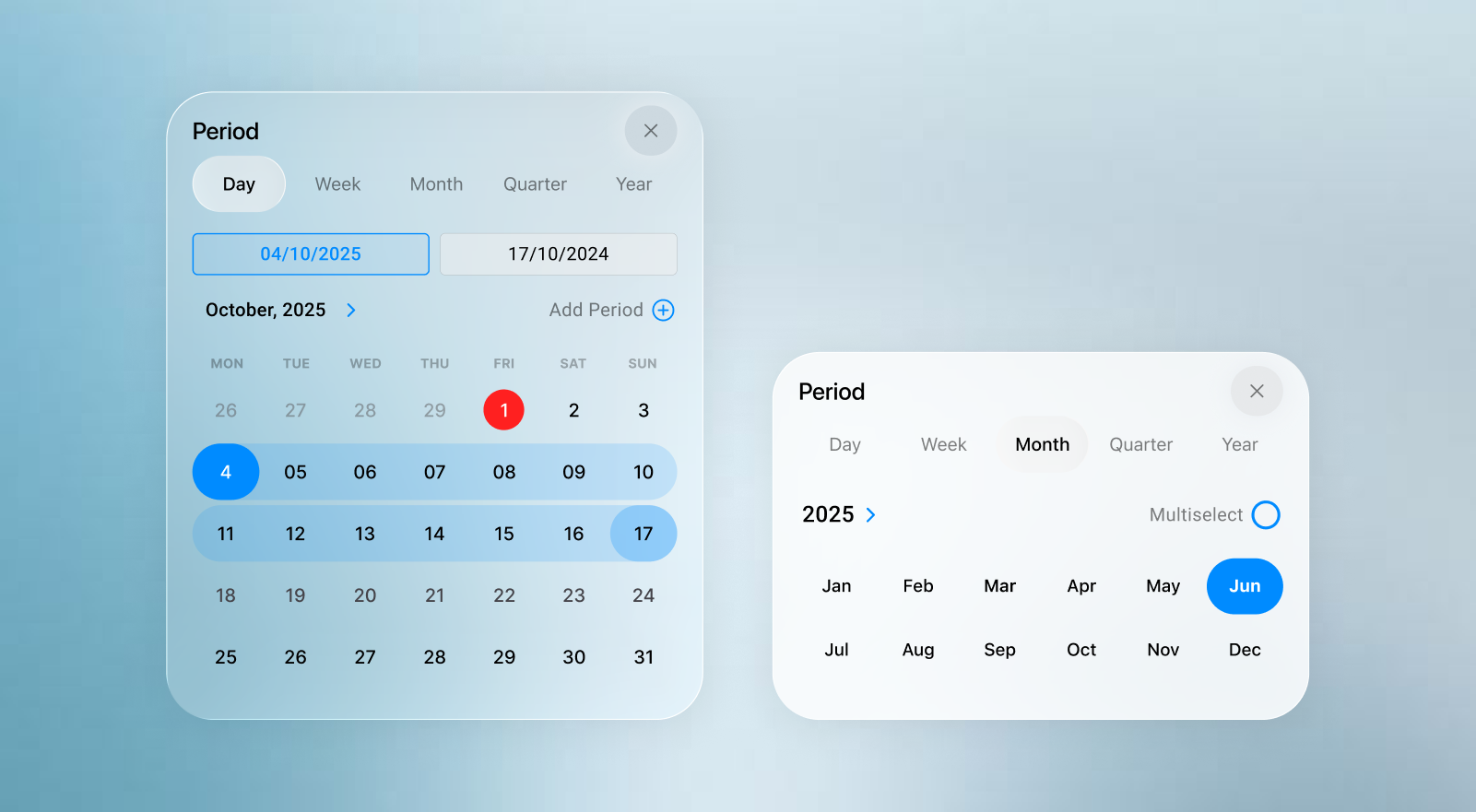
The final solution separates the interaction into two connected components. The period pill keeps the active time scope visible within the current context, and the Period Sheet provides the space needed to explore and construct a new selection. Inside the sheet, users can select a single period (day, week, month, quarter, or year), combine multiple periods of the same cadence, define a continuous custom range, or create a non-adjacent selection from separate ranges. They can also switch between time units and navigate to nearby or distant periods without losing their temporal context. Period selection is a form of context that needs to remain visible as users move through the aapp. The active period is therefore carried across relevant views through a consistent toolbar entry point, while the sheet allows to change the scale at which they are viewing time, from days to years, without loosing their position on the timeline
Preview any selected period
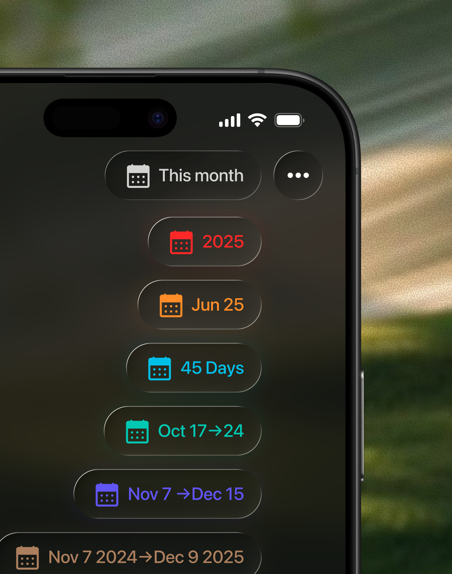
The Period Pill adapts to single periods, relative periods, continuous ranges, durations, and combinations of separate periods while remaining compact in the navigation bar.
Switch between time units
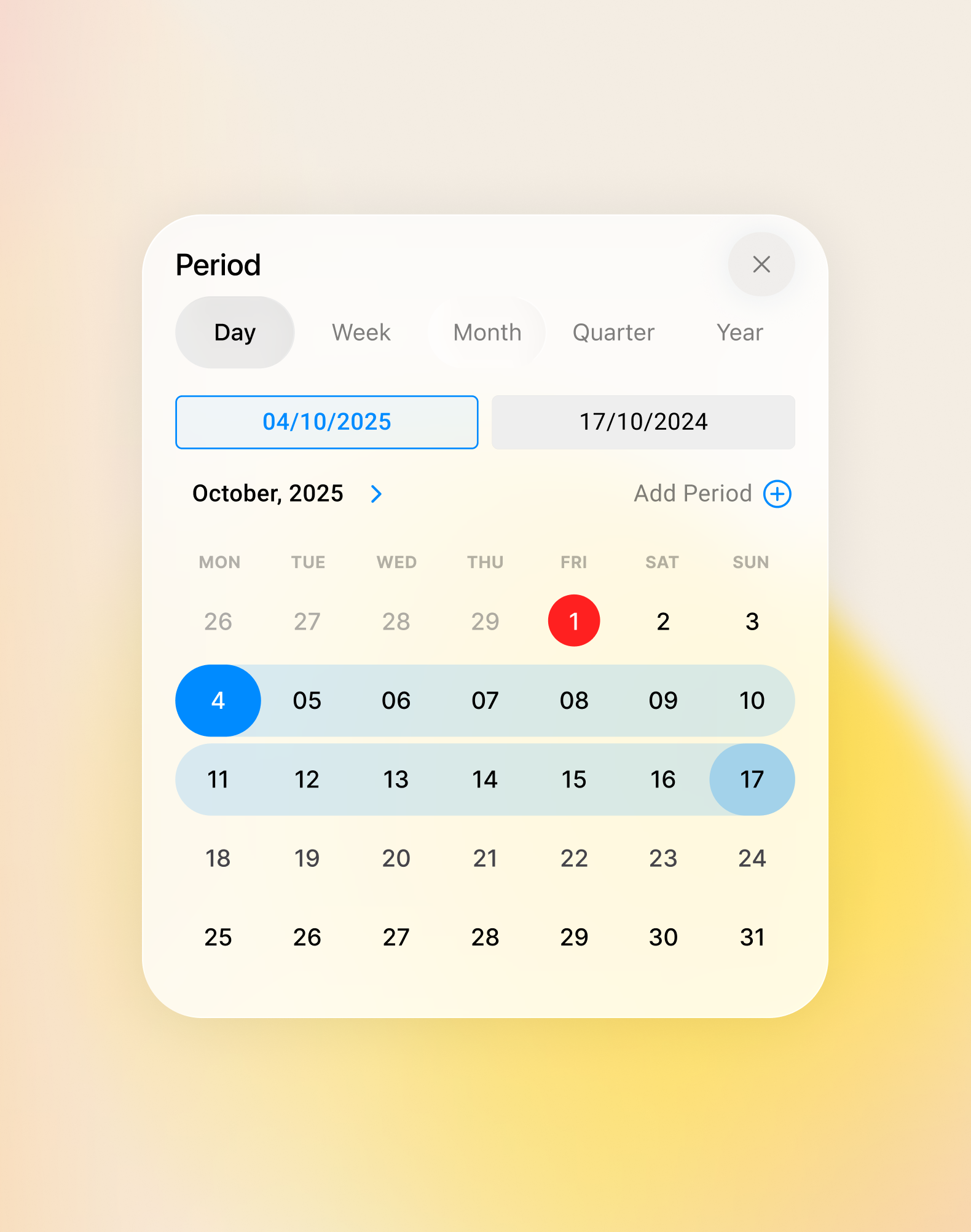
Move between days, weeks, months, quarters, and years while staying oriented around the same point in time.
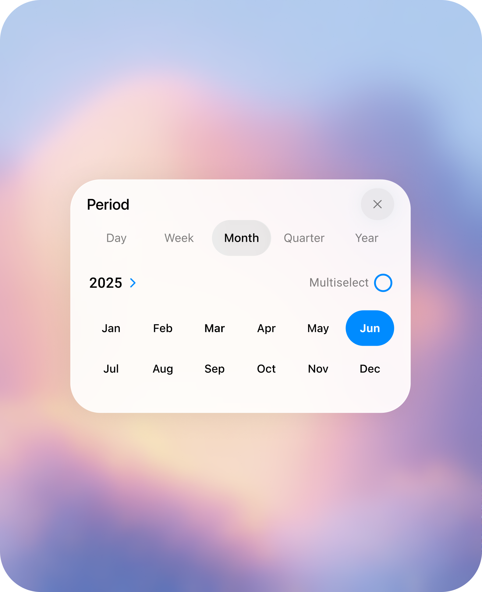
Select a single period
Choose one complete day, week, month, quarter, or year.
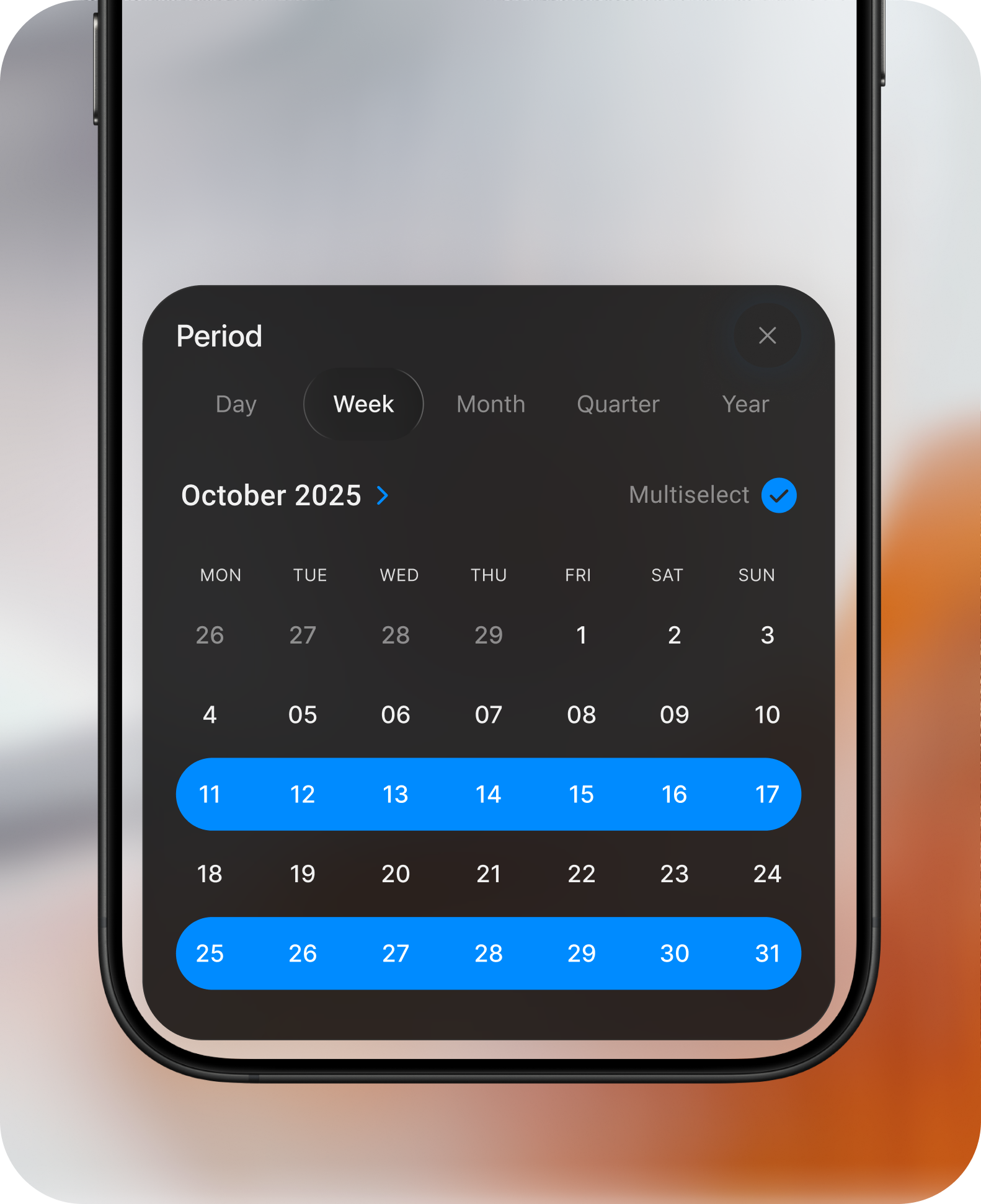
Combine multiple periods
Select several periods of the same cadence to create a broader time scope.
Browse nearby periods
Move naturally through adjacent periods when exploring changes over time.
Jump to distant periods
Move directly to a distant date without stepping through every period in between.
Define a custom range
Select precise start and end dates for periods that do not follow a standard calendar unit.
Combine separate ranges
Bring non-adjacent periods together without including the time between them.
Decisions & Iterations
With the core direction established, the next phase explored how the Period Pill and Period Sheet should look, behave, and scale from simple selections to the most complex cases.
Decision 01
Finding the right direction
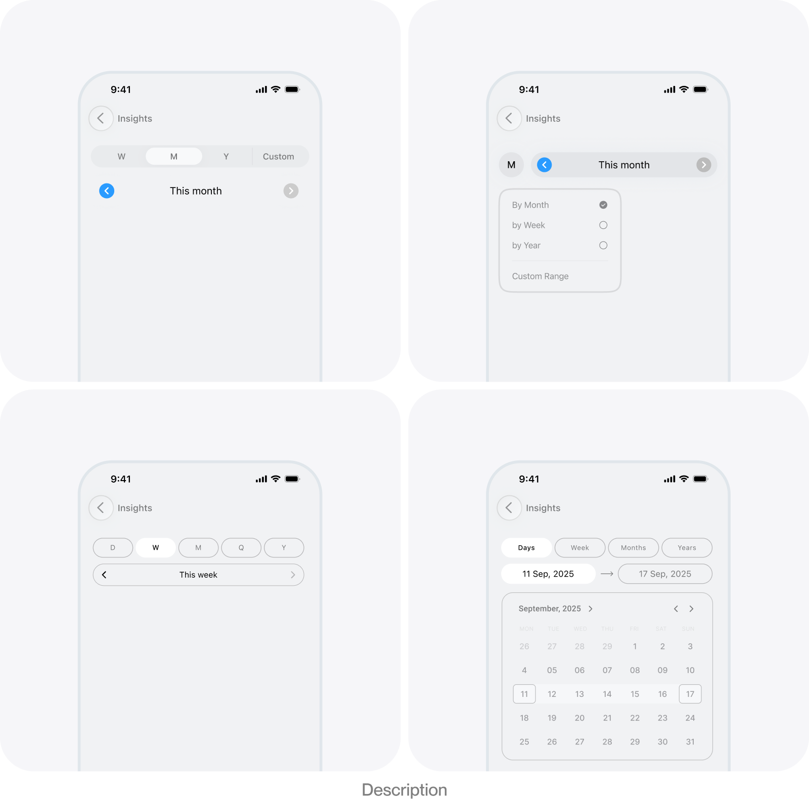
The initial challenge was architectural. The interaction needed to retain the speed of a simple month stepper while expanding to different cadences, distant dates, ranges, and multiple selections. I explored progressively more capable models before separating the compact summary from the full construction experience.
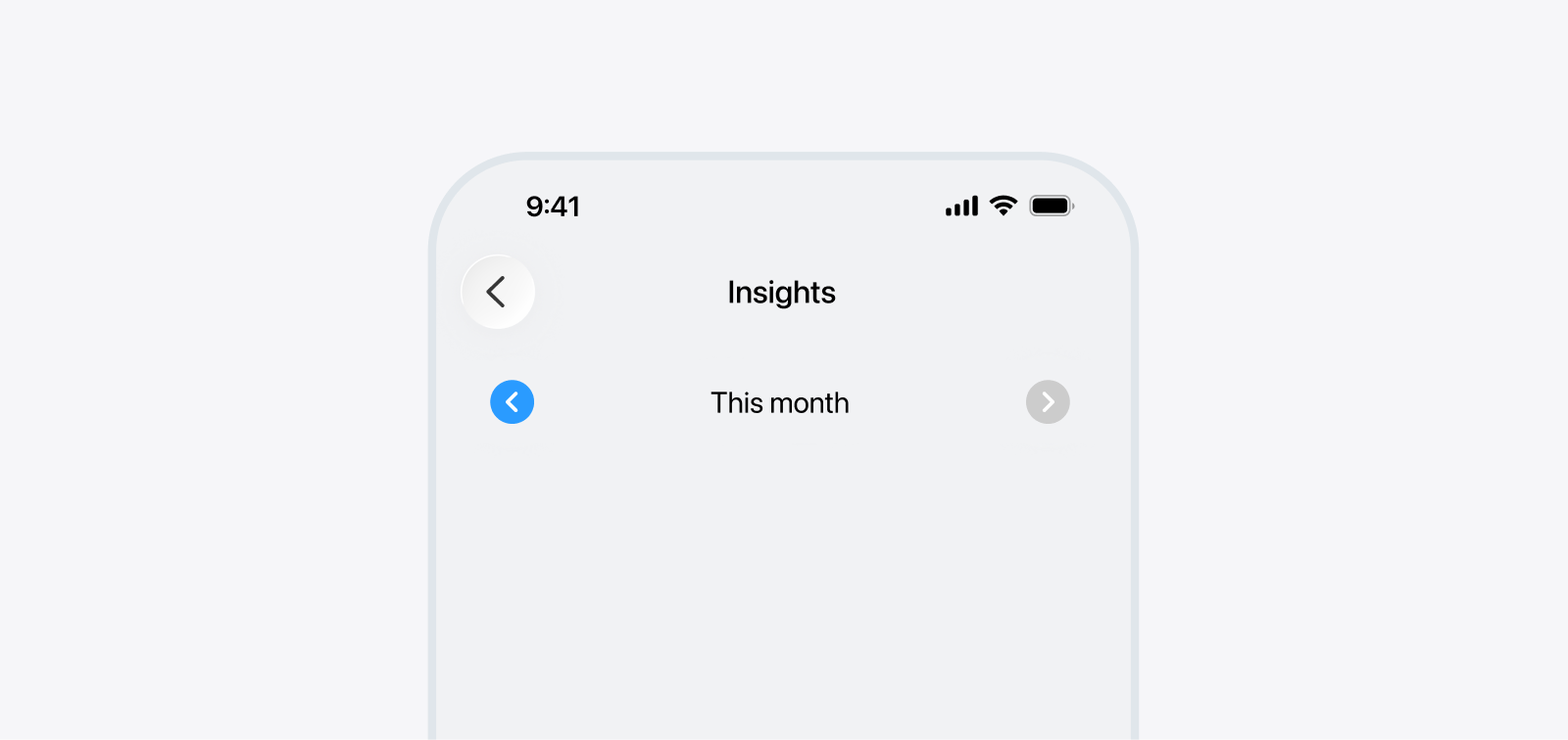
Single cadence navigation
The selected month sits between previous and next controls. The model is familiar and efficient when the product supports one fixed time unit, but it cannot grow beyond that assumption.
- Fast for adjacent months
- Compact and immediately understandable
- Limited to one cadence
- Inefficient for distant periods
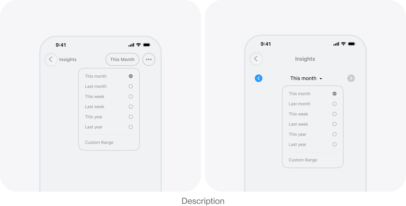
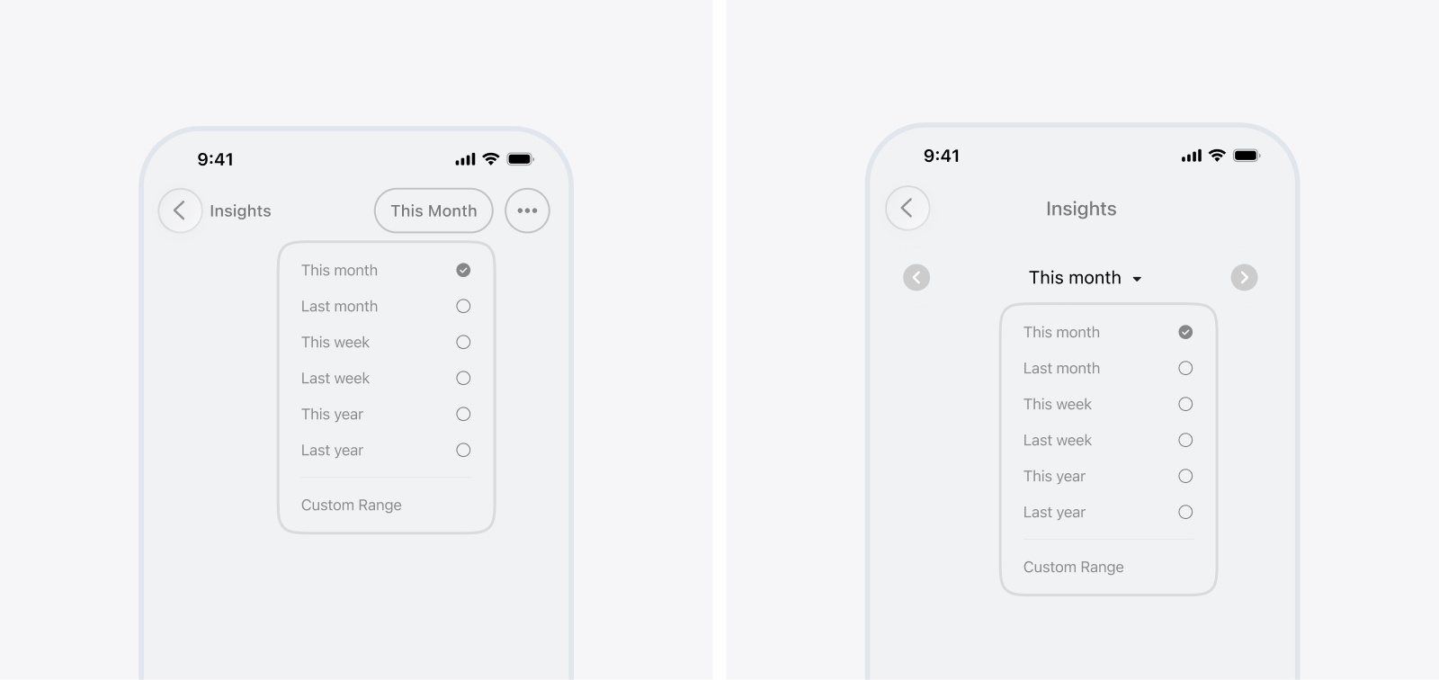
Preset period selection
A menu exposes common periods and sends custom ranges to a separate flow. It covers more recurring needs, but moving sequentially between periods becomes slower and less direct.
- Simple access to common presets
- Custom ranges remain possible
- Repeated navigation is less efficient
- The menu mixes shortcuts with period construction
Inline cadence and period controls
The screen combines one control for switching cadence with another for moving between periods. Frequent actions stay directly accessible, but the added controls consume valuable space and still make distant navigation inefficient.
- Cadence and navigation remain visible
- No sheet is required for common changes
- The interface becomes control-heavy
- Many layouts are possible without a clear hierarchy
Period Pill and Period Sheet
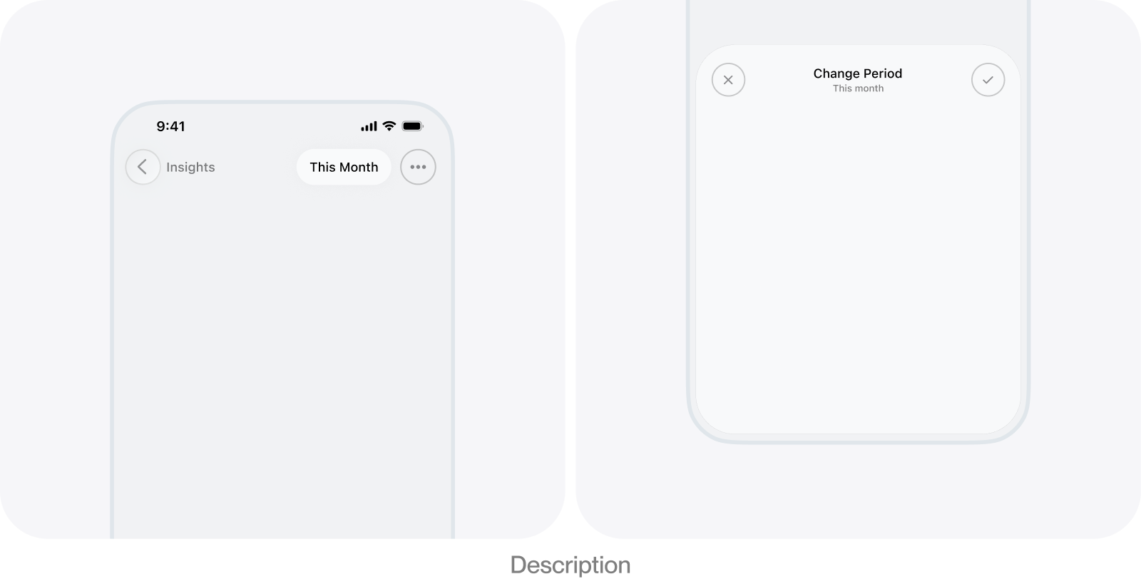
Supporting many period types required more controls than the main screen could comfortably hold. The Period Pill became a compact summary and entry point, while the Period Sheet progressively disclosed the full selection experience. This was the strongest tradeoff and became the foundational direction.
- Keeps the active period continuously visible
- Provides space for simple and advanced selections
- Adds one presentation step
- Requires careful summary and state logic
Decision 02
Simplifying the Period Sheet
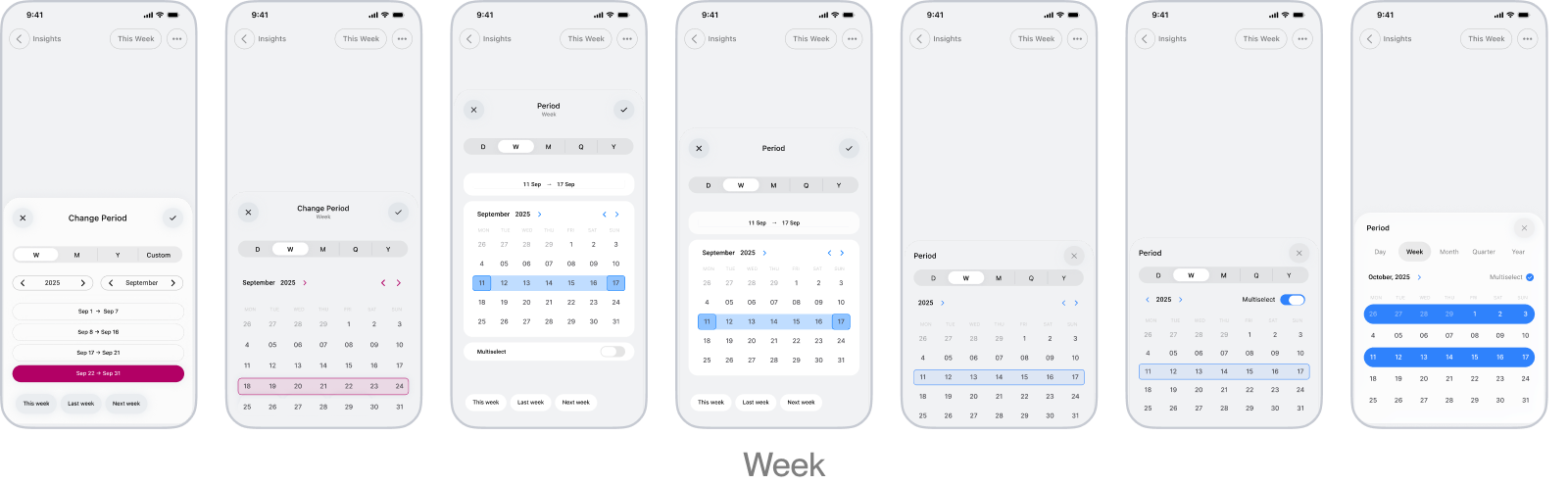
The segmented cadence control remained visible because switching units was too frequent to hide in a menu. Beneath it, I tested different content structures, densities, and visual treatments, initially using month selection as the clearest baseline. The aim was to keep the sheet compact enough to preserve the report behind it without compressing the controls to the point that they became difficult to scan or use.
Decision 03
Improving the sheet interactions
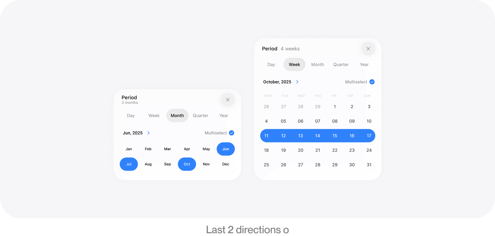
The sheet needed to remain efficient after the initial selection. Swiping provided a natural way to browse adjacent periods, while the iOS wheel offered a faster path to distant years. I also differentiated single and multi-selection feedback so the same grid could support both direct replacement and cumulative selection without changing the overall structure.
Decision 04
Supporting multiple periods and clear feedback
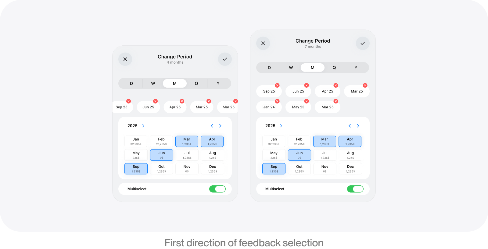
The architecture created an opportunity to select several periods of the same cadence without forcing every question into a start-and-end range. Multi-selection made persistent feedback essential because users could browse away from the periods they had already selected. I explored removable chips with wrapping and horizontal scrolling, but both added friction as the selection grew. The final direction relied on grid highlights and a compact summary label instead.
Decision 05
Adding a custom day range
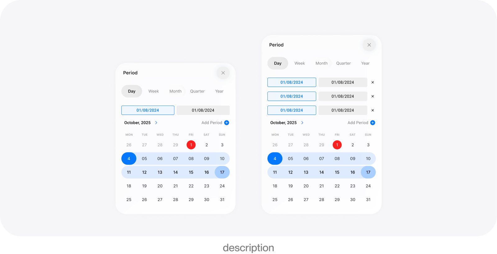
A single fixed range was not enough for the original goal of supporting almost any time scope, so the day cadence expanded to cover continuous ranges and linked non-adjacent ranges. The interaction had to make start, end, and intermediate days distinct while guiding people from one endpoint to the next without adding more permanent labels or pushing the sheet beyond a half-screen detent.
Decision 06
Improving performance
Immediate report updates made simple selections feel direct, but complex or rapidly changing selections could trigger expensive work before the user had finished. Separating the draft selection inside the sheet from the applied report scope introduced a deliberate validation boundary. The picker could remain immediately responsive while the report updated only after confirmation, and later implementation work addressed the underlying reporting bottleneck.

Decision 07
Preserving context when switching cadence
Moving from a month to a week or year should not reset the interface to an unrelated point in time. Cadence changes therefore stay anchored around the current selection, preserving orientation even when the new unit cannot represent exactly the same span. This continuity was more important than attempting a rigid one-to-one conversion between unlike periods.
Decision 08
Designing the adaptive Period Pill label
The Period Pill had to summarize selections ranging from “This month” to long cross-year ranges and combinations of separate periods. Its label therefore uses context-sensitive formatting, preferring a familiar relative name when possible, then a semantic unit label, explicit endpoints, or a compact duration when space is limited. Minimum and maximum widths keep the pill readable without allowing it to compete with the navigation title or toolbar actions.
Preview any selected period
Switch between time units
Select a single period
Combine multiple periods

Browse nearby periods
Jump to a distant period
Define a custom range
Combine separate ranges
Key Decisions & Iterations
Finding the right direction
Time is an unusual kind of filter because people do not think about it in one consistent form. Sometimes it is understood as a continuous timeline that can be moved forward or backward. Sometimes, it is divided into familiar calendar units such as days, weeks, months, quarters, and years. Sometimes, it is connected to events that do not align with a standard calendar boundary. A selection might therefore be a single month, a continuous range, several months considered together, or completely separate periods combined for a specific question. Most period selectors are built around only one of these mental models. Previous and next controls treat time as a sequence of equal steps. Preset menus treat it as a short list of recurring choices. Calendar pickers treat it as a surface on which users define a start and end date. Timelines and sliders emphasize continuity, while more advanced filter builders allow complex combinations but require users to construct their selections explicitly. Each model works well for certain tasks, but becomes restrictive when applied to every kind of temporal question.
The flexibility of this model would ultimately determine the kinds of questions the rest of the product could answer. Financial reports, time-tracking summaries, comparisons, trends, and any future view organized around time would inherit the limits of the period picker. If the picker only supported predefined months or continuous ranges, the reporting system would be restricted in the same way.
This made the information architecture more important than the appearance of the controls. I began separating period selection into three dimensions. The cadence determines the scale at which time is being considered, the position determines where the user is on the timeline, and the composition determines whether the selection contains one period, several periods, a continuous range, or separate ranges. Treating these as distinct concepts made it possible to change one aspect without unnecessarily resetting the others.The early exploration was therefore less about designing a polished date picker and more about finding a stable interaction model for time across the app. It needed to make familiar periods quick to reach, preserve orientation while moving through time, and allow more unusual selections without placing the full complexity on every screen. I explored several directions, each prioritizing a different understanding of how users might navigate and construct time.
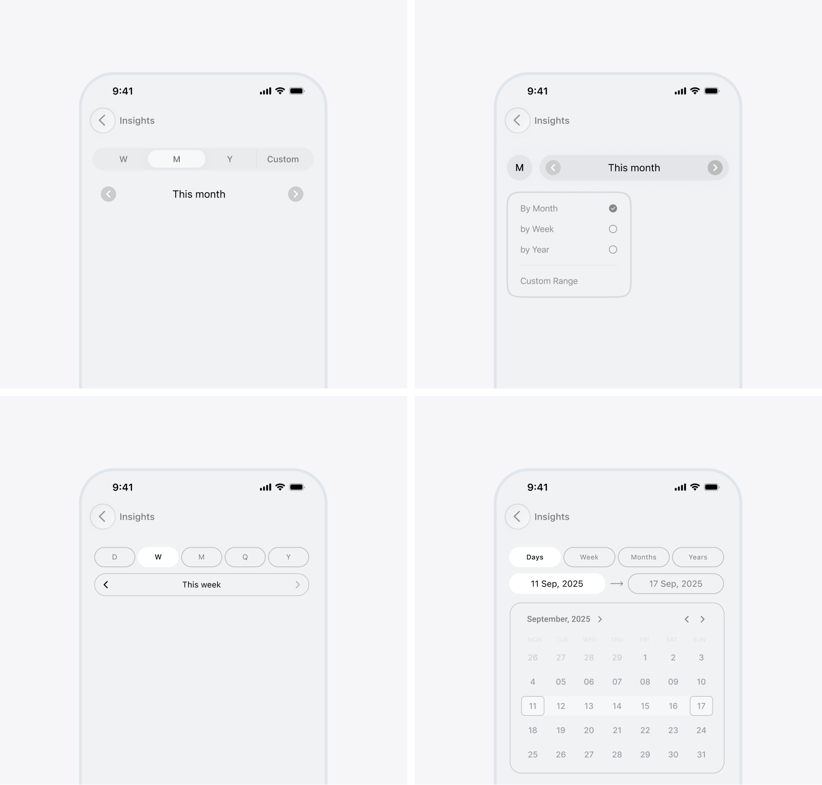
The first approach assumed that each view would use one fixed cadence. A monthly report, for example, would show the active month with previous and next controls for moving through adjacent months. This was the clearest and most compact model, but its simplicity depended on limiting what users could select.
The second direction treated period selection as a list of common presets, with a custom range available when none of them matched the user’s needs. I explored two representations: a compact menu placed in the toolbar and a more prominent selector positioned within the content area, with adjacent arrows for moving between periods. Both kept most of the complexity hidden until needed, but they also exposed the limitations of a preset-based model. The toolbar version made sequential navigation difficult, while adding arrows to the second version began reintroducing persistent controls. More importantly, the approach was built around a finite list of expected choices, leaving less common periods and more complex selections to a separate custom flow.
The third direction brought cadence switching and period navigation directly into the main interface so users could change between days, weeks, months, quarters, and years while also moving through periods without opening a separate sheet. Once both actions were made permanently available, however, there was no obvious way to organize them. I explored four representations, including segmented controls with separate navigation, a compact cadence menu, two stacked control rows, and an expanded calendar. Each arrangement offered a different balance between immediate access, clarity, and screen space, but the underlying limitations remained. The controls added persistent complexity to every screen, their hierarchy was difficult to resolve, and reaching a distant period still required either repeated navigation or an additional mechanism.
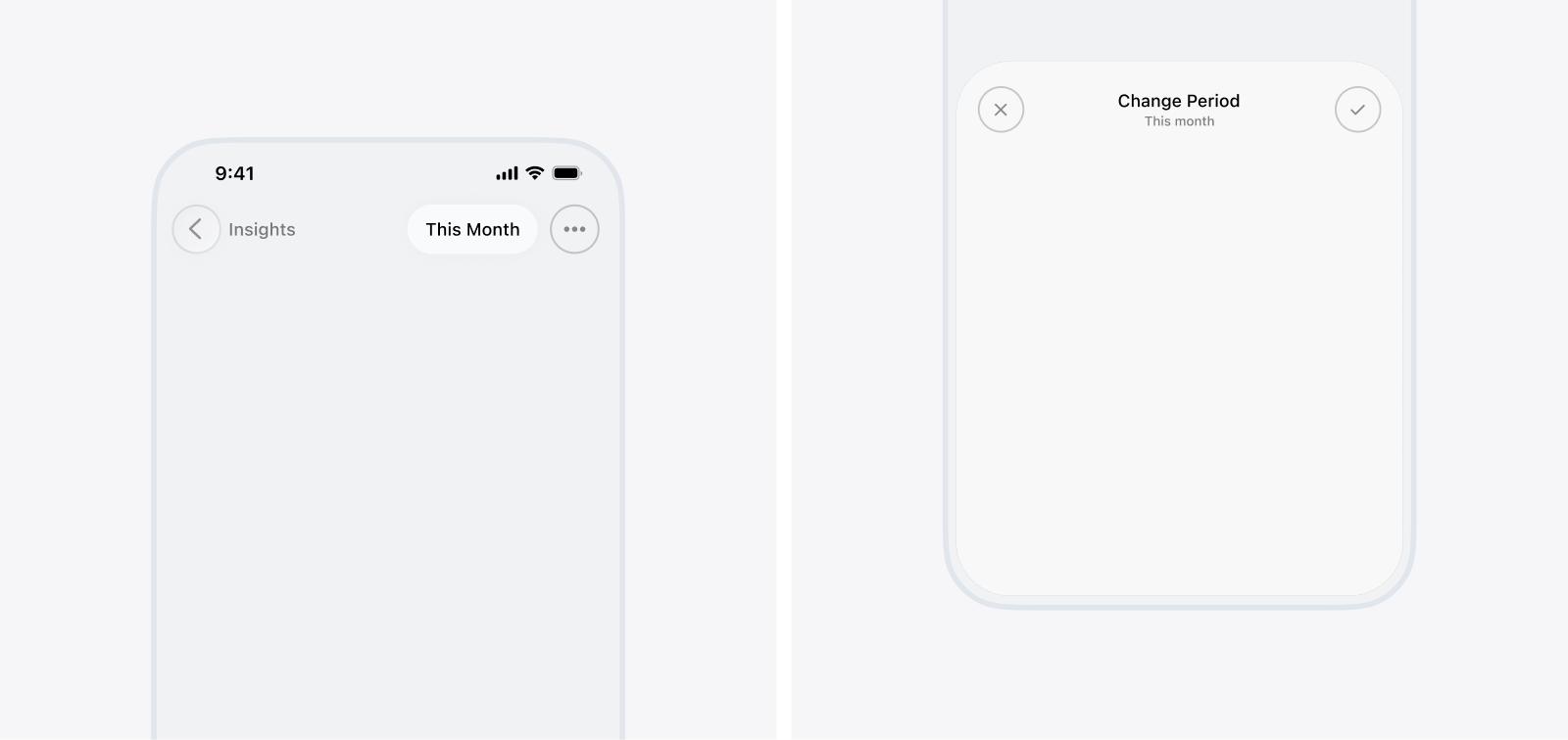
The final direction separated the persistent representation of time from the controls used to change it. A compact period pill remained visible in the native iOS toolbar across relevant views, showing the active selection and providing a consistent entry point to a dedicated Period Sheet. The sheet could then accommodate cadence switching, nearby and distant navigation, single and multiple selections, and custom ranges without placing that complexity on every screen. This introduced an additional tap before editing the period, but it resolved the larger conflict between keeping time context visible and supporting advanced selections within limited screen space. The separation between the pill and the sheet became the foundational structure of the final system.
Finding the right balance
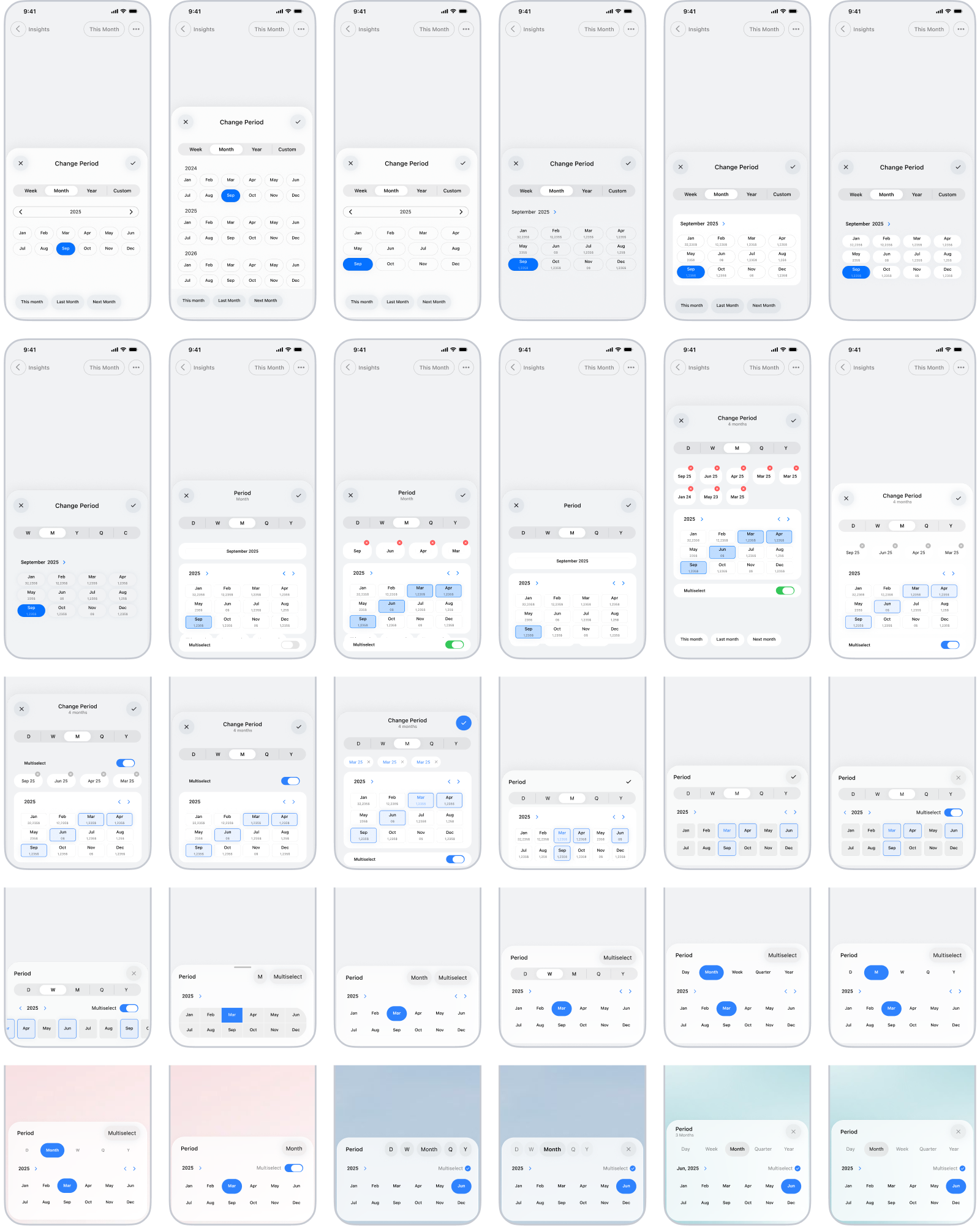
Once the pill-and-sheet direction was established, the problem could be divided into two focused components. The pill had the contained responsibility of preserving the active time context and providing a consistent entry point. Most of the interaction model lived inside the Period Sheet, which made it the next and more substantial area of exploration. A conventional bottom sheet containing every available control would have been the easiest solution, but period selection was expected to be a recurring action rather than an occasional configuration task. A large or visually dense sheet would repeatedly obscure the report beneath it and make small period changes feel unnecessarily disruptive. I wanted the sheet to remain as short and unobtrusive as possible without compromising its visual balance, touch targets, or the clarity of its hierarchy.
This balance became more difficult as the sheet expanded across different cadences, navigation methods, and selection types. Its structure needed to accommodate days, weeks, months, quarters, and years, then scale from a single period to multiple periods and custom ranges without feeling like a different component each time. Reaching that point required repeated changes to its density, proportions, control placement, and the options exposed at each stage, gradually reducing its footprint without removing the flexibility that made the direction valuable. The month view became the main reference point for the sheet because it needed to expose enough surrounding context without growing into a full calendar. I explored different sheet heights, navigation placements, grid densities, shortcut positions, and ways of introducing multiselect, gradually reducing the interface until the controls felt compact without becoming crowded or difficult to understand.
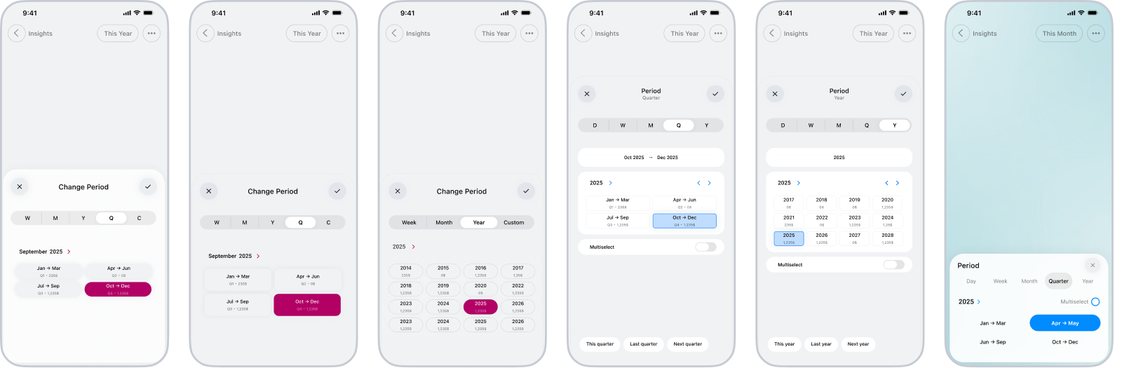
Years and quarters required their own layouts because they contain fewer, larger units and create different navigation expectations. I tested several ways of presenting them, ranging from compact grids to more descriptive period blocks, aiming to preserve the same overall hierarchy and interaction patterns used elsewhere without forcing every cadence into an identical structure.
Weeks introduced a different problem because they frequently cross month boundaries and are less easily identified by a single label. The iterations explored how much date information each week needed, how surrounding weeks should be represented, and how users could move through them without losing their position, resulting in a view that remained consistent with the rest of the sheet but was organized around the specific character of weekly navigation.
Supporting multiple periods & selection feedback
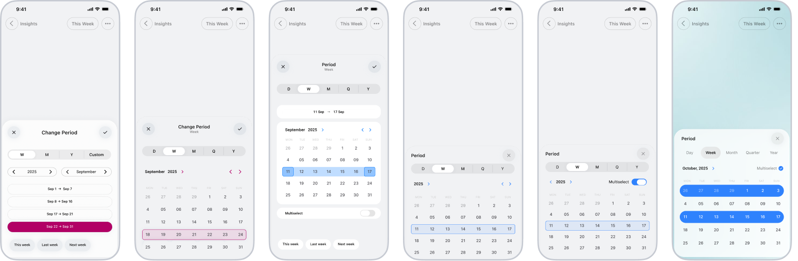
The original sheet supported either one predefined period or a continuous range defined by start and end dates. As I used the reporting views more, this distinction began to feel unnecessarily restrictive because many questions concerned several complete periods rather than one uninterrupted span. Comparing selected months, weeks, quarters, or years should not require including everything between them, so multiselect was introduced as a separate selection model built around whole calendar units. This created a feedback problem that did not exist in the single-selection flow. A single selected period usually remained visible and was easy to identify, but a multiselection could extend across different months or years. Users could navigate away from earlier selections and no longer see their highlights, making it easy to forget that those periods were still part of the result. The interface therefore needed to communicate both the selections visible in the current view and the broader selection that persisted beyond it.
Early iterations represented every selected period as a removable pill above the grid. This provided explicit feedback and made individual periods easy to remove, but the pattern became increasingly expensive as the selection grew. Horizontal scrolling concealed parts of the selection and became frustrating after only a few items, whereas wrapping the pills onto additional lines continuously increased the sheet’s height. The pills also competed with the period grid despite mostly duplicating information already communicated through selection highlights.
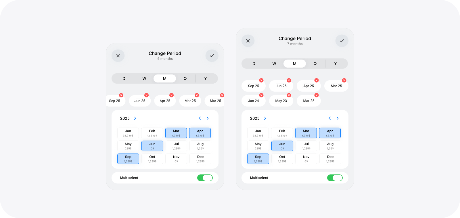
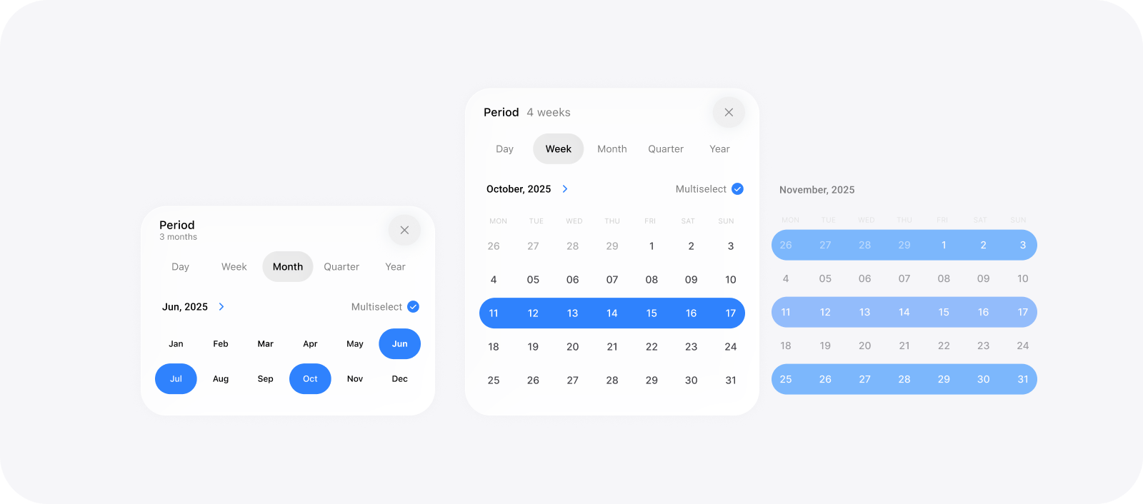
The final direction replaced the pill list with a short summary beneath the sheet title, such as “3 months” or “4 weeks,” and retained highlights as the primary feedback within the period grid. The summary confirmed that a broader selection remained active even after users navigated elsewhere, and highlighted periods could still be removed by selecting them again. This provided less detail at a glance than the pill-based version, but preserved a stable sheet height, avoided horizontal navigation, and scaled consistently as more periods were added.
Adding custom day ranges
The cadence-based views worked well for periods that followed calendar boundaries, but they could not represent every way someone might frame time. Some questions begin and end on specific dates, such as the duration of a trip, a project phase, or the period surrounding an event. The original sheet addressed this through a single custom range, which acted as a fallback whenever days, weeks, months, quarters, or years were not precise enough. As the selection model expanded, I reconsidered how this option fitted within the rest of the system. Renaming it from “Custom” to “Day” positioned it as the most granular cadence rather than an exceptional mode, with the calendar allowing users to construct a range from individual days. This created a more consistent structure across the sheet and left room to extend the same interaction beyond one continuous span.
Most of the design challenge concerned feedback and sequencing. The interface needed to communicate which boundary was currently being defined, display the selected start and end dates, and distinguish the first day, last day, and days between them inside the calendar. I avoided adding permanent labels above the date fields because they increased the sheet’s height, using the field placeholders to communicate their purpose instead. The start field receives focus when the view opens, and selecting a date immediately advances the interaction to the end field, reducing the need for an additional step or explicit instruction. A single range still excluded cases involving separate parts of the timeline, so I introduced the ability to link additional ranges into the same selection. Each added range needed its own start and end feedback without turning the sheet into a growing form or pushing it beyond the half-screen detent. The resulting interaction reused the same range-building sequence for every addition and relied on the calendar highlights to communicate the structure of the active range, keeping the more advanced capability within the same compact layout rather than introducing a separate flow.
Refining the interaction model
Once the sheet structure was established, the focus shifted to maintaining continuity as users moved between cadences, navigated through time, and constructed selections. I treated the current position on the timeline and the active selection as separate states, allowing users to explore other periods without accidentally replacing earlier choices. Changing cadence preserved the same temporal context, so moving from a month to its surrounding weeks or year did not feel like starting again
Navigation was adapted to the distance users needed to travel. Arrows and swiping supported movement between adjacent periods, shortcuts provided immediate access to recurring destinations such as the current, previous, or next period, and a higher-level control made distant dates reachable without repeated stepping. These methods served different situations but returned users to the same selection surface. Selection behaviour then adapted to the period being constructed. A single period could be chosen directly, multiselect retained earlier choices through persistent highlights and a compact summary, and custom ranges guided users from the start date to the end date by advancing focus automatically. The same sequence could be repeated to add non-adjacent ranges without introducing another interaction model. Local highlights communicated what was selected in the current view, the summary confirmed selections that might no longer be visible, and the period pill displayed the final result after confirmation.
Performance Tradeoffs
My initial expectation was that the picker would not need an Apply button because every selection could update the report immediately. This seemed like the most direct interaction for a single period, but the assumption failed once the component was connected to real reporting data. Each update could take roughly five to ten seconds, and constructing a multiselection triggered the same delay after every tap even though the user had not finished defining the intended period. Custom ranges became particularly frustrating, and I began avoiding them despite having designed the picker specifically to support that flexibility.The problem changed the interaction contract rather than only exposing a technical limitation. The picker needed to distinguish the period currently applied to the report from the draft selection being edited inside the sheet, as well as the part of the timeline being browsed. Introducing an explicit confirmation step added one action, but allowed users to complete a single period, several periods, or a custom range before initiating the expensive report update. In practice, this felt more immediate than repeatedly applying incomplete selections.
The underlying reporting performance was improved later, but the separation between editing and applying remained useful beyond the original delay because compound selections naturally contain intermediate states that should not affect the report. This became an important lesson from the implementation: removing a button does not make an interaction direct if the system responds slowly or acts before the user has finished expressing an intention.
Resetting context when switching cadence
I explored two ways of handling the transition between time units. The first preserved the user’s position on the timeline, treating cadence switching like zooming in or out around the same date. If someone moved from September 2025 to the year view, for example, the picker would remain within 2025. This appeared conceptually continuous, but testing it in use revealed an important ambiguity. The period visible before the switch was not always the period the user wanted to keep exploring, and the resulting destination could feel arbitrary, especially when moving from a broad unit to a narrower one.The final picker instead treats a change of cadence as the beginning of a new selection and returns users to the current day, week, month, quarter, or year. This sacrifices some continuity, but provides a stable and predictable starting point every time. Navigation within a cadence still preserves the user’s position, whereas switching cadence resets the temporal context. The distinction made the behaviour easier to learn because each action now has a clear meaning. Browsing changes where the user is on the timeline, and changing cadence changes both the type of period and the point from which that exploration begins.
Designing the adaptive period pill label
The Period Pill had to translate every possible selection into a label that remained understandable outside the sheet. This was straightforward for a year such as “2025,” but became more difficult with relative periods, ranges crossing months or years, and selections containing several separate periods. Showing every boundary would make the pill too wide for the iOS toolbar, whereas aggressive shortening could remove the information that distinguished one selection from another. The label therefore needed to adapt to both the meaning and complexity of the selected period rather than apply one fixed date format.
The logic prioritised familiar relative terms such as “This month,” followed by natural labels for complete calendar units. Ranges removed repeated month or year information when the remaining label stayed unambiguous, then restored that context when crossing a boundary. More complex selections used shorter summaries, but could never present separate periods as one continuous range or omit information required to identify the scope correctly. The pill resized within defined minimum and maximum widths, allowing it to occupy the same toolbar position across time-based views without competing with the screen title or surrounding actions. The rules also needed to accommodate localisation, longer month names, different date orders, narrow screens, and larger text sizes.
Applications and Limitations
Although the picker emerged from personal finance and time management, its interaction model could support other products that require people to examine information across different time scales or compare non-adjacent periods, including health histories, project reporting, consumption dashboards, and analytical tools. I considered integrating it into a B2B supply-chain platform, where users occasionally needed to analyse specific ranges or combine periods such as two separate quarters. The idea was dismissed because it would have introduced considerable design, implementation, and maintenance complexity into a product where a short list of predefined options covered more than 80% of the need. Direction 2 was less flexible, but it was more appropriate for the frequency and importance of those edge cases. Given sufficient resources, the complete picker could have provided more powerful filtering, but technical possibility alone would not have justified the investment.
The system should therefore be treated as a model for products in which flexible period selection is frequent and consequential, not as a universal replacement for simpler date controls. It adds a step before changing the period, resets the temporal position when switching cadence, and must compress potentially complex selections into a short toolbar label. Applying it elsewhere would also require decisions around fiscal calendars, locale-specific weeks, time zones, accessibility, large selections, and which capabilities genuinely belong in that product. Since the picker was developed primarily through personal use and informal feedback, its usefulness in other contexts remains a reasoned possibility rather than a broadly validated conclusion.
