

Designing an ID Scanning & Autofill Experience for a Scholarship Application Flow
A look at the key decisions behind designing an AI-assisted ID upload and autofill flow during a brief, focused project. The case study explores working within an existing interface, supporting different document-upload methods, and giving applicants control over extracted information.
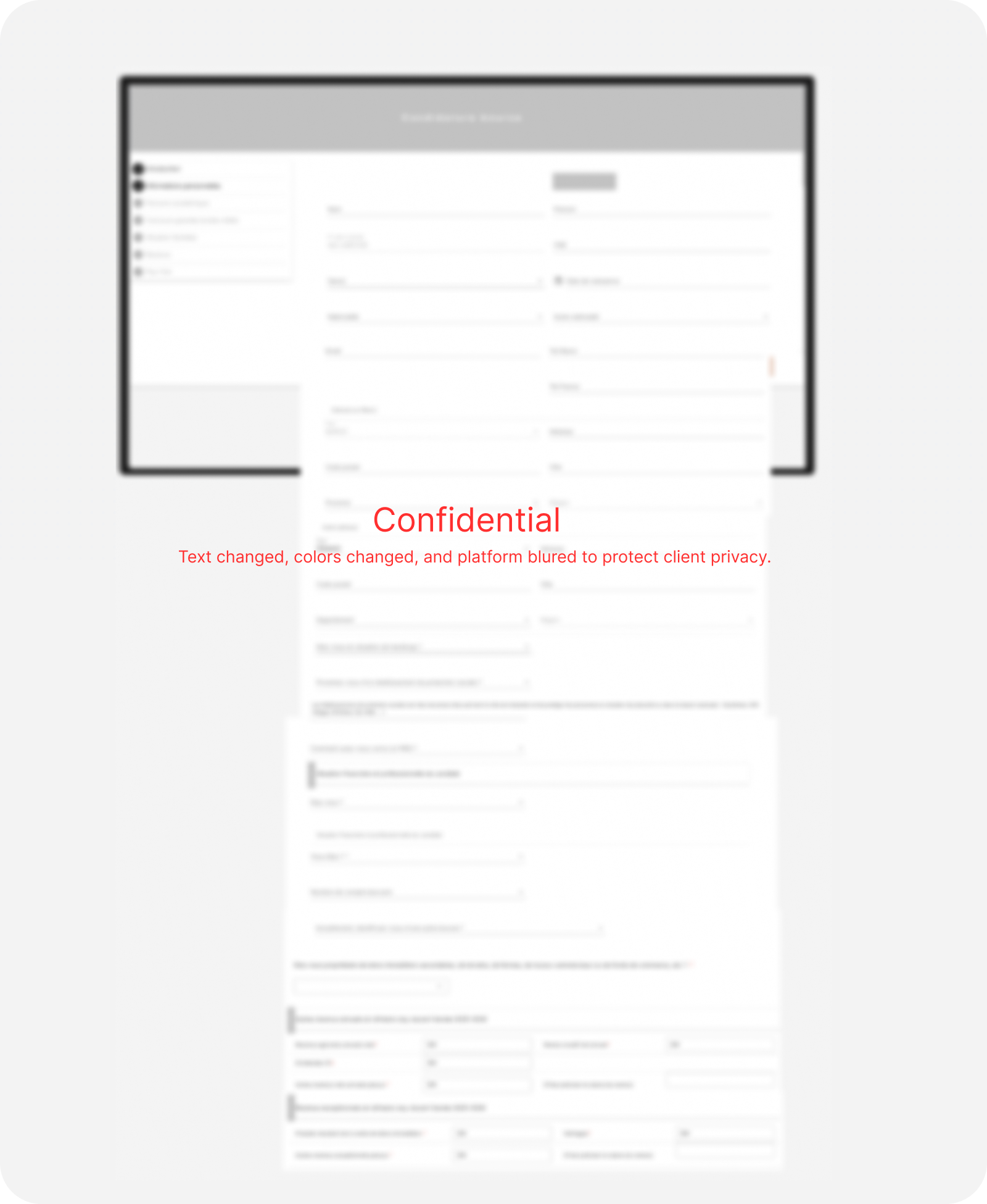
Note: No confidential applicant data, documents, or proprietary extraction details are disclosed. All names, ID information, values, and visuals were replaced or recreated solely to demonstrate the design approach and interaction model. The examples are illustrative and do not represent real applications.
Working within a focused scope
This brief project focused on introducing ID upload and autofill within an established application flow. The existing platform presented broader opportunities to simplify the application flow, improve accessibility, and reduce cognitive load. However, the immediate objective was intentionally focused on introducing an AI-assisted upload and autofill feature with minimal changes to the surrounding experience. My role was therefore to adapt the design approach to that scope and identify where smaller interaction improvements could still add value. The project required balancing broader UX opportunities with technical priorities and the practical boundaries of the engagement.
Context & Problem
A scholarship application platform required students to manually enter information already available on their national ID, adding repetition to an already lengthy submission process. While broader opportunities existed to simplify the experience, the project scope focused specifically on introducing an AI-assisted upload and autofill feature within the existing platform. The challenge was to make document submission more guided and reduce manual data entry without disrupting the established application flow or creating an experience that felt disconnected from the rest of the system.
Solution & Impact
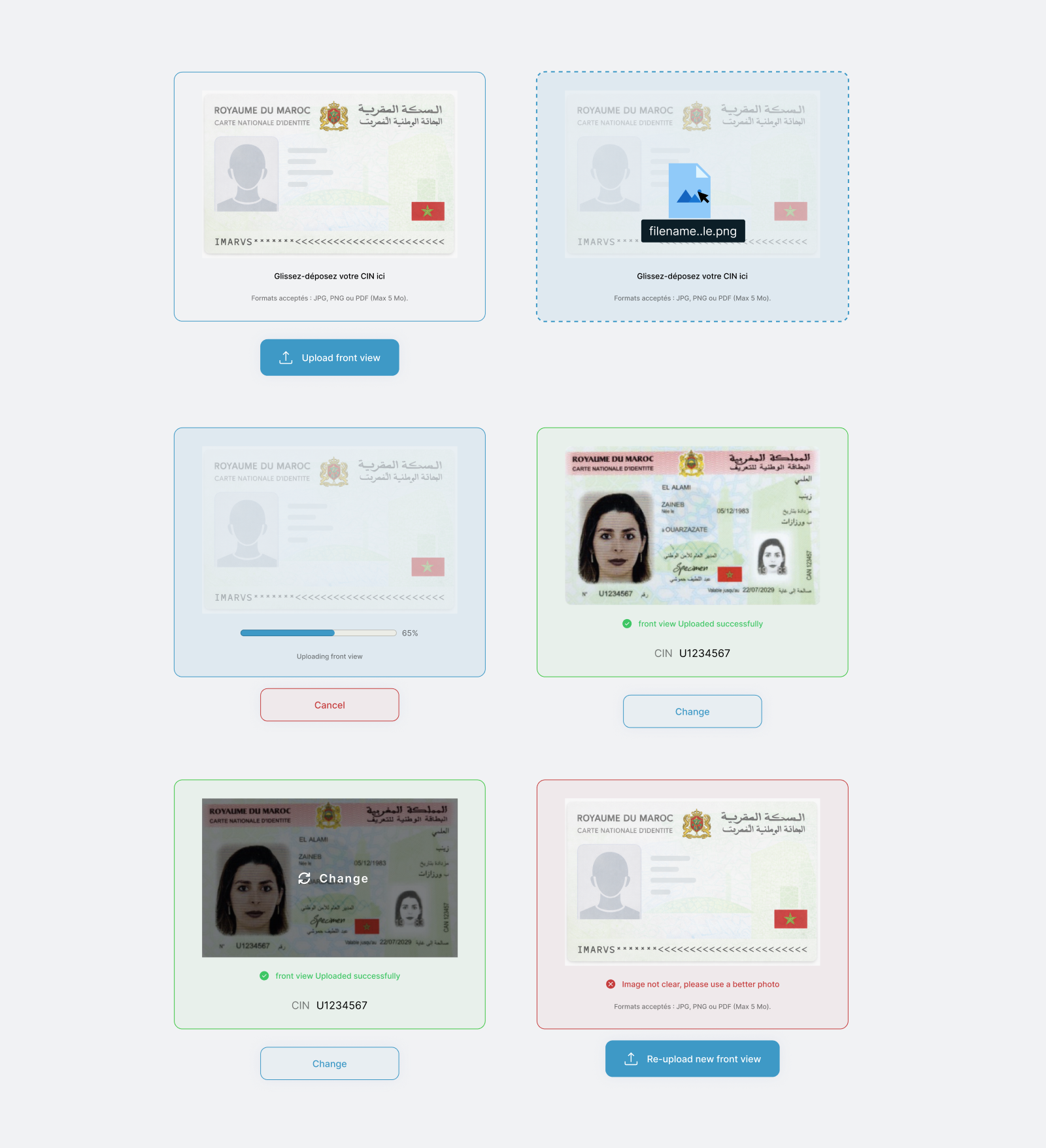
The final design introduced an AI-assisted upload flow that allowed students to submit their national ID and automatically populate application fields such as their name, address, city, and ID number. The experience supported separate front and back images as well as combined documents, with clear instructions, upload states, and an opportunity to verify or correct extracted information before continuing. Rather than transforming the broader application experience, the solution gave the organization a focused, lower-risk way to introduce AI-assisted document processing into its existing workflow. Its intended value was to reduce repetitive data entry and make document submission more approachable, although no measured impact data was available.
Key Decisions & Tradeoffs
The new upload experience had to fit within a legacy interface that offered several opportunities for visual and interaction improvements. Although it would have been relatively easy to design a cleaner and more contemporary upload flow, modernizing one isolated part of the platform risked making it feel disconnected from the rest of the application and introducing unfamiliar patterns into an established process. I therefore preserved the existing visual language, component styling, and overall level of interface density while improving the experience through clearer hierarchy, instructions, feedback, and error handling. This limited some visual freedom, but it allowed the feature to feel consistent with the surrounding platform and remain achievable without expanding the project into a broader redesign.
Supporting separate and combined ID uploads
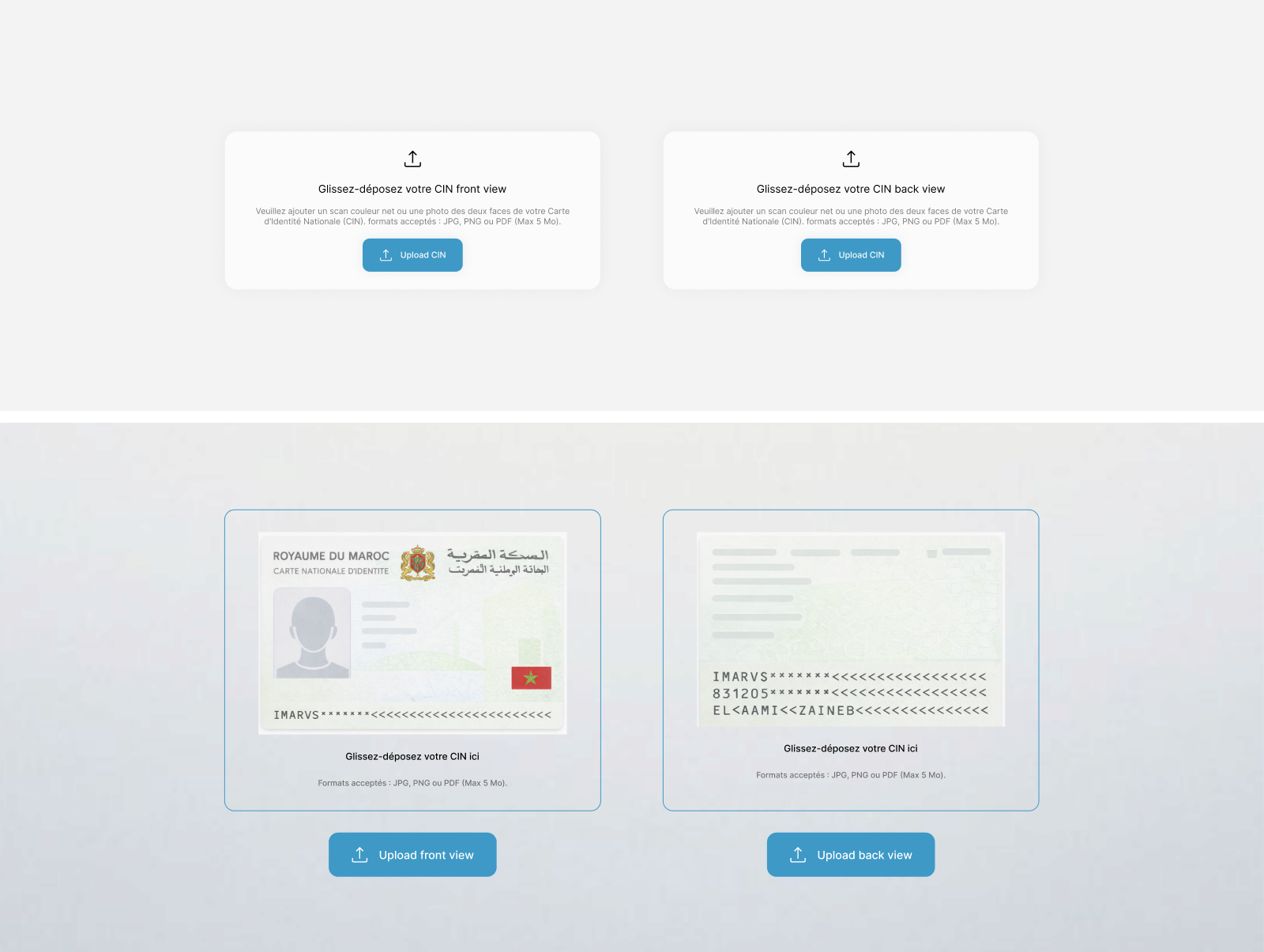
My early iterations used a single drag-and-drop area that assumed applicants would upload one file containing both sides of their national ID. During a stakeholder review, I learned that applicants often had separate front and back scans and sometimes relied on third-party tools to merge them before uploading. This added unnecessary effort outside the application. I redesigned the flow to support both methods. Applicants could upload the front and back separately, while the system could also accept an already-combined document and detect its contents automatically. However, placing two nearly identical upload components beside each other made it difficult to understand which side belonged in each one, particularly when relying only on labels. I introduced recognizable front and back graphics as functional visual cues rather than decoration. Because the Moroccan national ID was the primary use case, the graphics reflected that familiar structure instead of attempting to illustrate every possible identity document. Clear labels and instructions continued to communicate the actual upload requirements.
Evolving from generic upload states to document-specific feedback
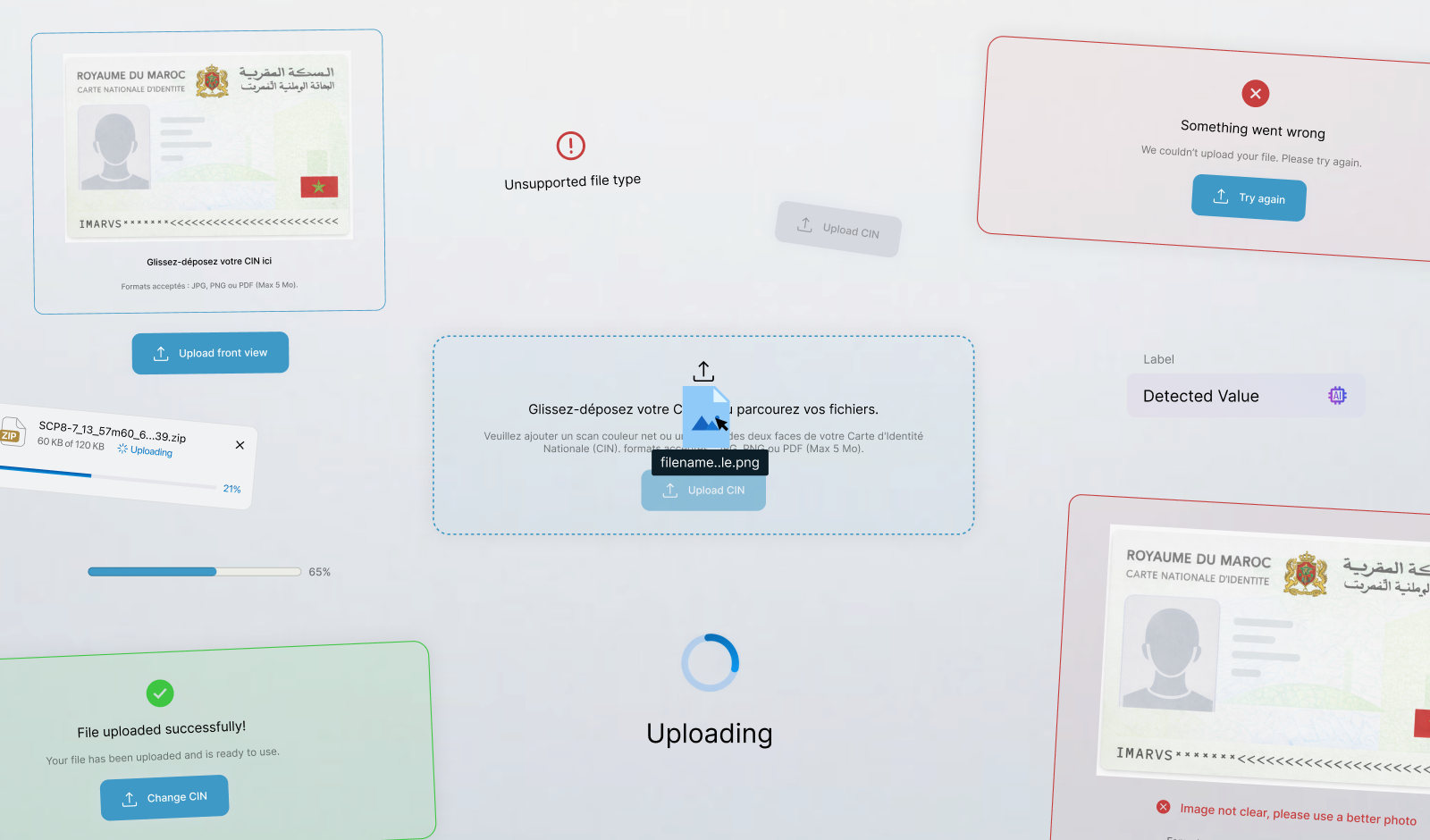
The upload component needed to communicate more than whether a file had been selected. Applicants could encounter default, hover, focus, drag, loading, disabled, success, unsupported-format, oversized-file, and general error states. My initial work focused on defining this functional state system and ensuring that every outcome communicated what was happening and provided a clear next action.
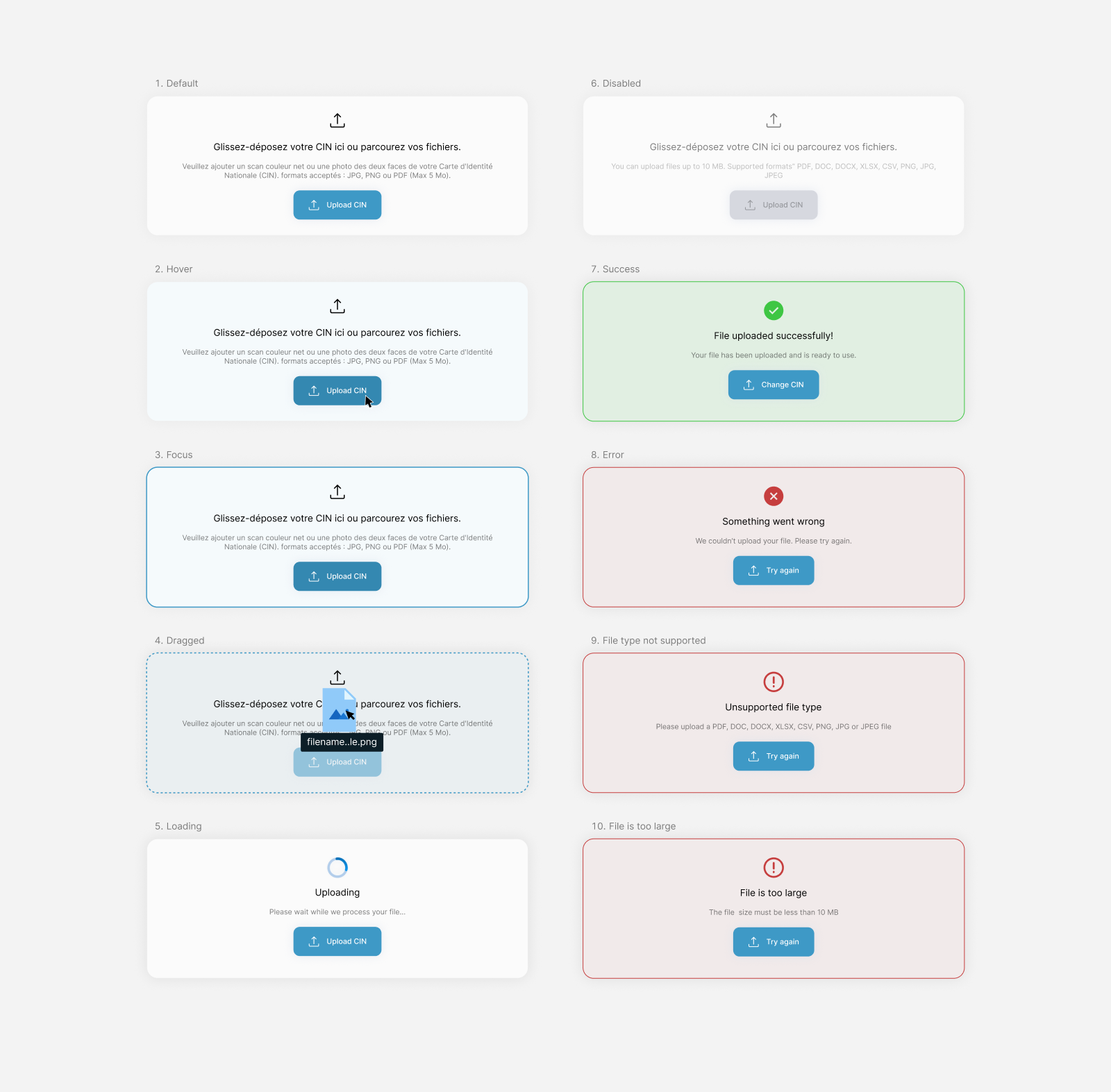
Although these states covered the necessary behavior, the early success and error treatments remained visually generic. They confirmed whether an upload had worked but provided little connection to the document being processed. I therefore developed a more visual, document-specific direction that kept the uploaded ID at the center of the experience. The final component introduced upload progress, a document preview, the extracted ID number, replacement controls, and contextual feedback when an image could not be processed clearly. Showing the preview was intended to help applicants confirm that they had selected the correct file and assigned it to the correct side. Errors also became more actionable by explaining what needed to change rather than exposing technical processing details.
Balancing automation with user verification
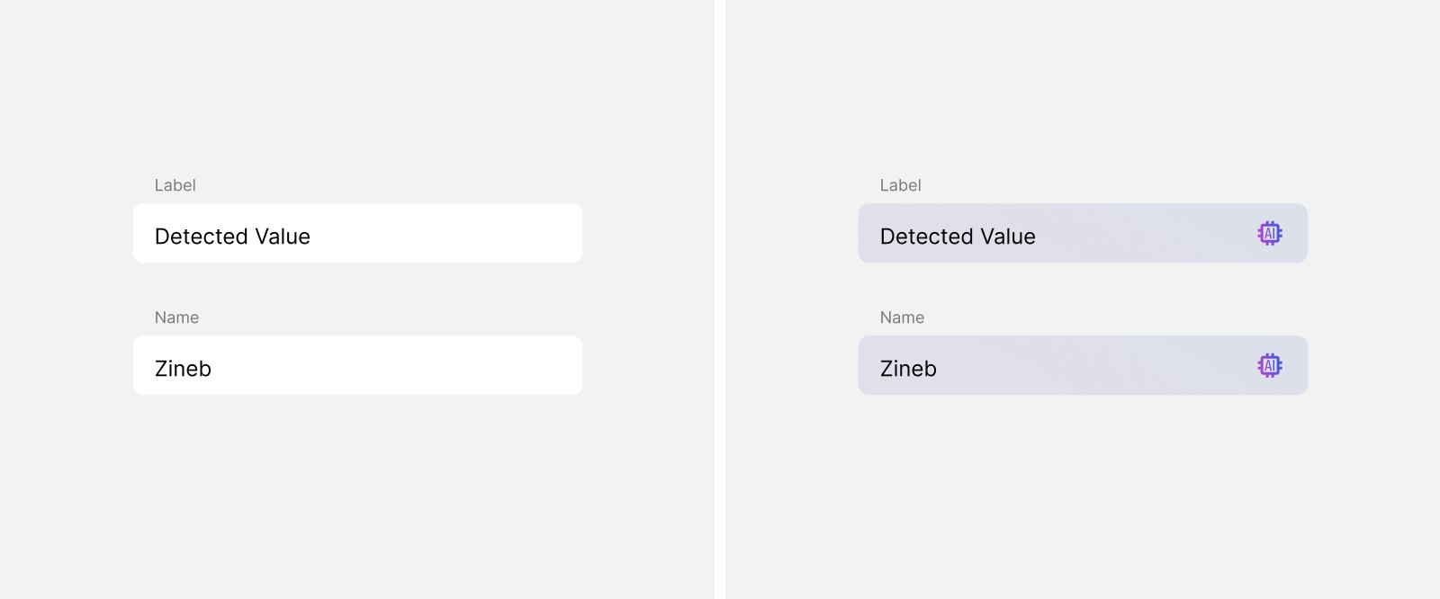
Another decision concerned how much of the AI extraction process should be visible. An early direction considered exposing confidence scores and technical extraction details because these metrics were useful internally. I recommended keeping them out of the applicant experience, where they would add complexity without clearly helping users complete the task. The interface instead communicated understandable states such as processing, successful extraction, and information requiring attention. A less straightforward decision was whether applicants should review the extracted information before continuing. My initial instinct was to keep the flow frictionless and send users directly to the application form. However, an incorrect extraction, particularly of the national ID number, could affect the rest of the application. A lightweight review step provided greater visibility and control while adding relatively little effort. Extracted fields were visually distinguishable from manually completed inputs and remained editable. This helped applicants understand which information had been populated automatically, verify it, and make corrections when necessary without exposing the technical workings of the extraction model. Because the project did not include direct applicant testing, this remained an informed design direction rather than a validated outcome.
